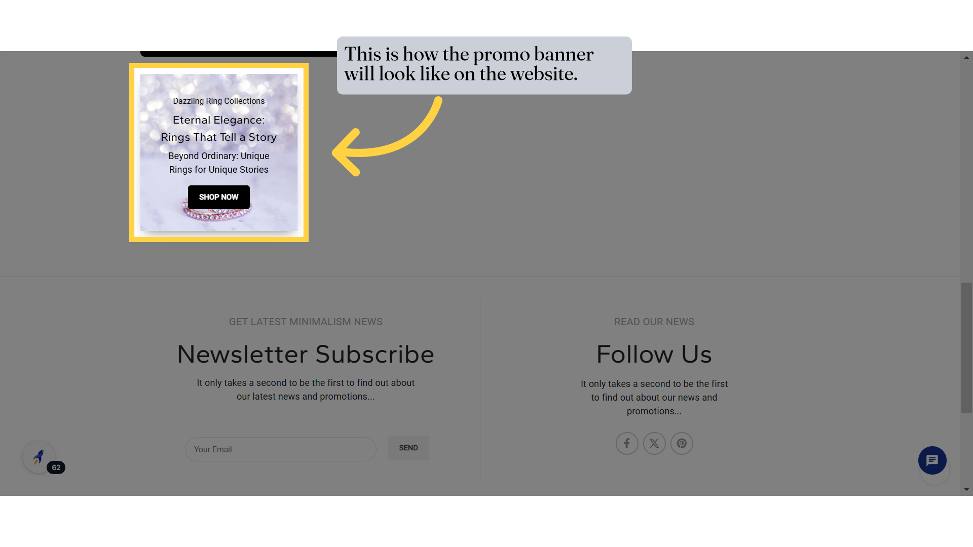
Promo Banner Element
Promo Banner Element
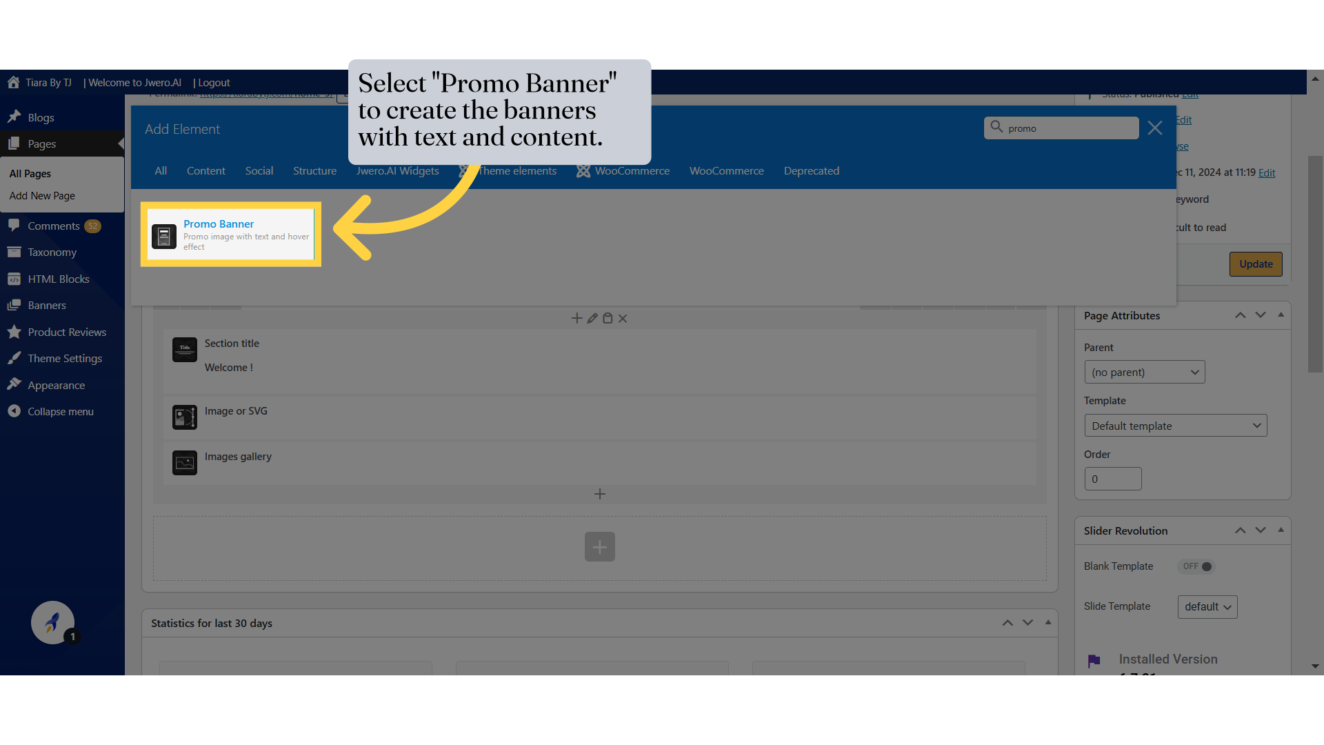
1. Select "Promo Banner" to create the banners with text and content.
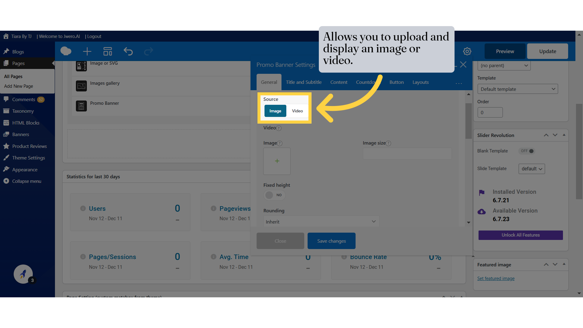
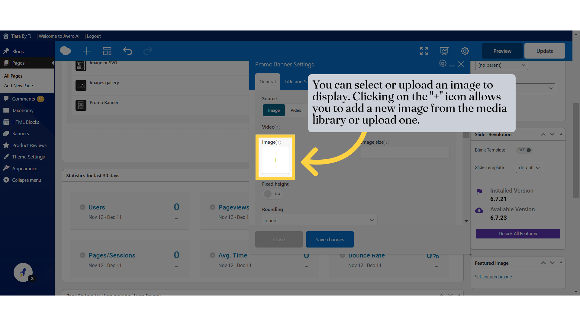
2. Allows you to upload and display an image or video.
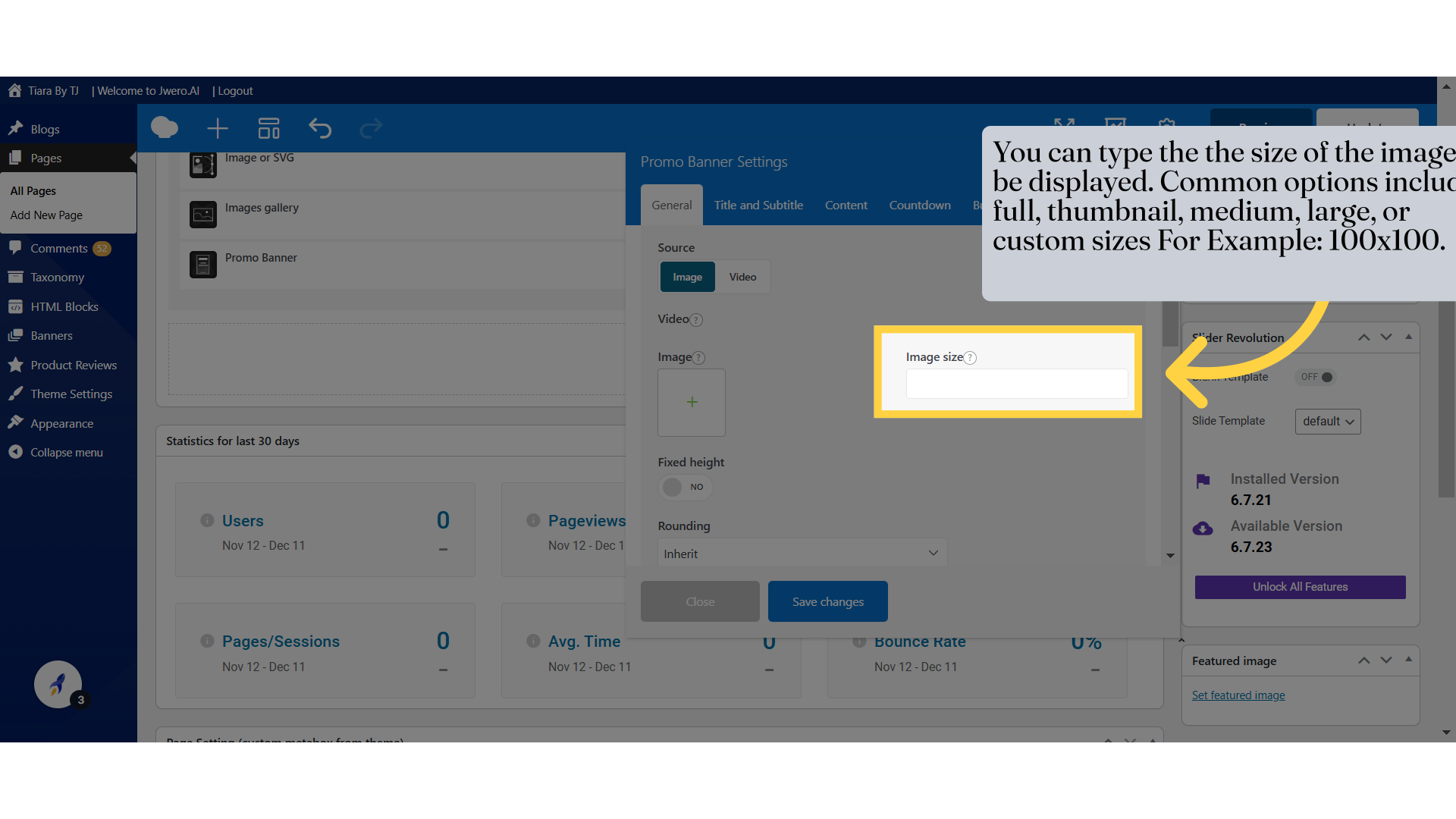
4. You can type the the size of the image to be displayed. Common options include full, thumbnail, medium, large, or custom sizes For Example: 100x100.
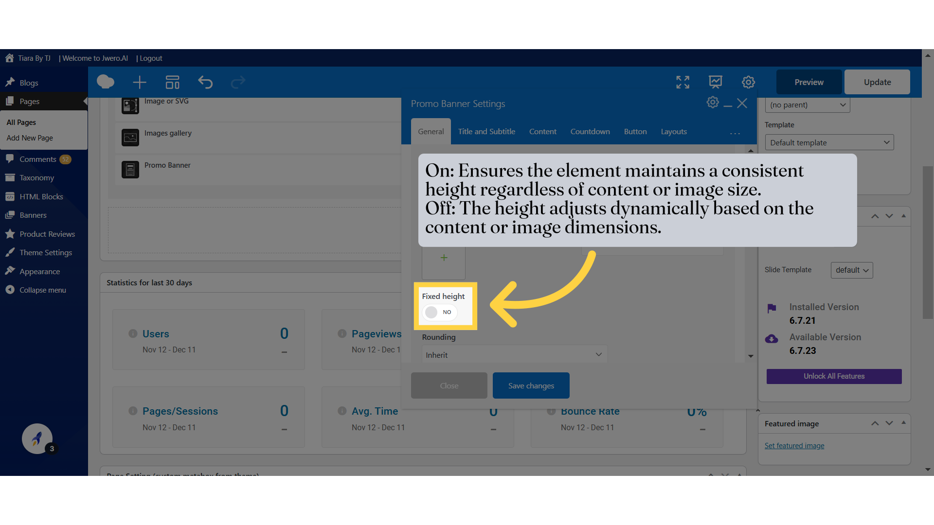
5. On: Ensures the element maintains a consistent height regardless of content or image size.
Off: The height adjusts dynamically based on the content or image dimensions.
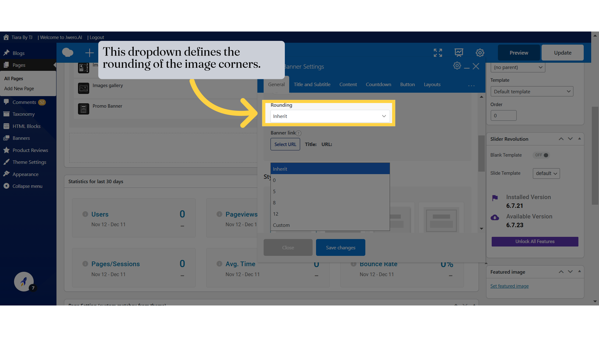
6. This dropdown defines the rounding of the image corners.
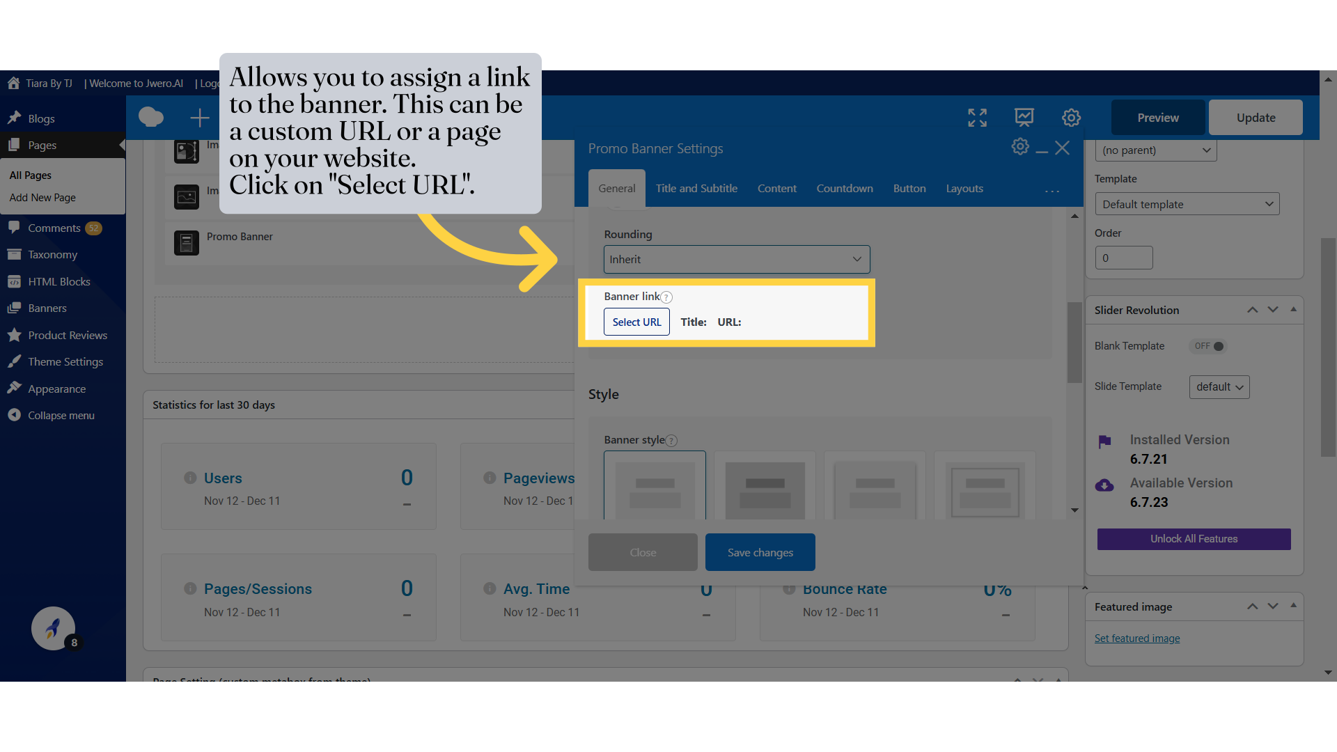
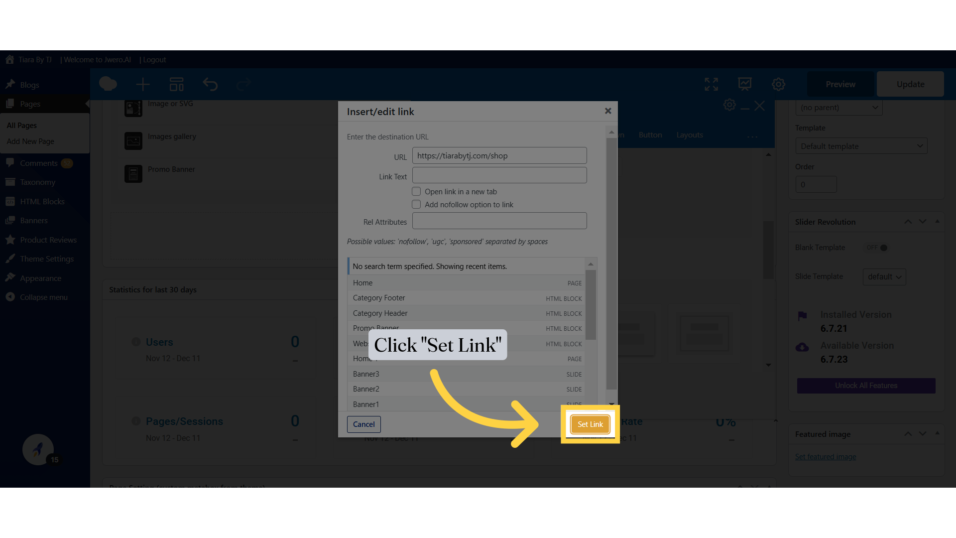
7. Allows you to assign a link to the banner. This can be a custom URL or a page on your website.
Click on "Select URL".
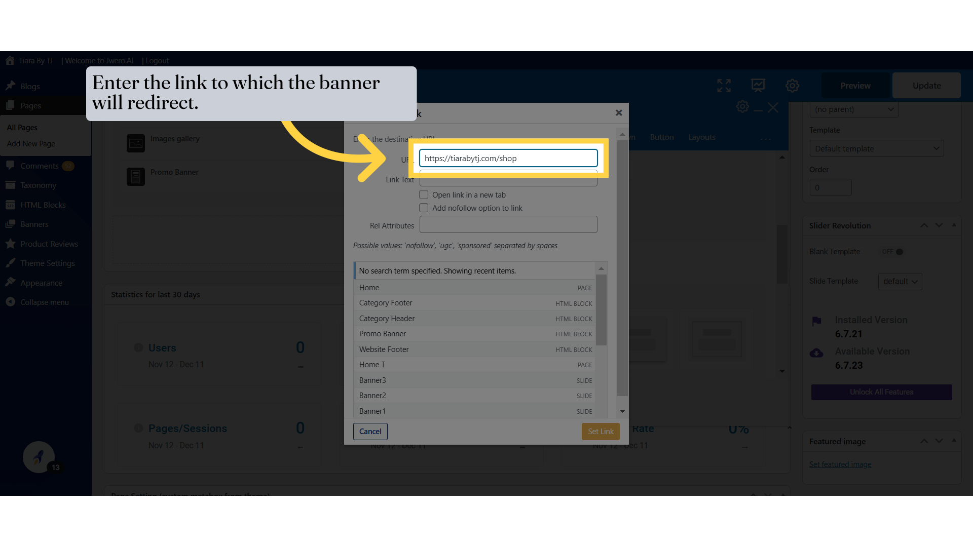
8. Enter the link to which the banner will redirect.
9. Click "Set Link"
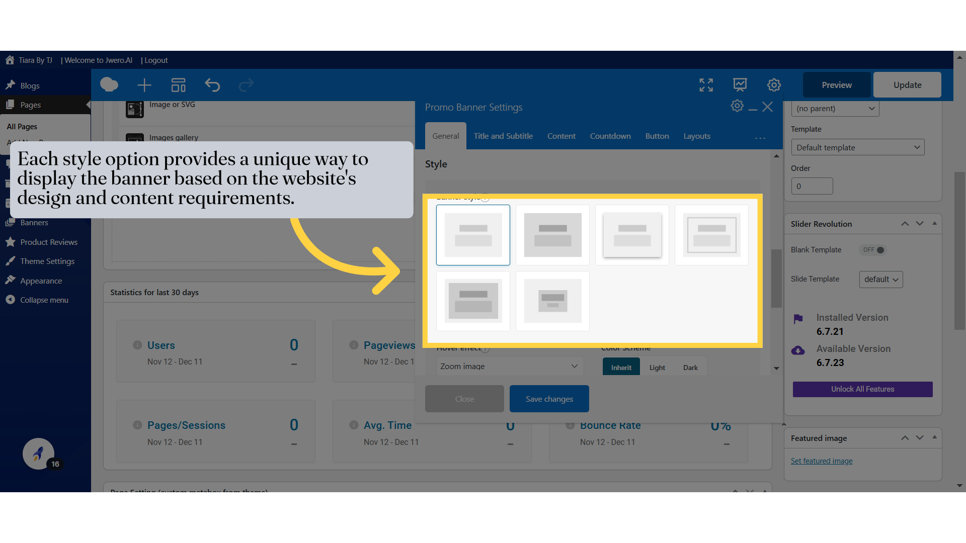
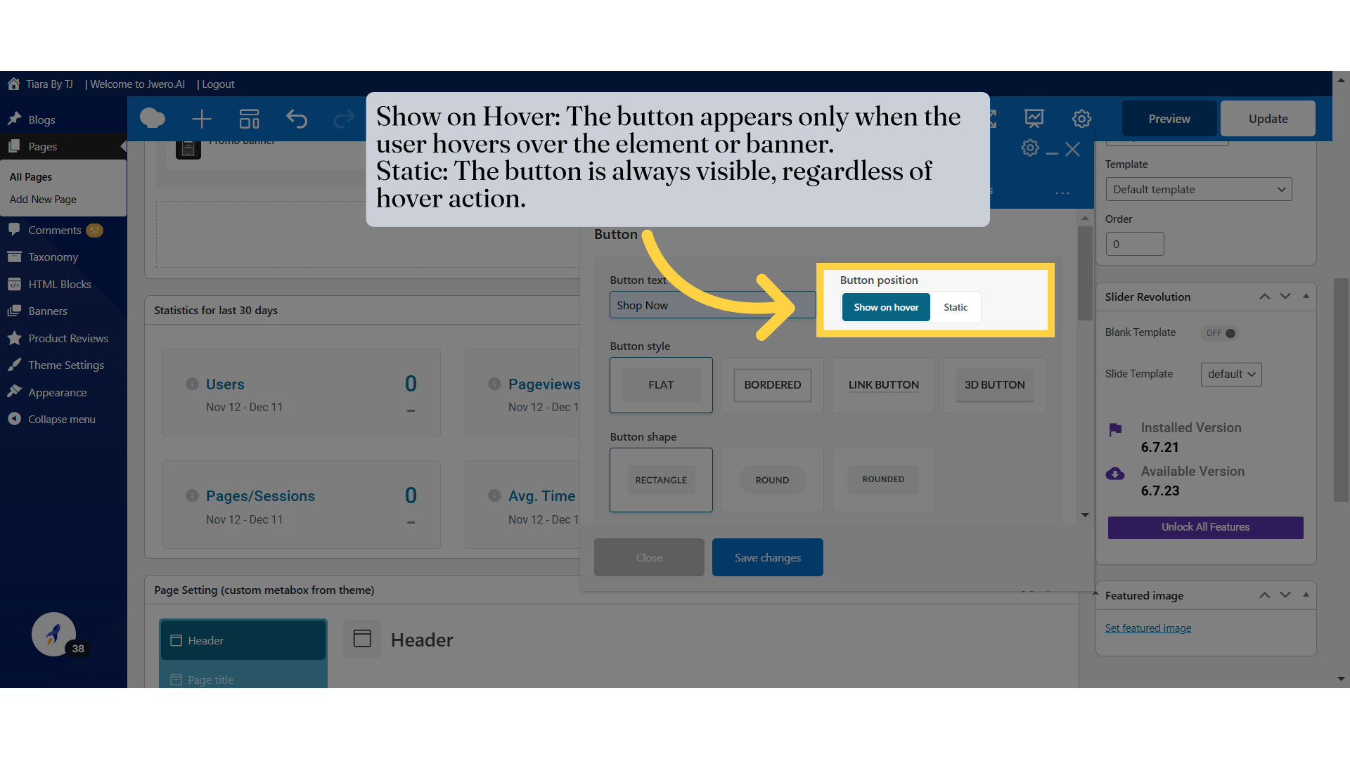
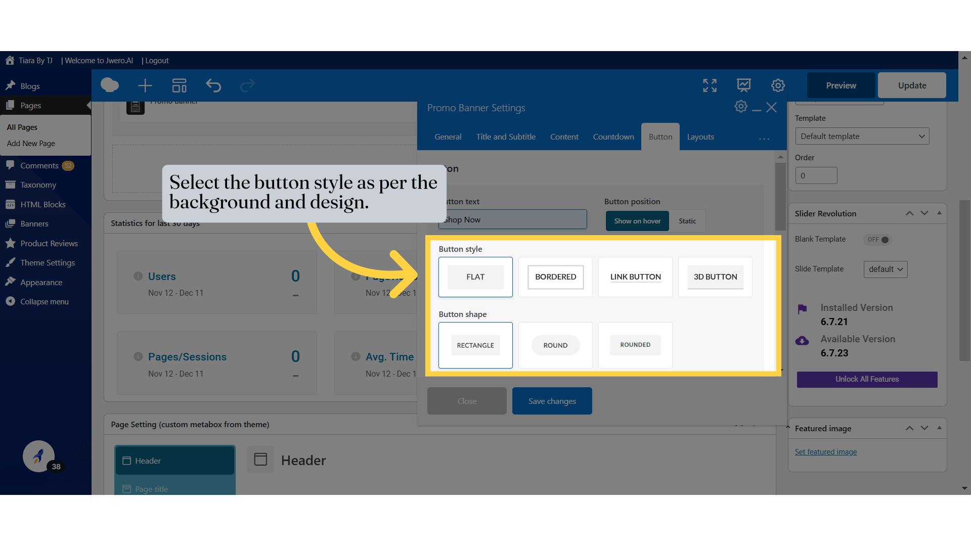
10. Each style option provides a unique way to display the banner based on the website's design and content requirements.
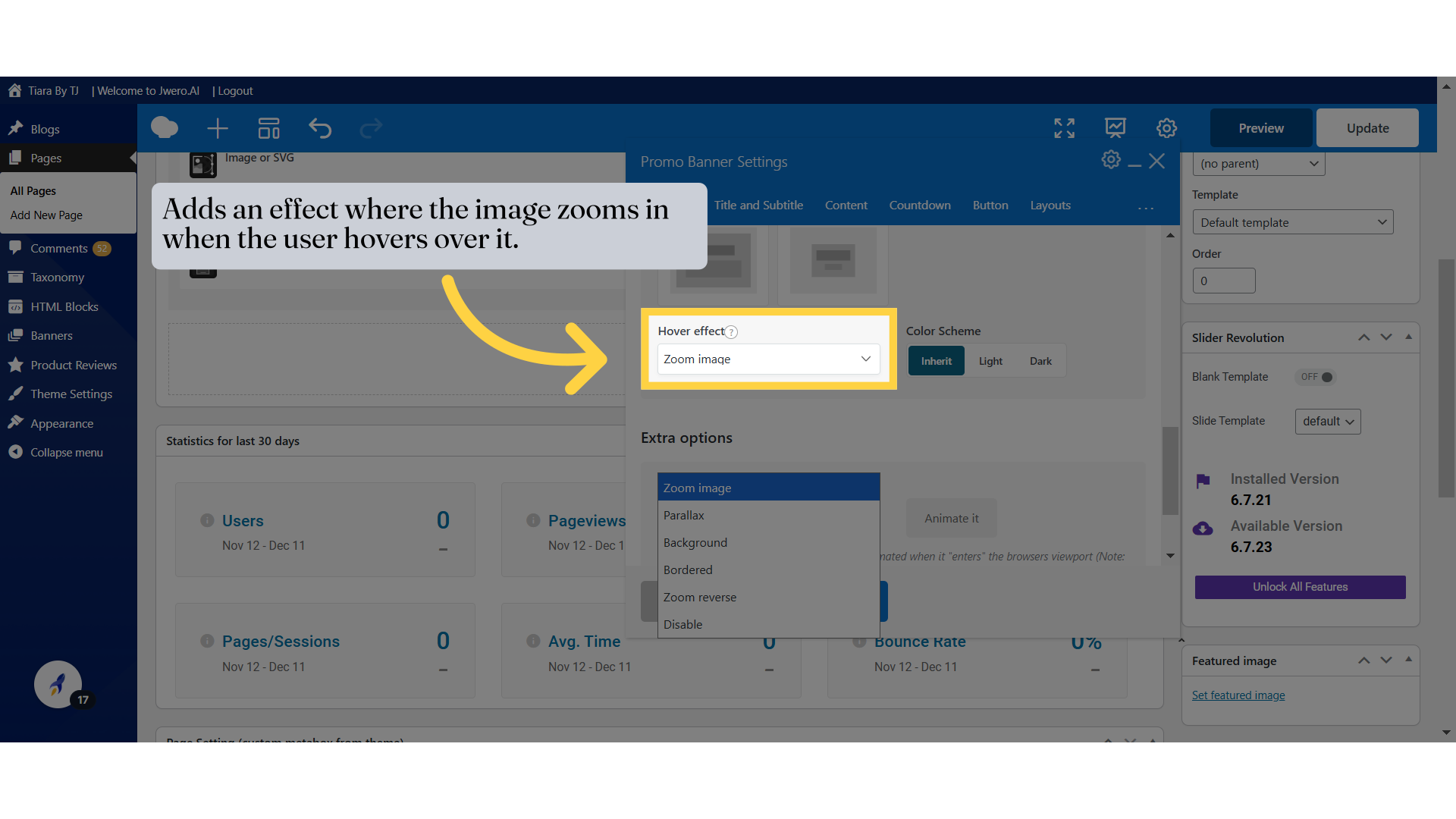
11. Adds an effect where the image zooms in when the user hovers over it.
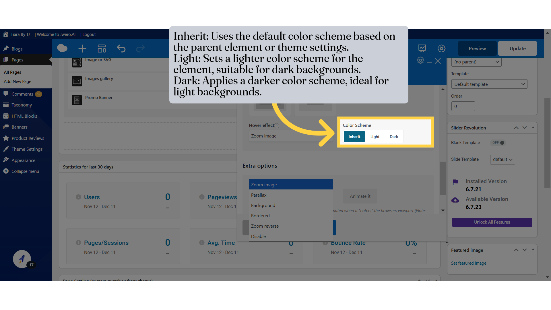
12. Inherit: Uses the default color scheme based on the parent element or theme settings.
Light: Sets a lighter color scheme for the element, suitable for dark backgrounds.
Dark: Applies a darker color scheme, ideal for light backgrounds.
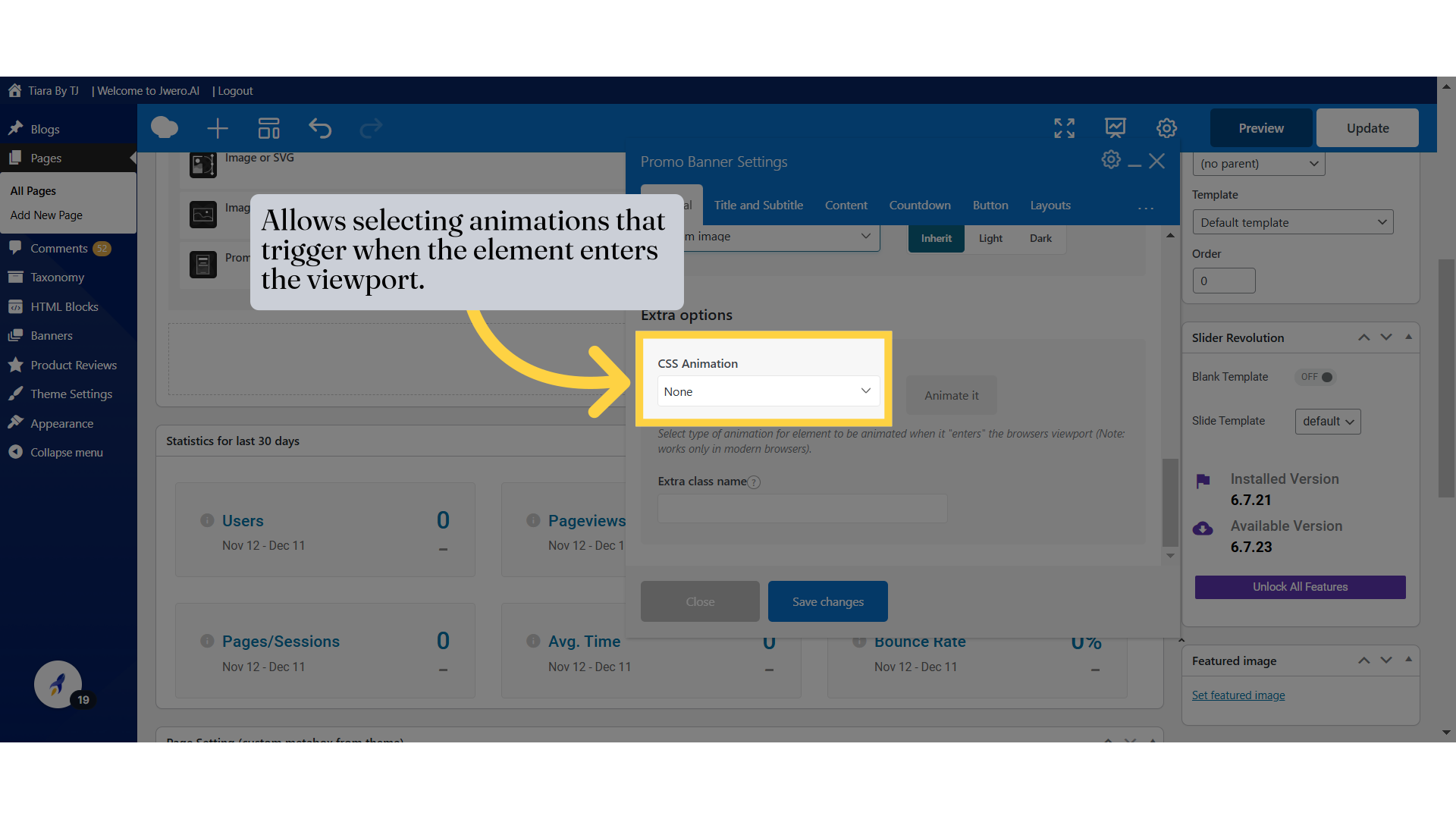
13. Allows selecting animations that trigger when the element enters the viewport.
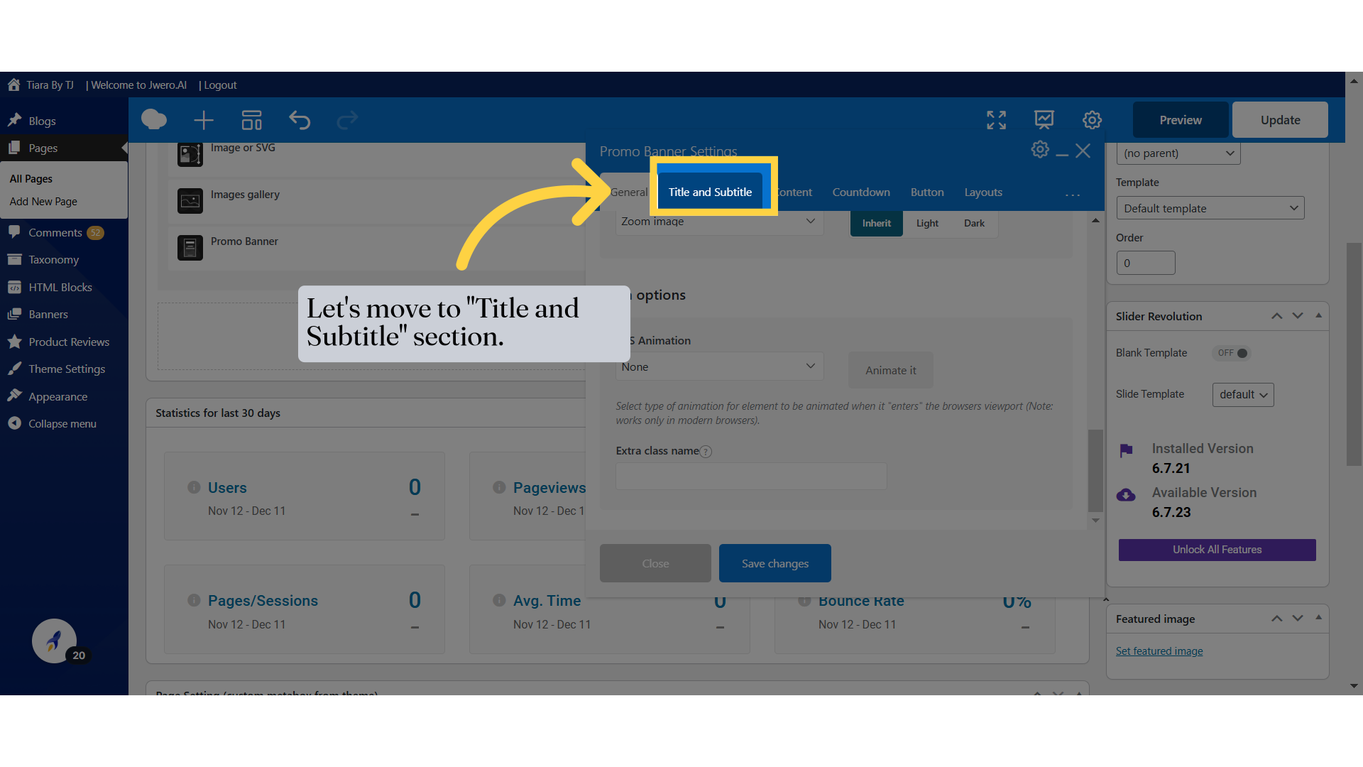
14. Let's move to "Title and Subtitle" section.
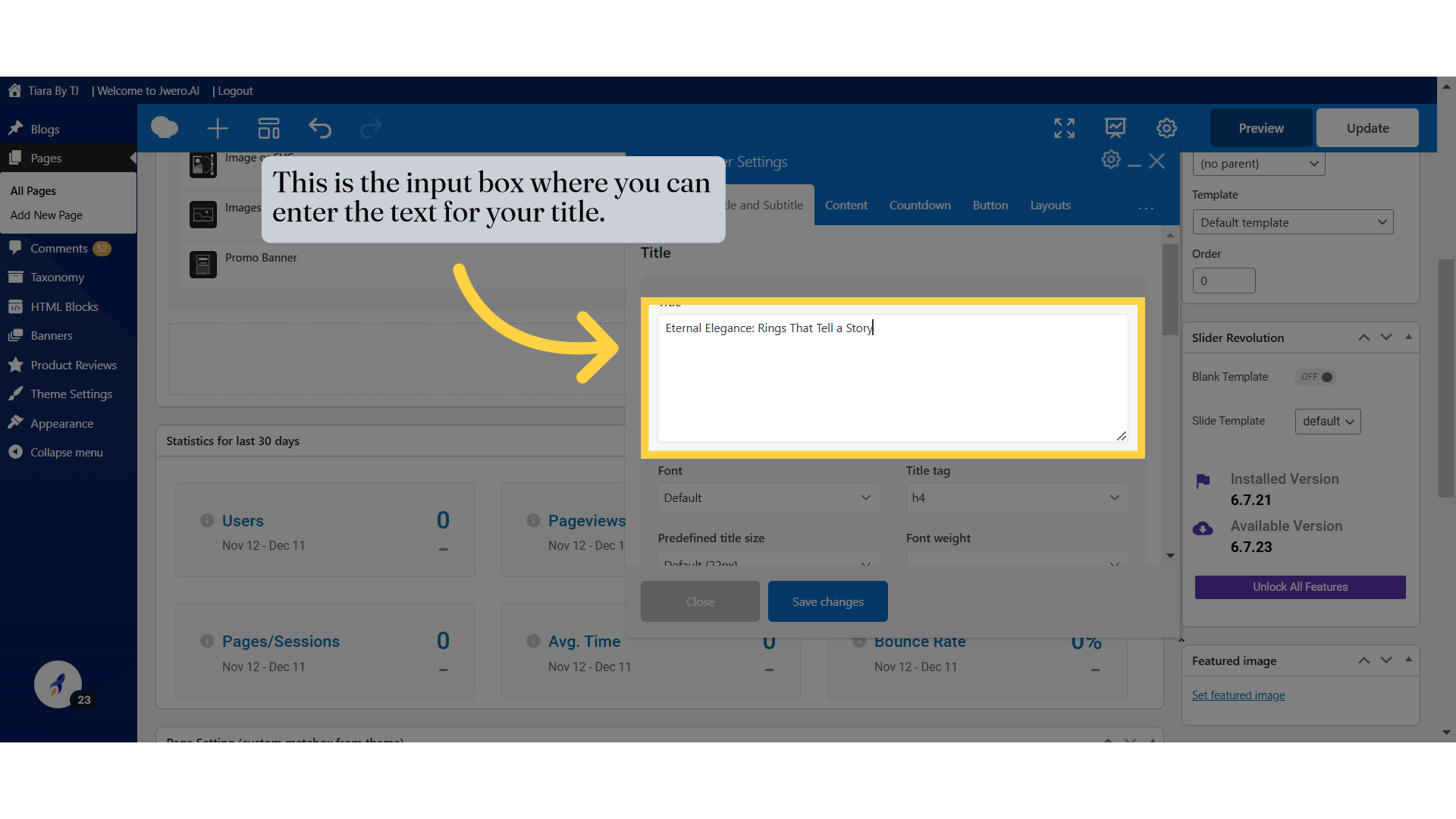
15. This is the input box where you can enter the text for your title.
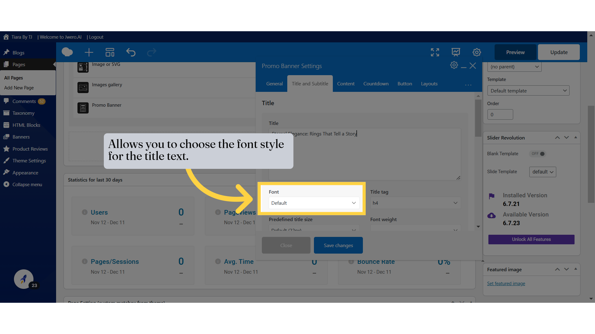
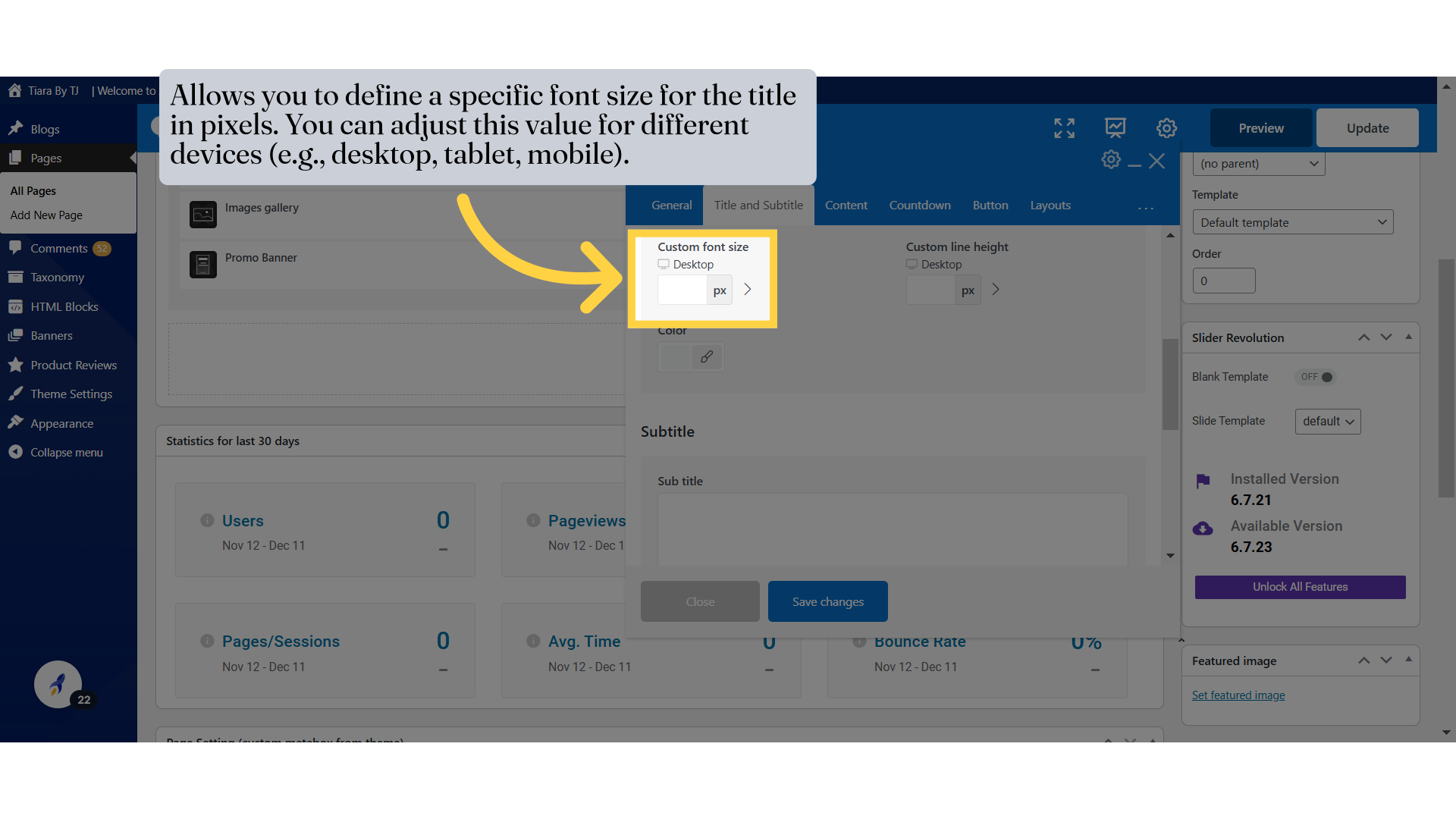
16. Allows you to choose the font style for the title text.
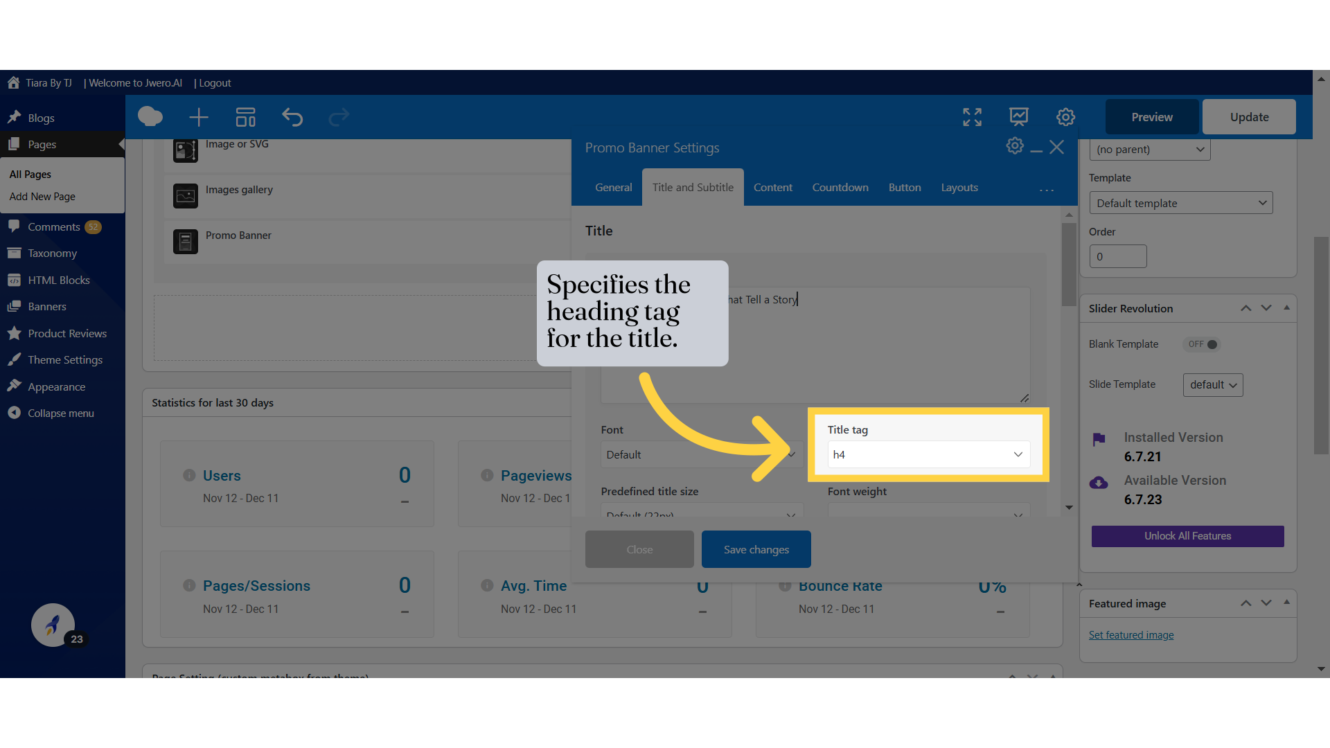
17. Specifies the heading tag for the title.
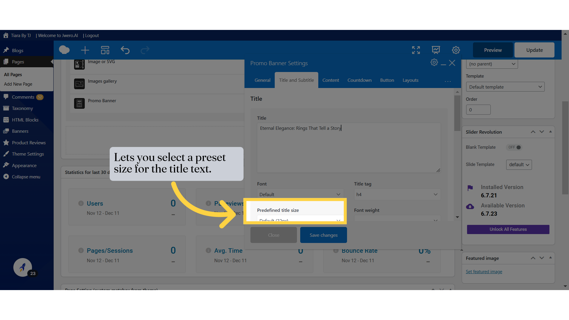
18. Lets you select a preset size for the title text.
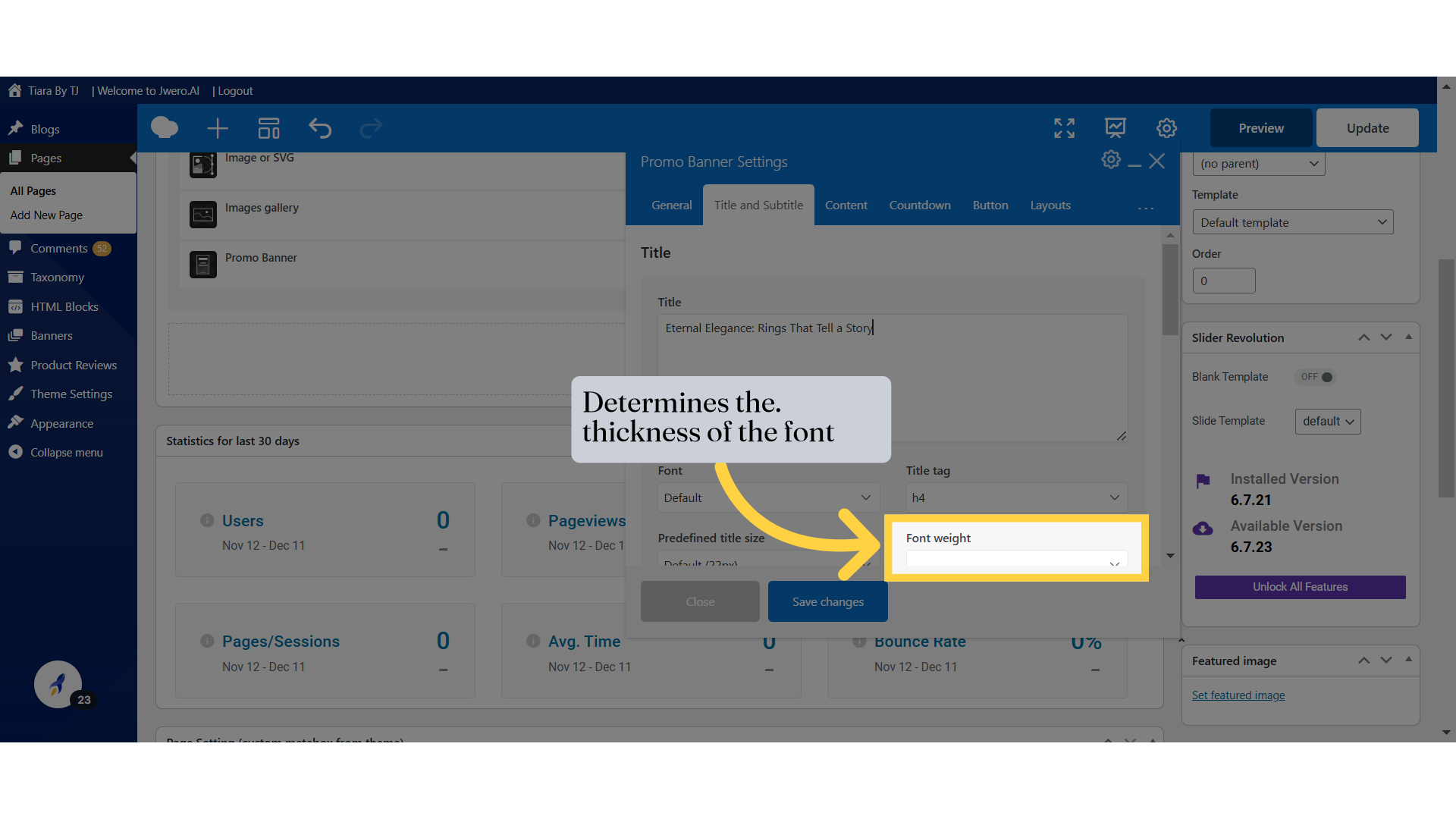
19. Determines the. thickness of the font
20. Allows you to define a specific font size for the title in pixels. You can adjust this value for different devices (e.g., desktop, tablet, mobile).
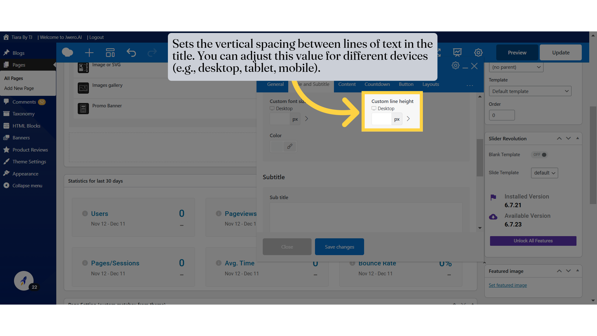
21. Sets the vertical spacing between lines of text in the title. You can adjust this value for different devices (e.g., desktop, tablet, mobile).
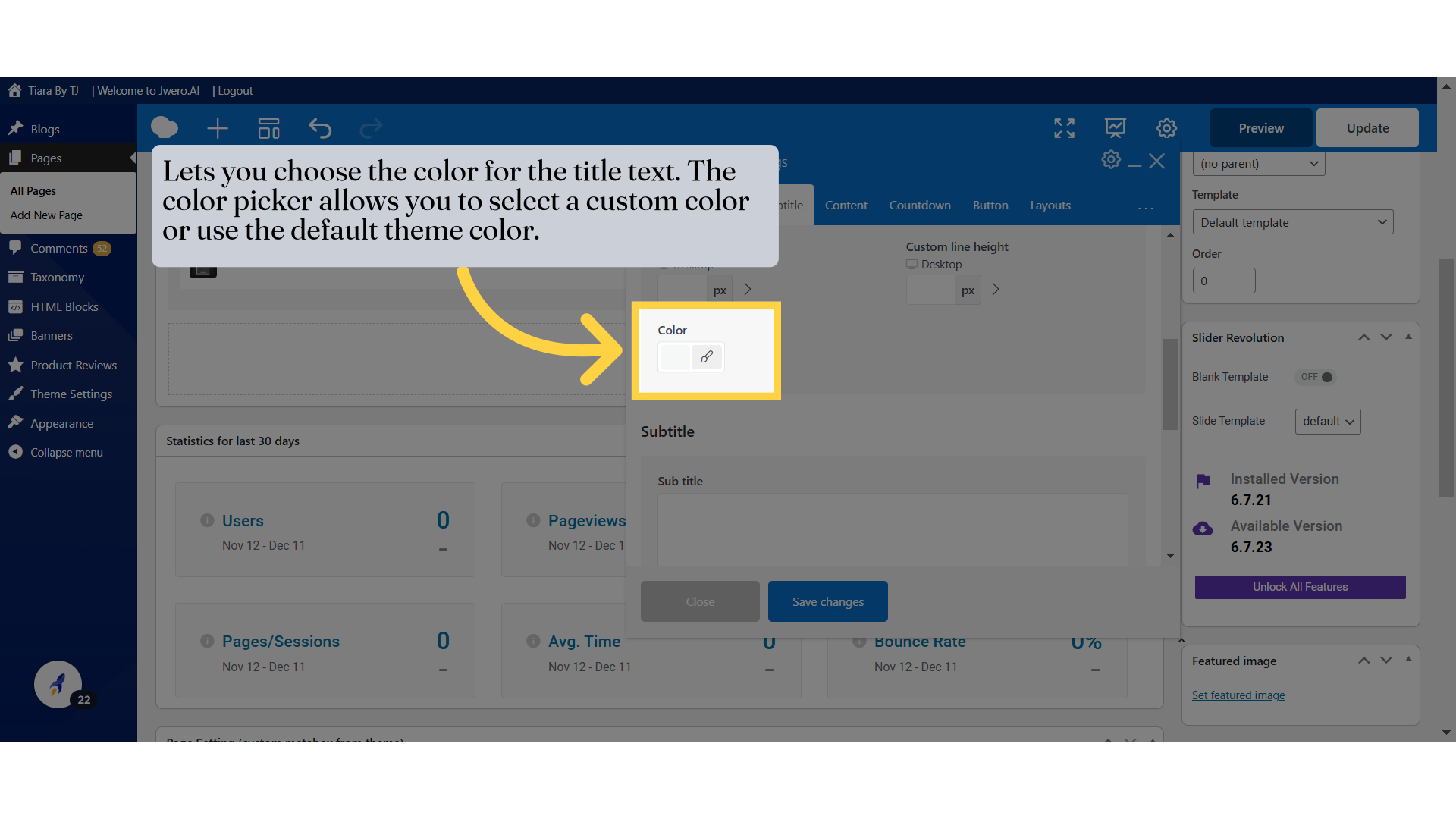
22. Lets you choose the color for the title text. The color picker allows you to select a custom color or use the default theme color.
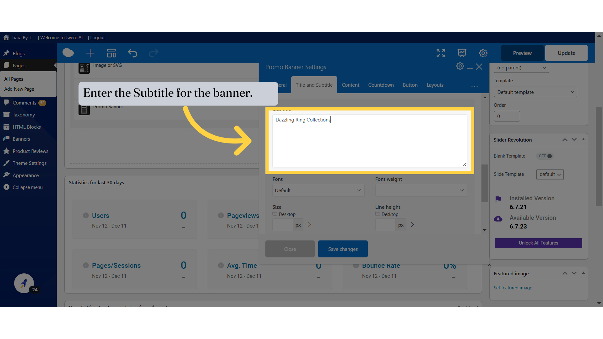
23. Enter the Subtitle for the banner.
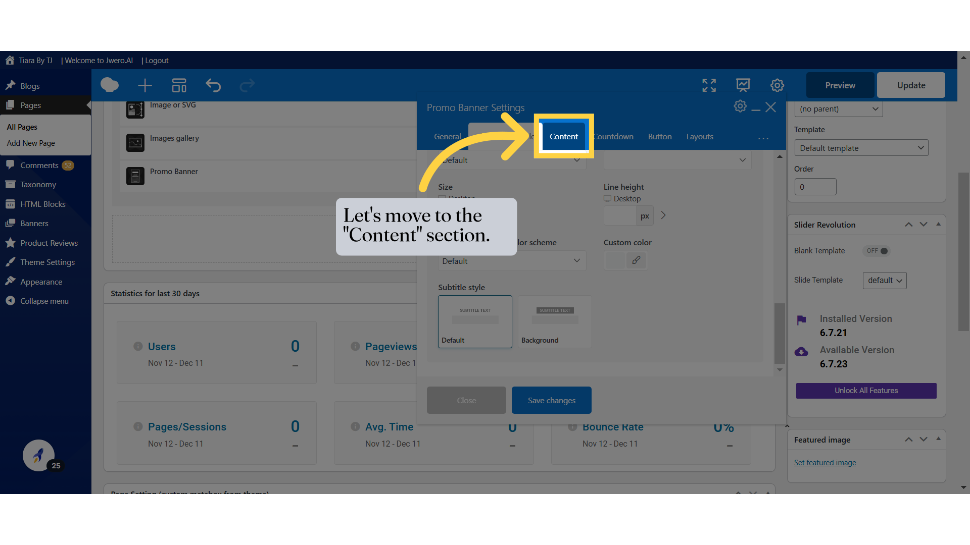
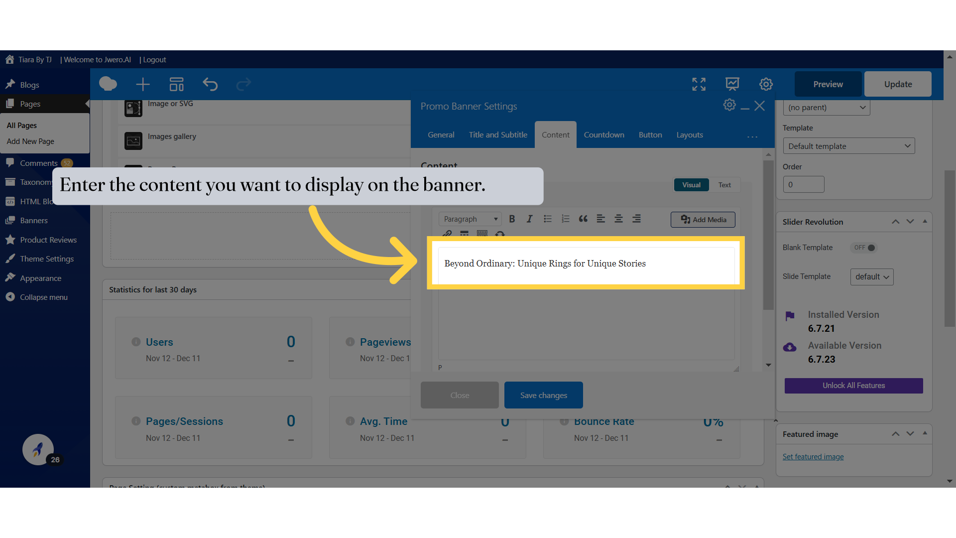
24. Let's move to the "Content" section.
25. Enter the content you want to display on the banner.
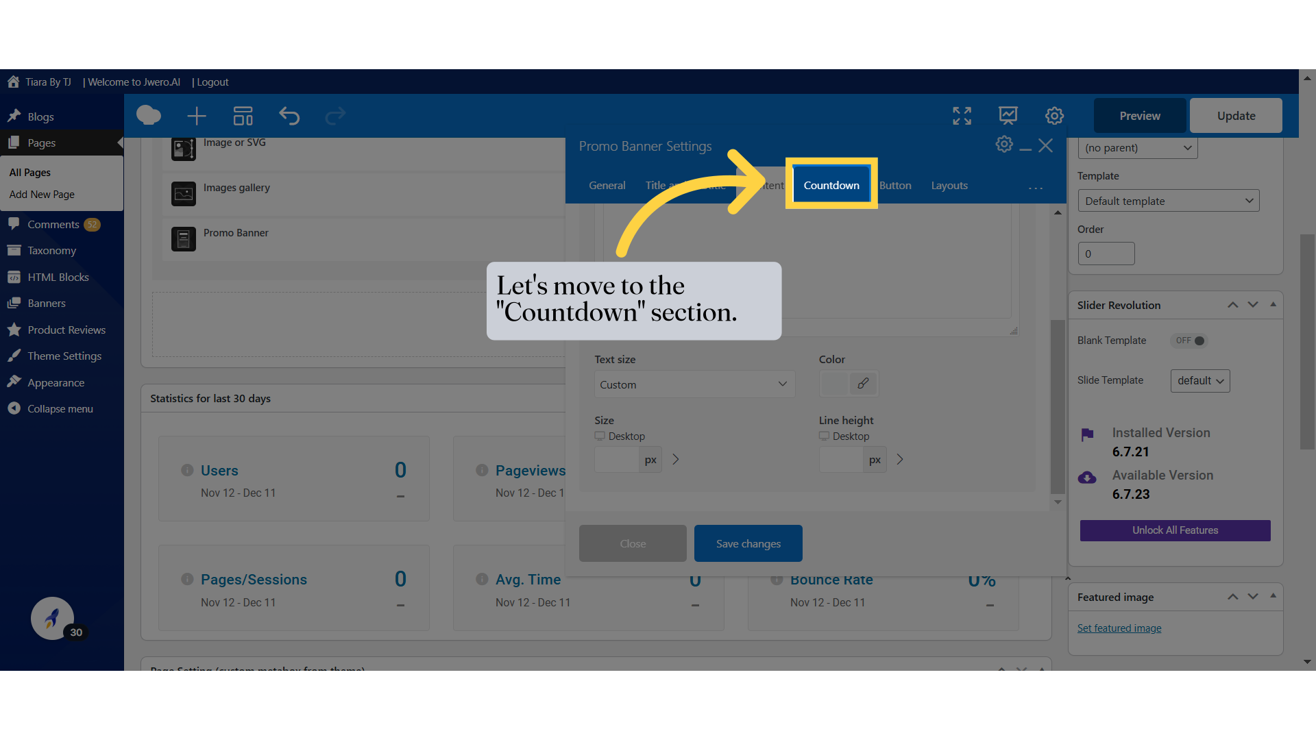
26. Let's move to the "Countdown" section.
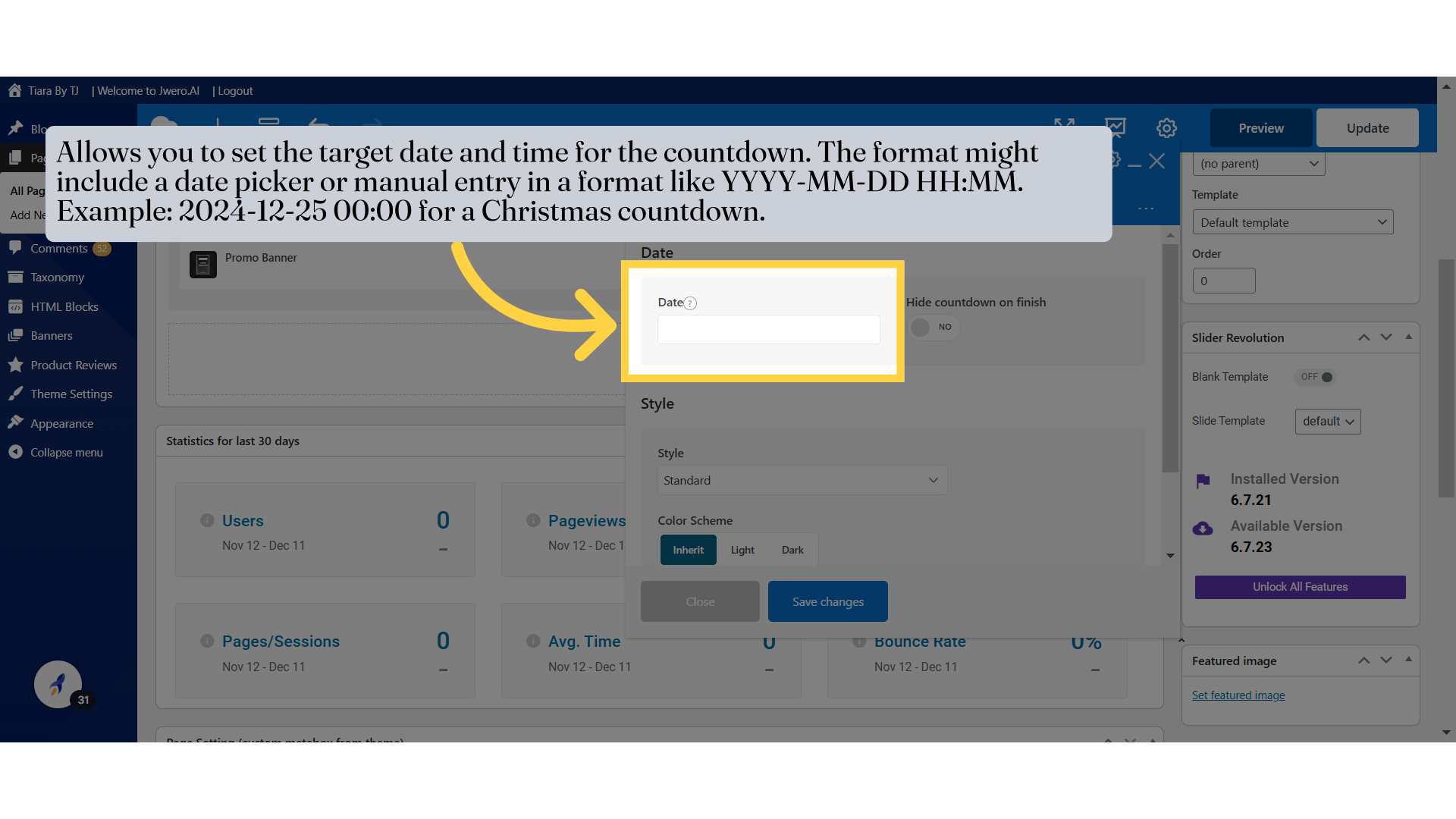
27. Allows you to set the target date and time for the countdown. The format might include a date picker or manual entry in a format like YYYY-MM-DD HH:MM. Example: 2024-12-25 00:00 for a Christmas countdown.
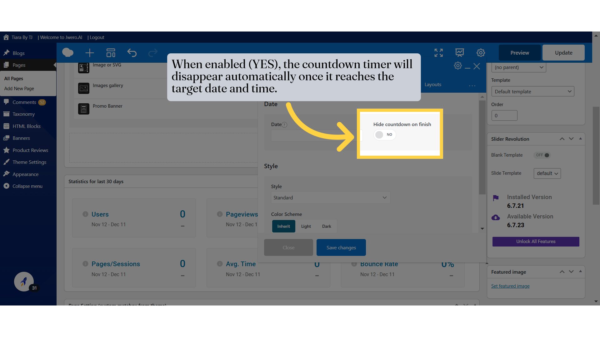
28. When enabled (YES), the countdown timer will disappear automatically once it reaches the target date and time.
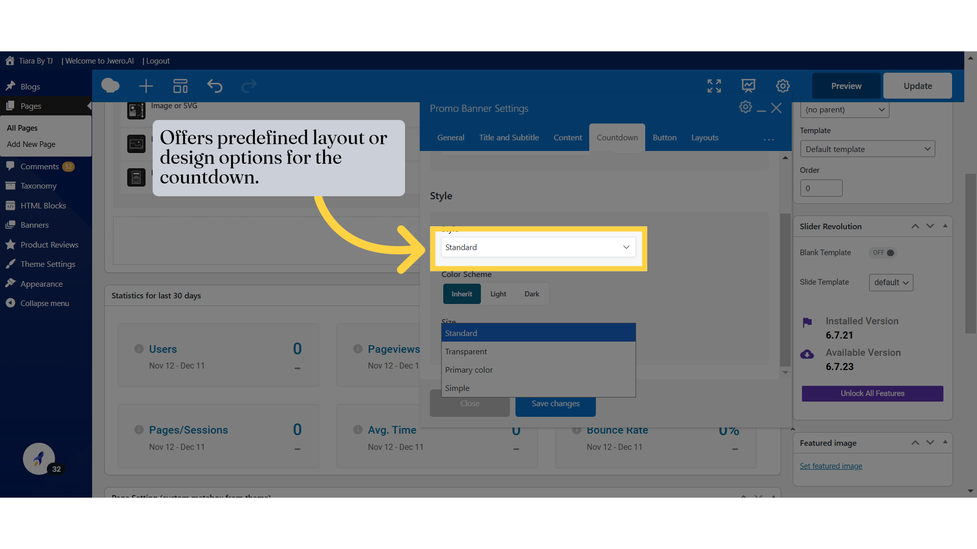
29. Offers predefined layout or design options for the countdown.
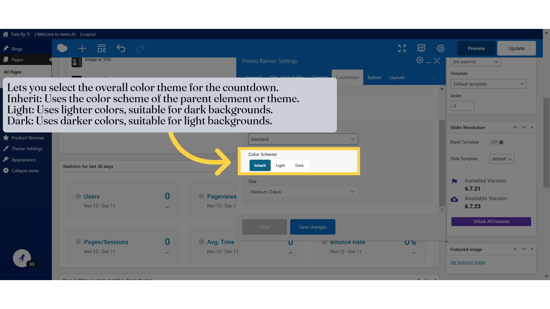
30. Lets you select the overall color theme for the countdown.
Inherit: Uses the color scheme of the parent element or theme.
Light: Uses lighter colors, suitable for dark backgrounds.
Dark: Uses darker colors, suitable for light backgrounds.
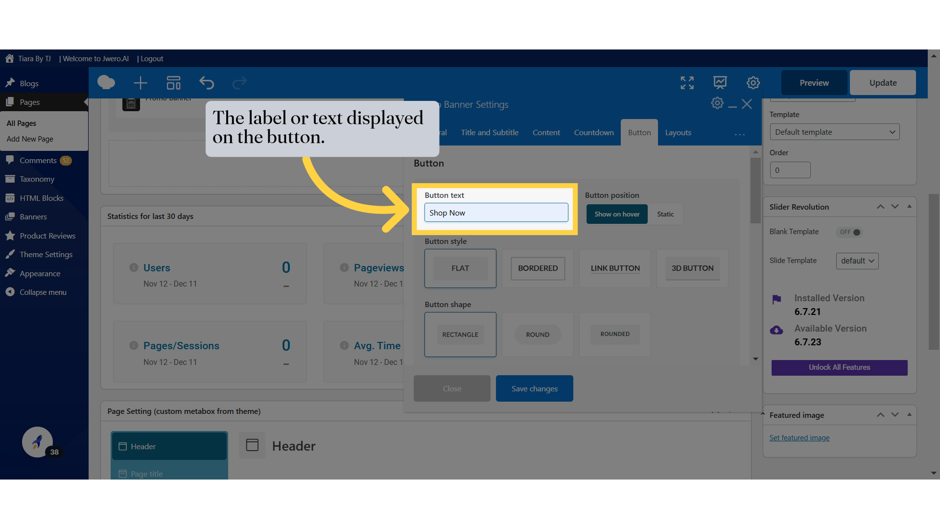
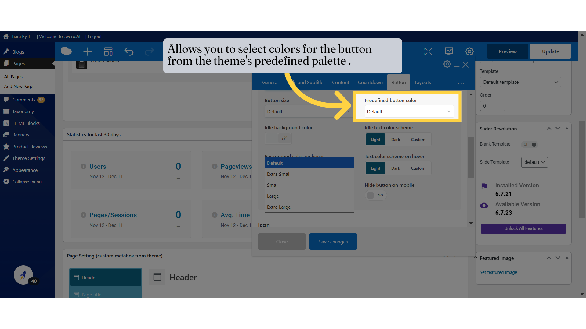
33. The label or text displayed on the button.
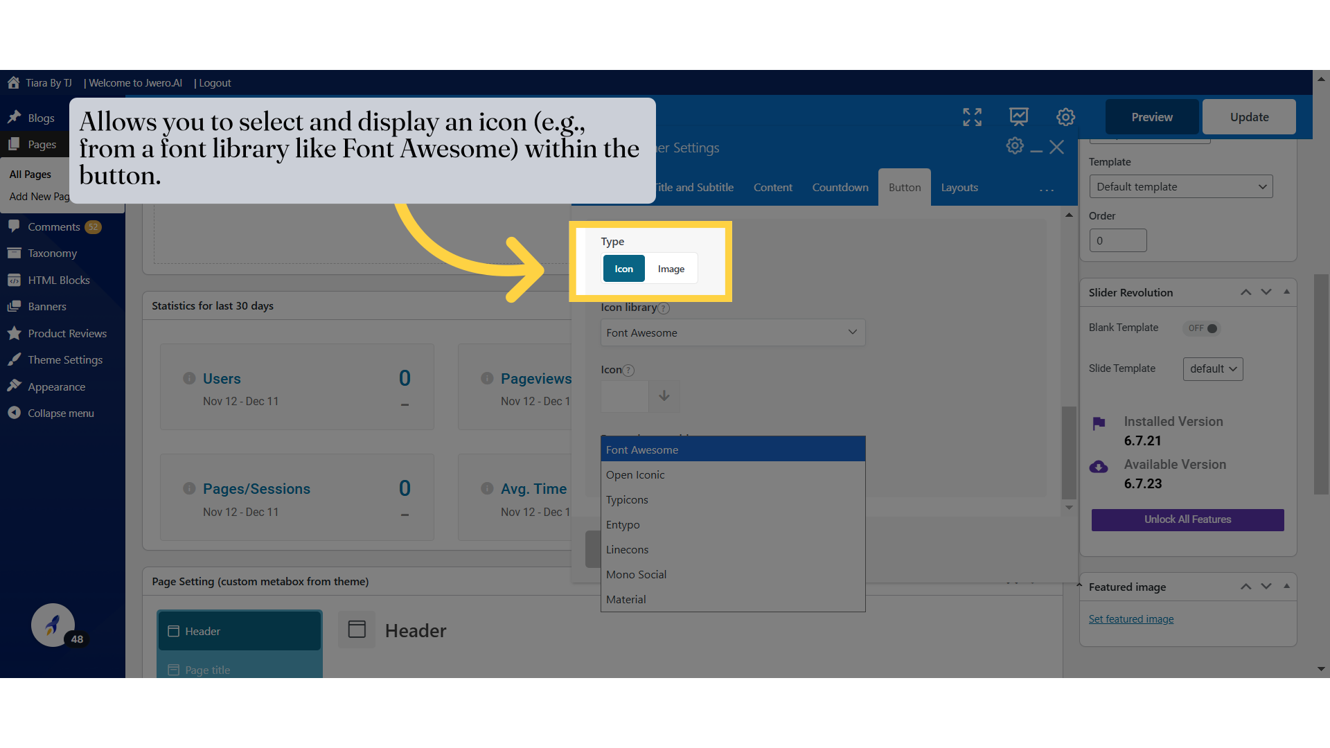
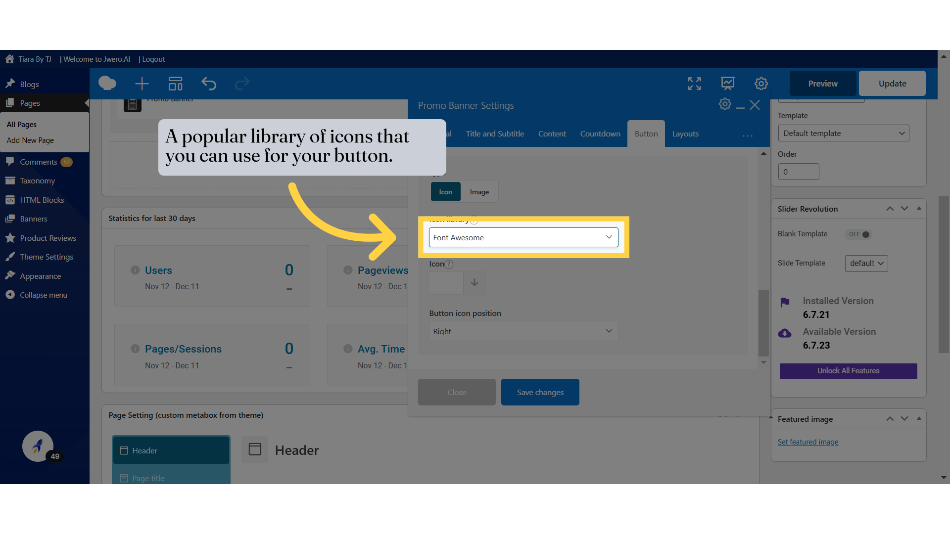
39. Click "Font AwesomeOpen IconicTypiconsEntypoLineconsMono SocialMaterial"
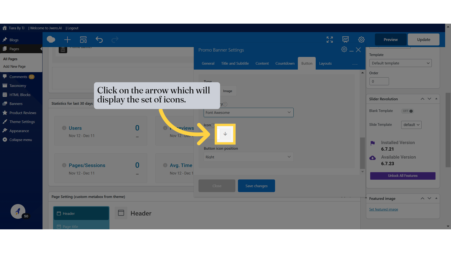
40. Click on the arrow which will display the set of icons.
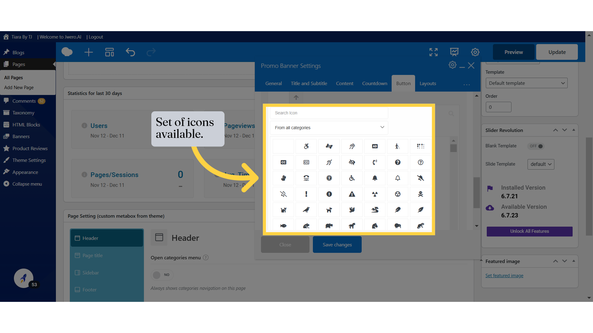
41. Set of icons available.
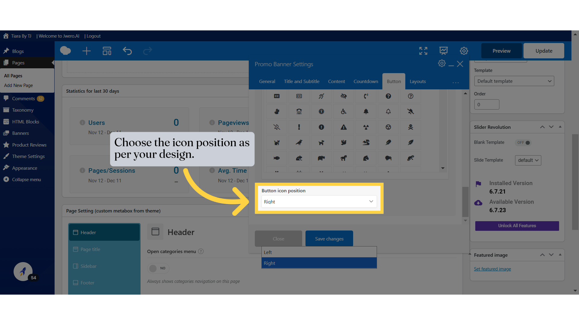
42. Choose the icon position as per your design.
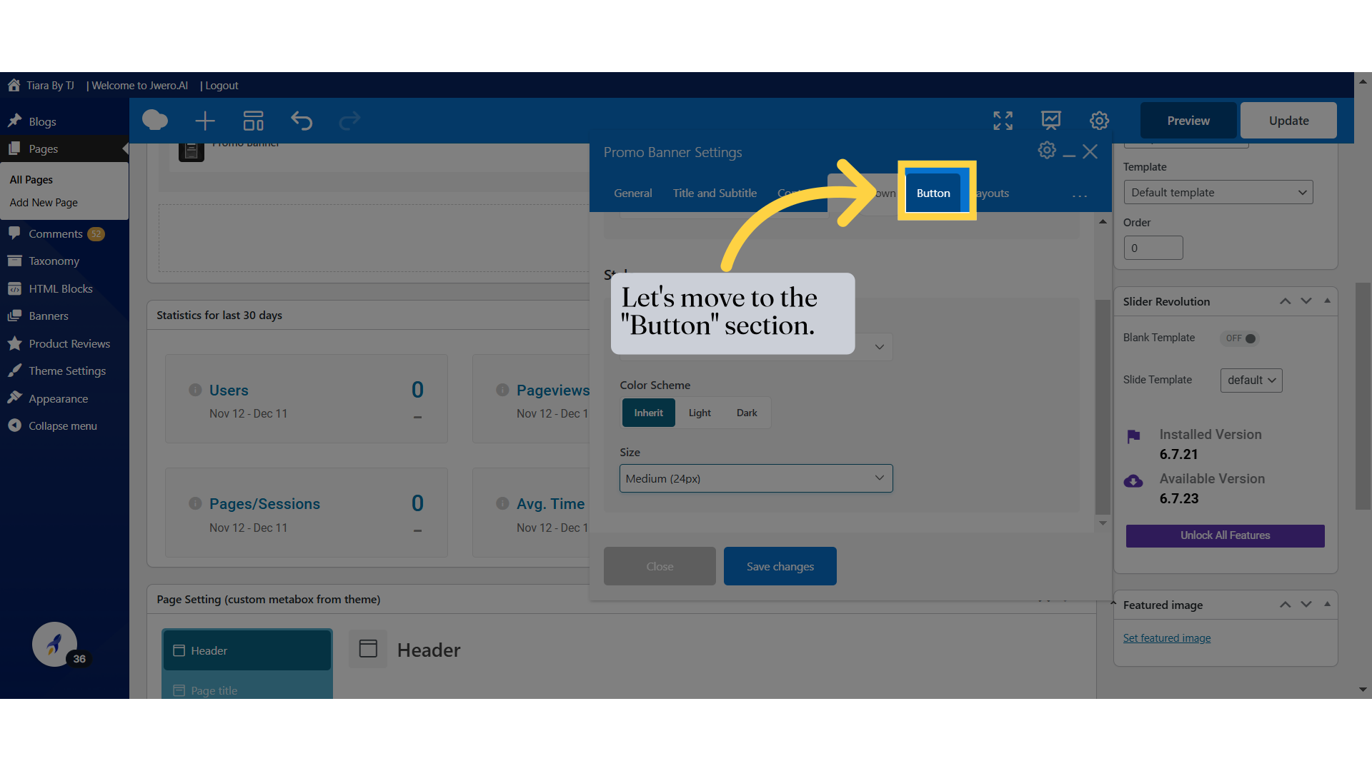
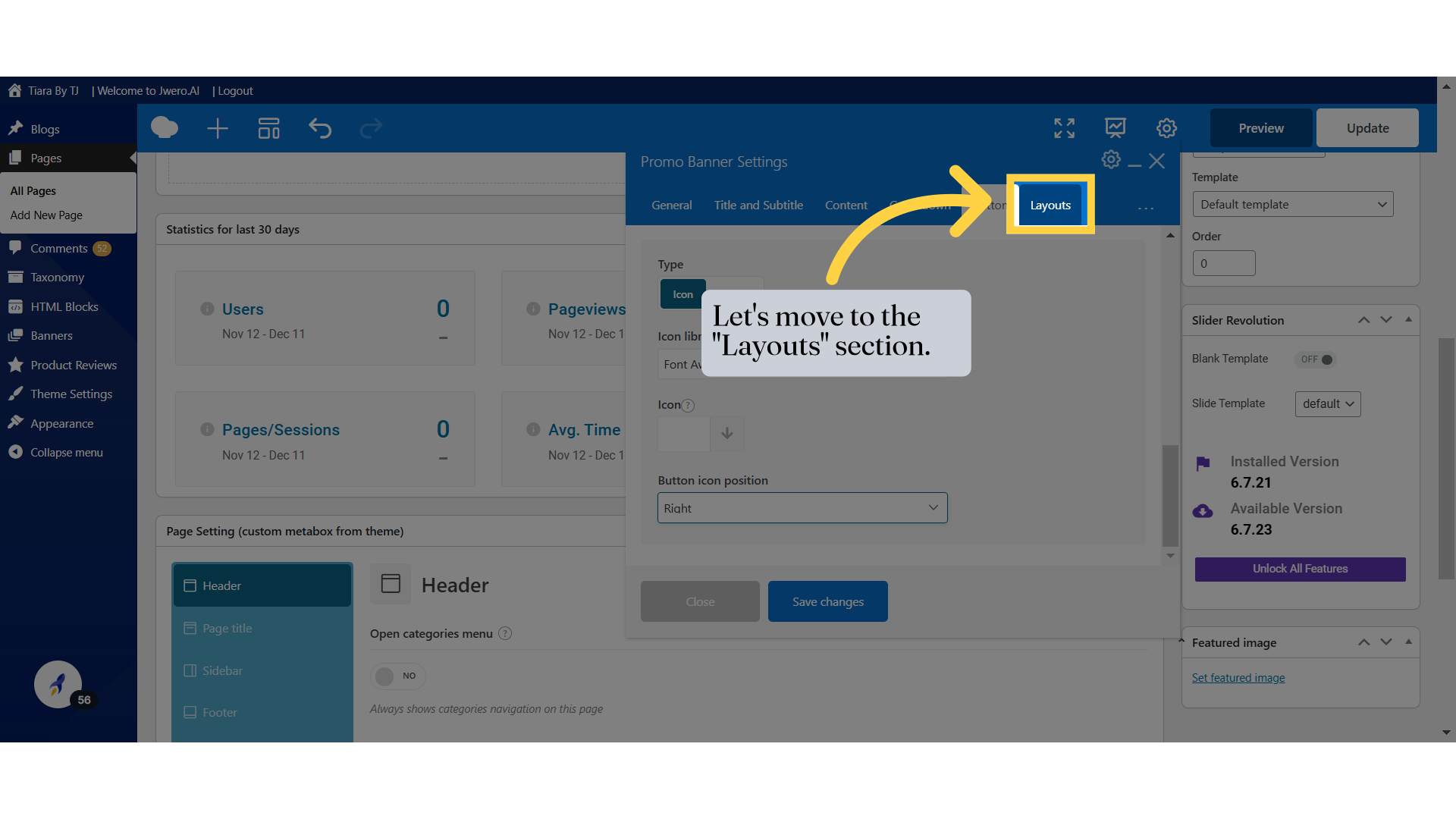
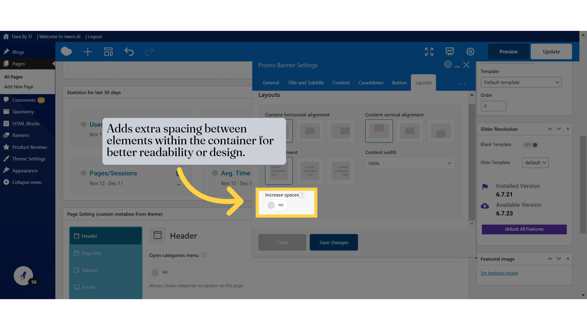
43. Let's move to the "Layouts" section.
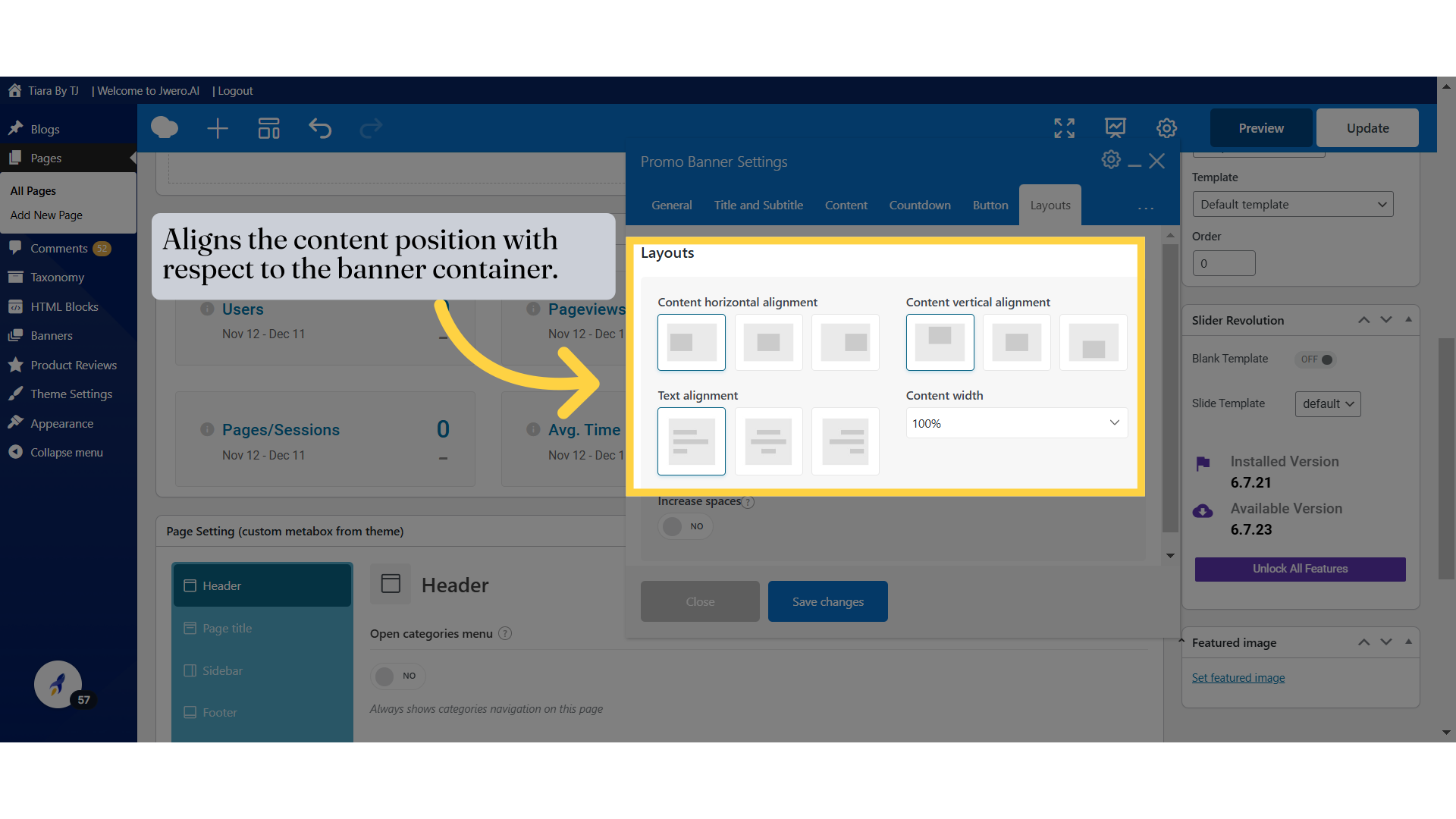
44. Aligns the content position with respect to the banner container.
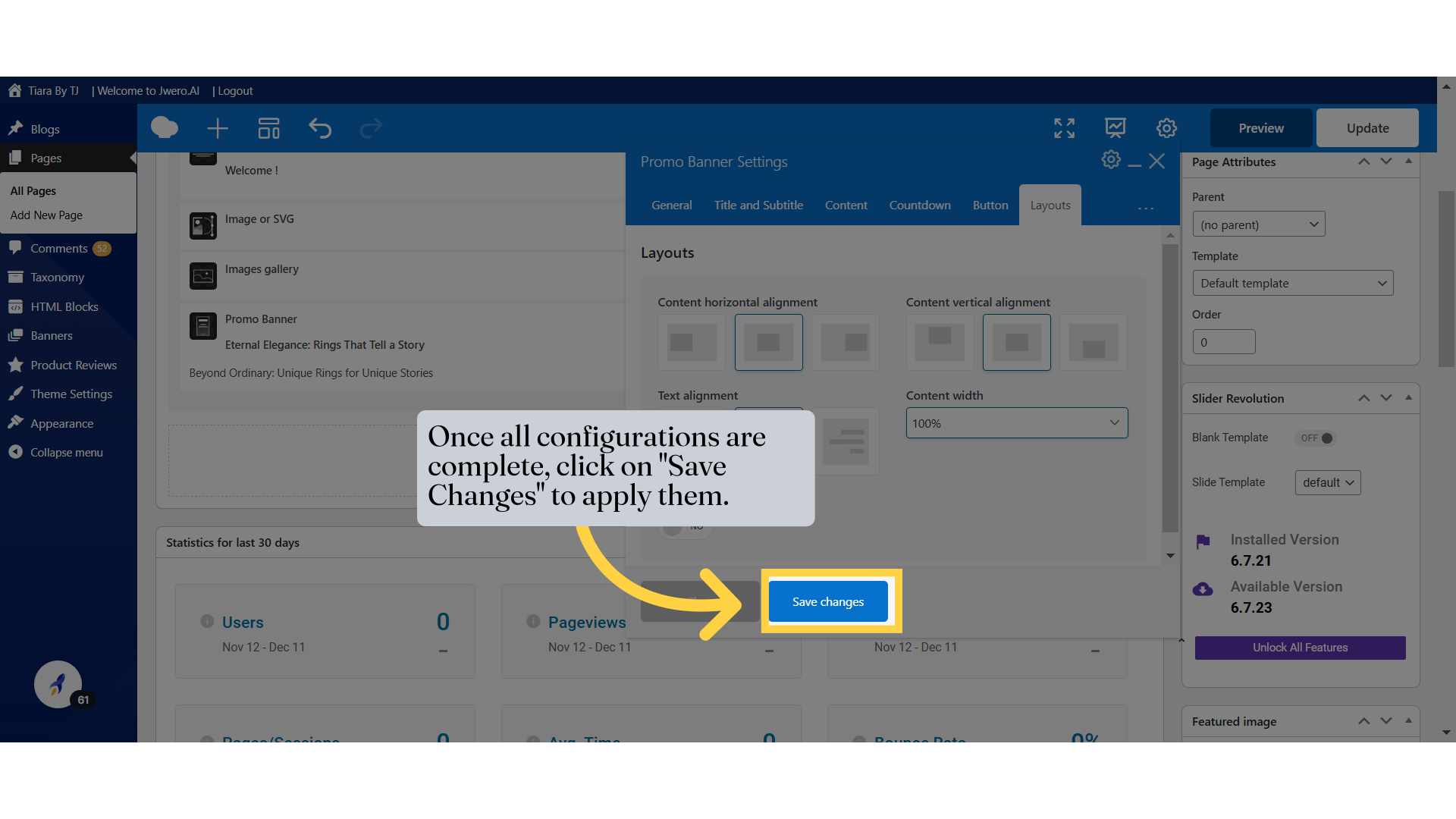
46. Once all configurations are complete, click on "Save Changes" to apply them.