Products (Grid or Carousel)
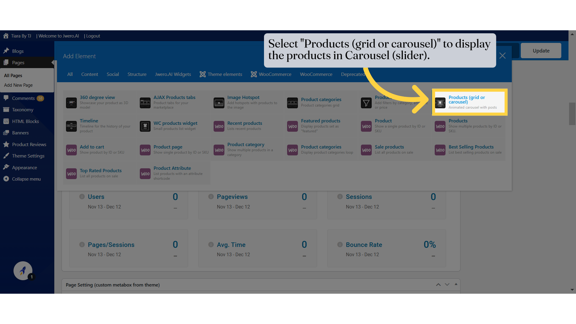
1. Select "Products (grid or carousel)" to display the products in Carousel (slider).
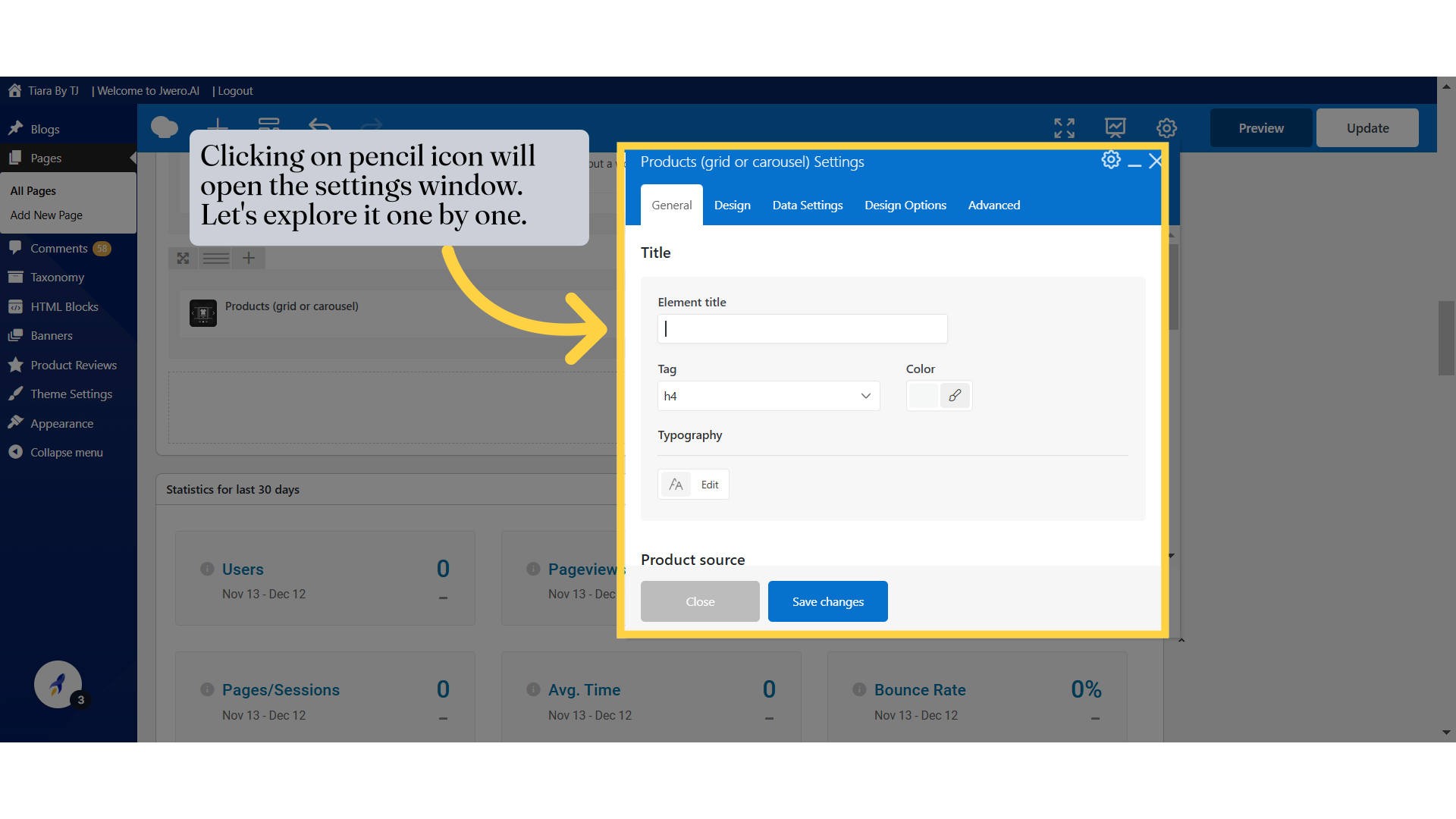
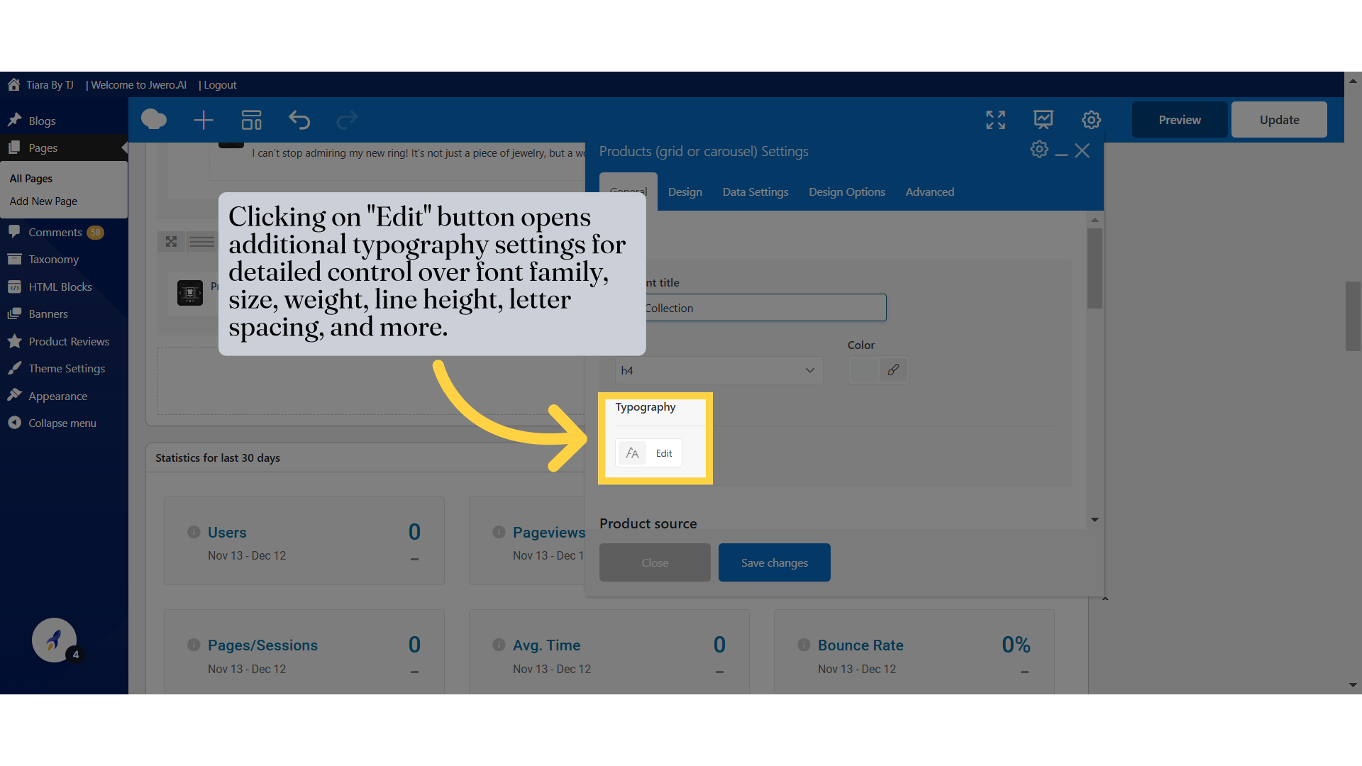
2. Clicking on pencil icon will open the settings window. Let's explore it one by one.
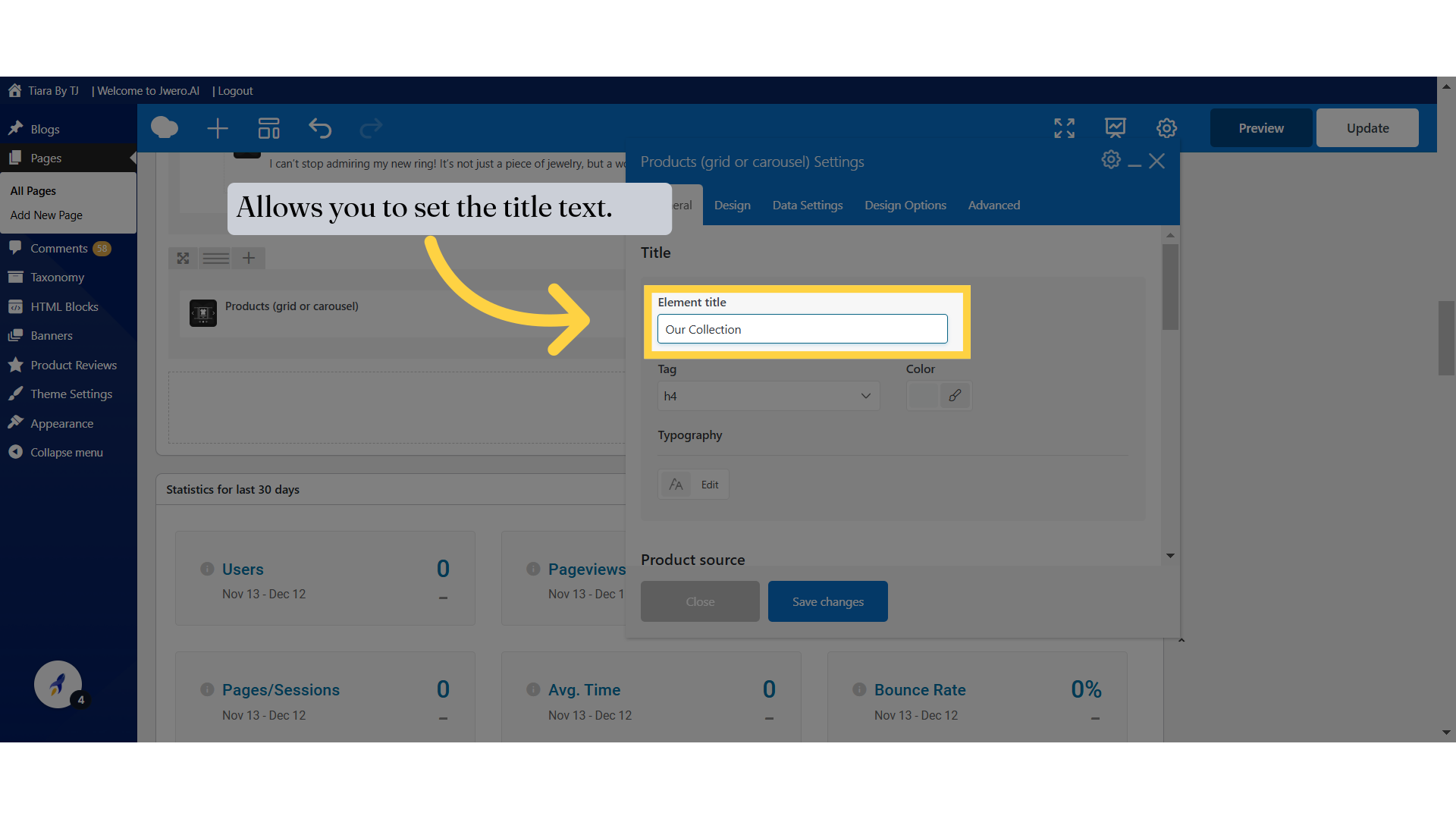
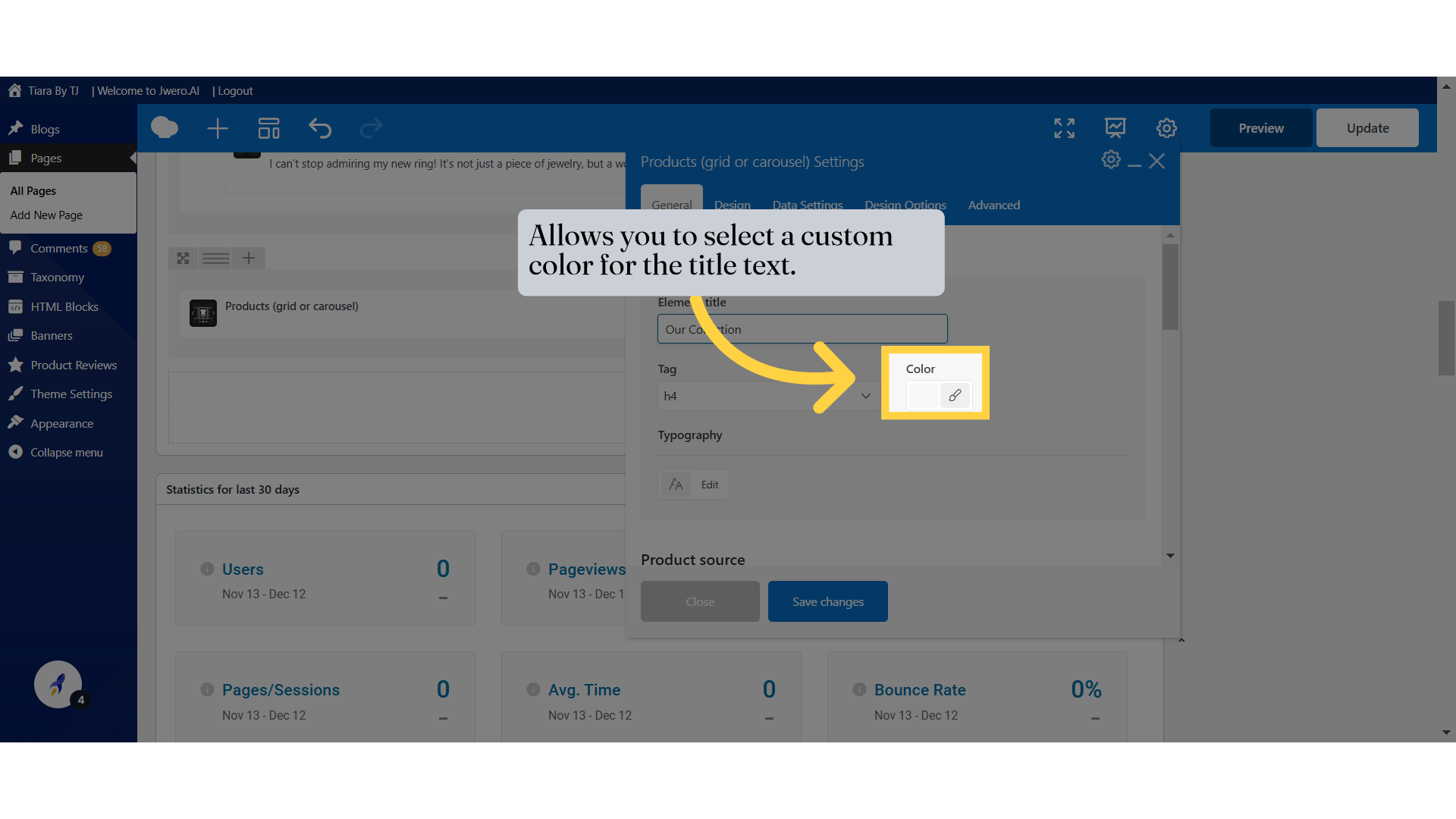
3. Allows you to set the title text.
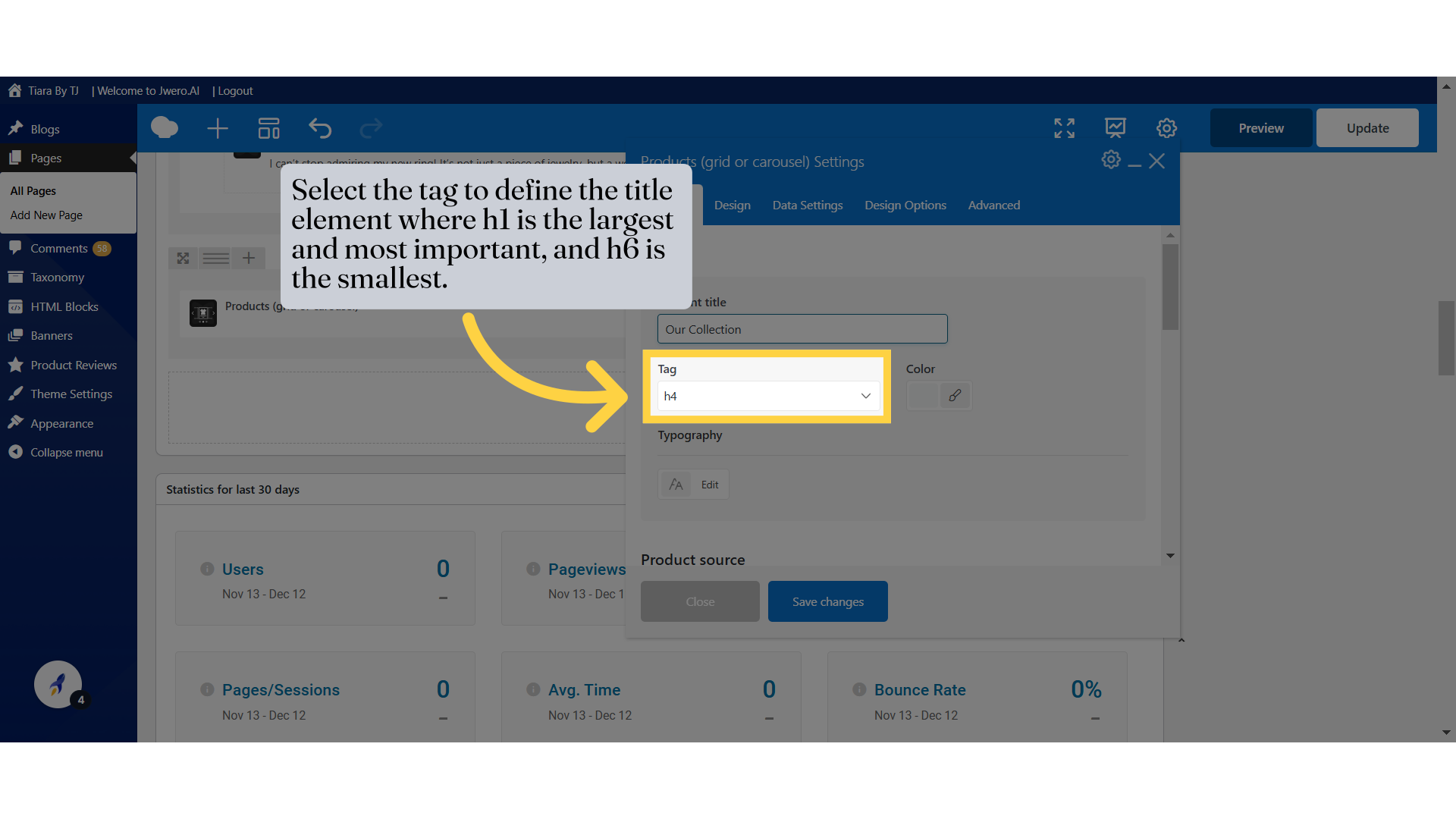
4. Select the tag to define the title element where h1 is the largest and most important, and h6 is the smallest.
5. Allows you to select a custom color for the title text.
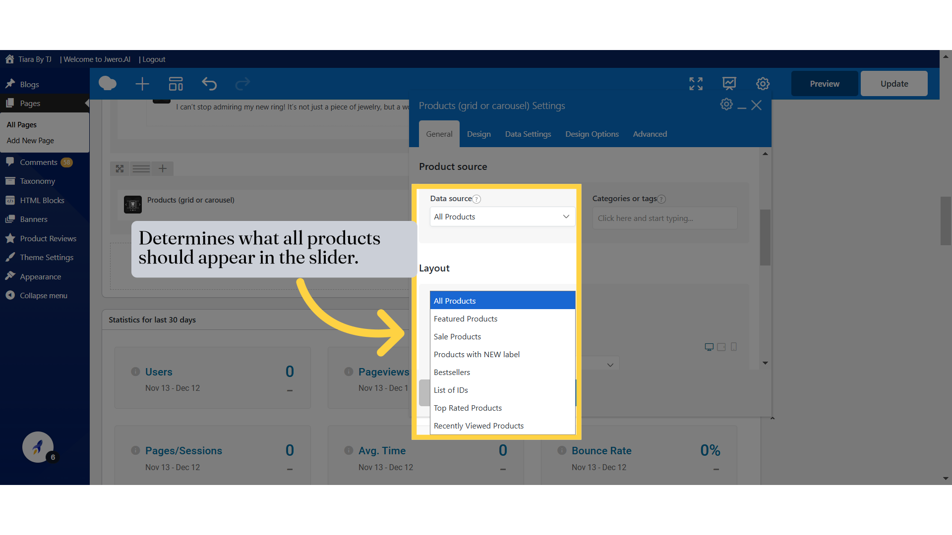
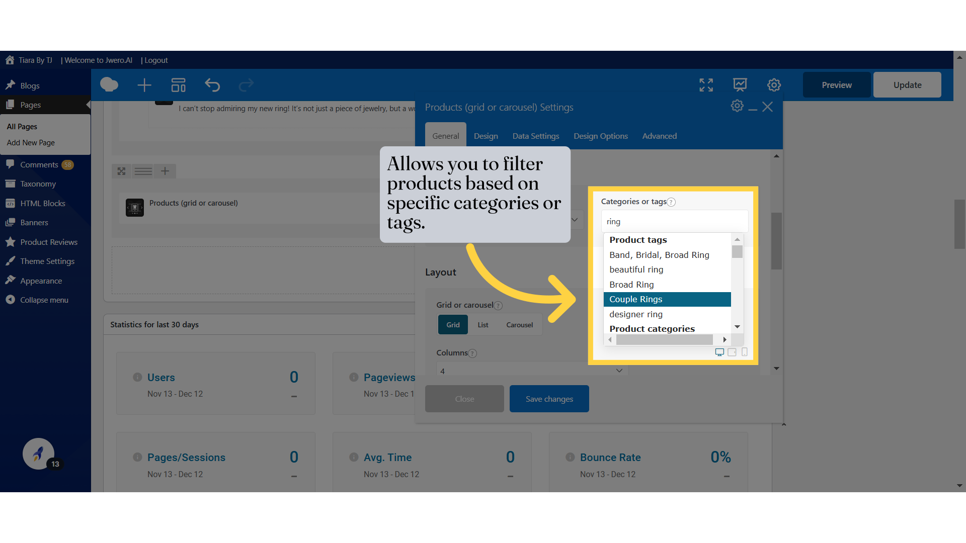
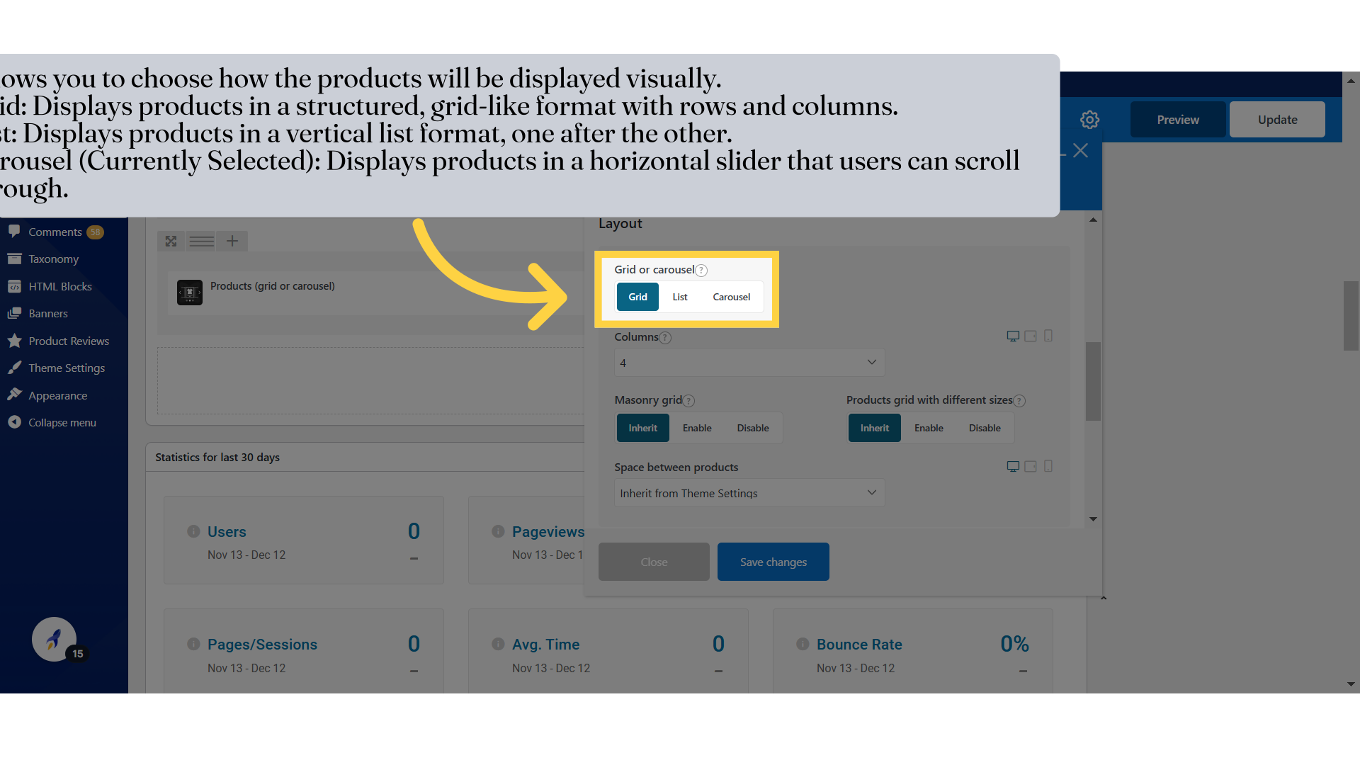
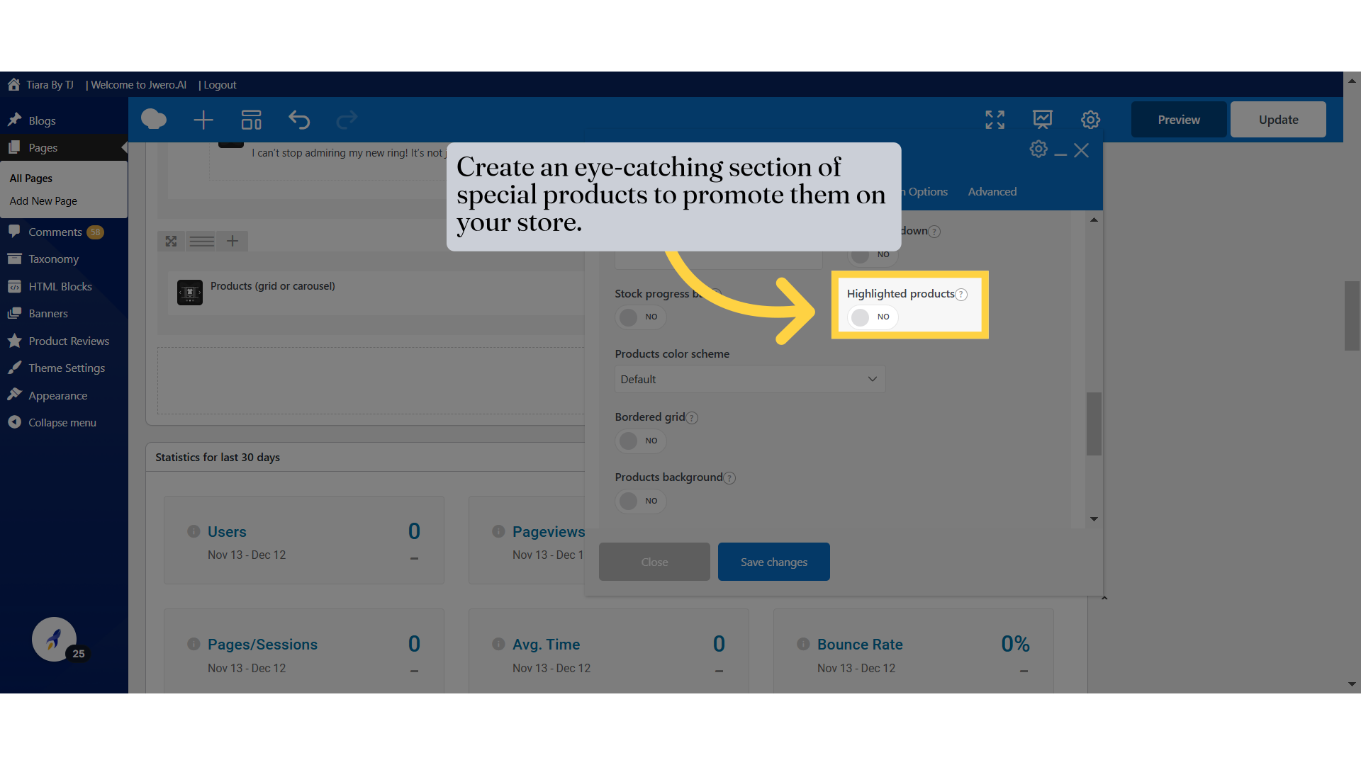
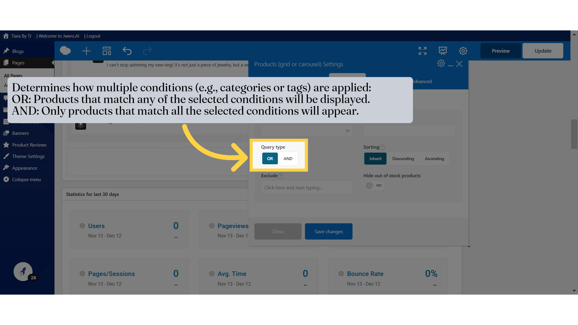
7. Determines what all products should appear in the slider.
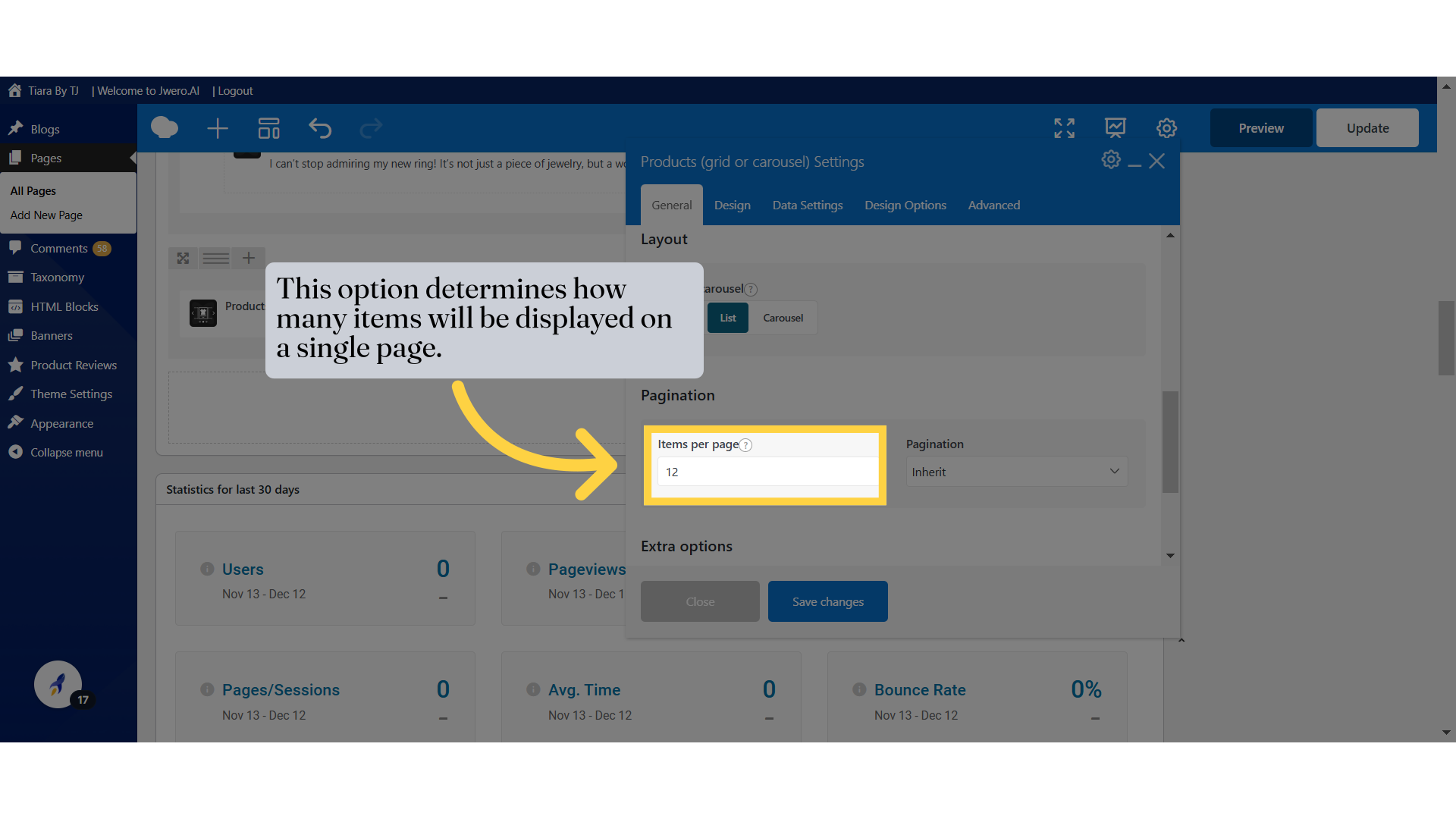
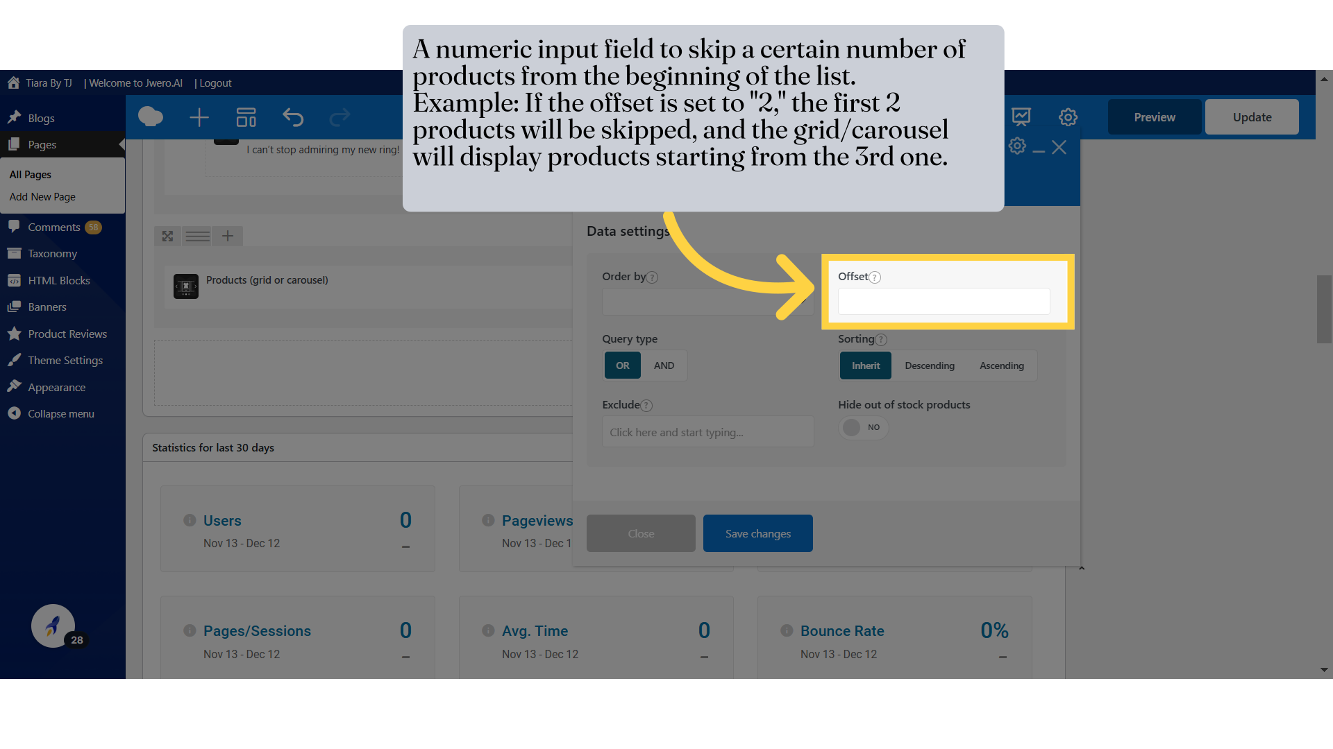
10. This option determines how many items will be displayed on a single page.
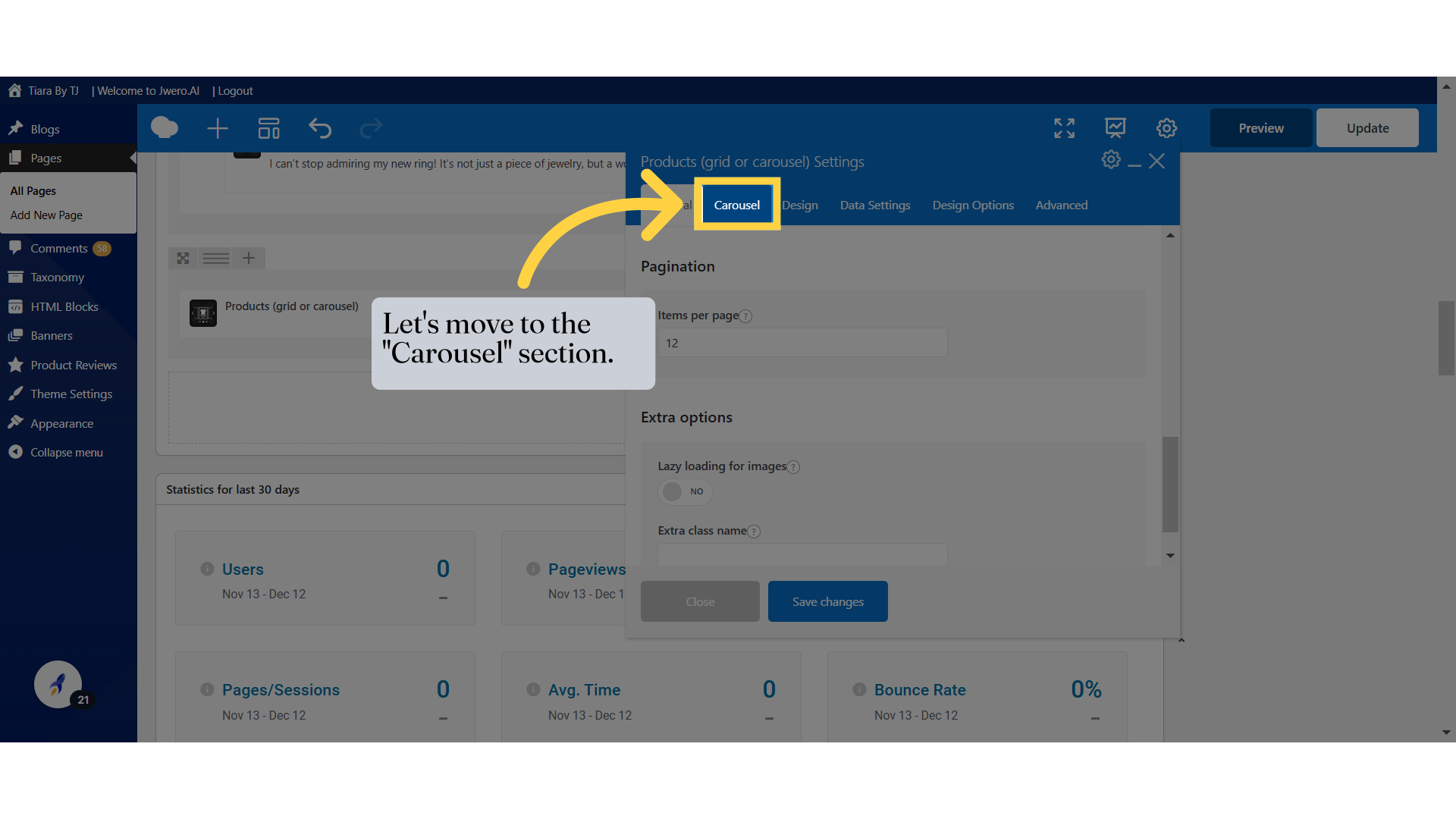
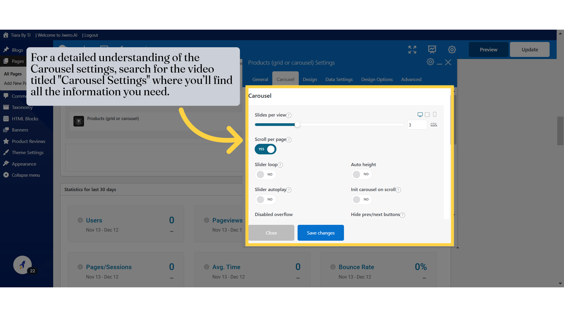
11. Let's move to the "Carousel" section.
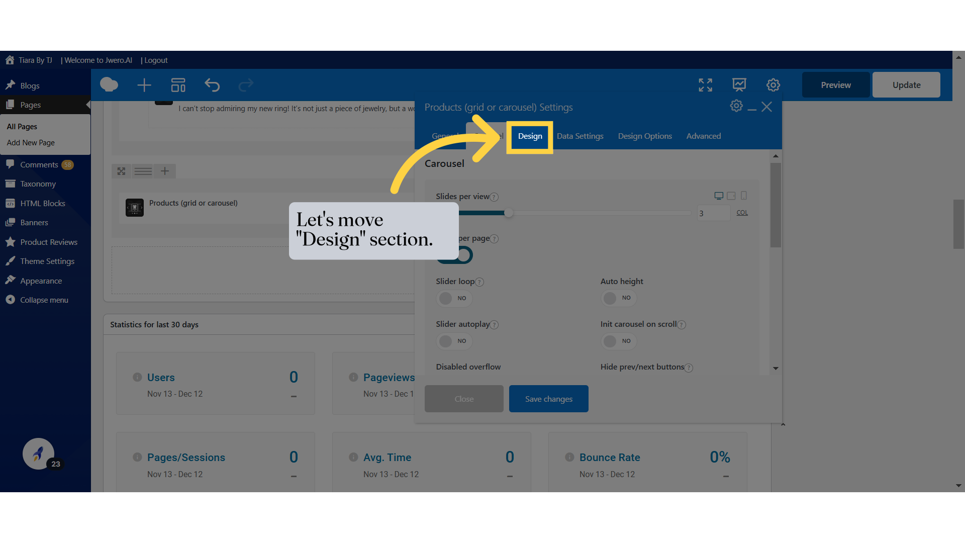
13. Let's move "Design" section.
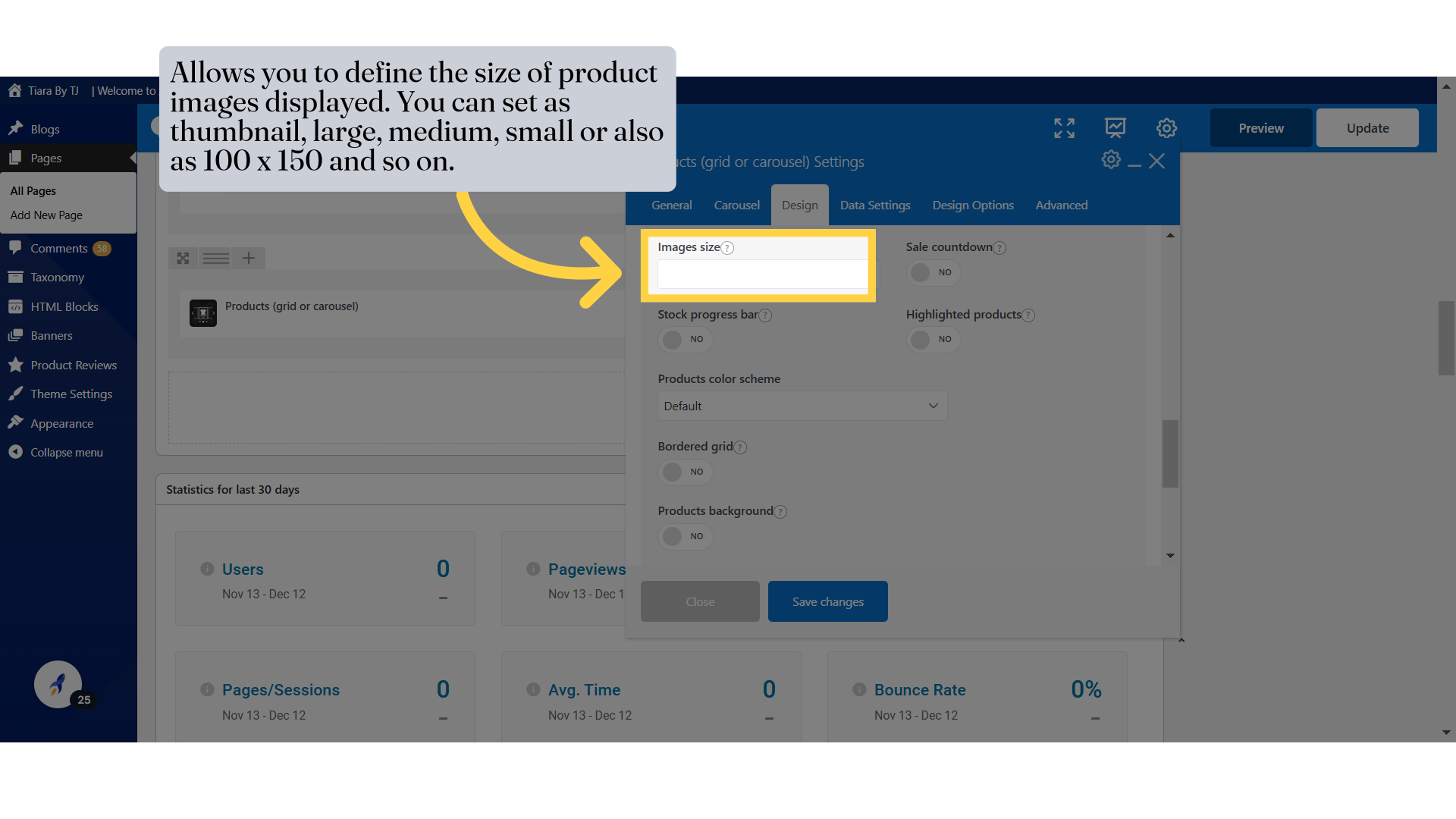
15. Allows you to define the size of product images displayed. You can set as thumbnail, large, medium, small or also as 100 x 150 and so on.
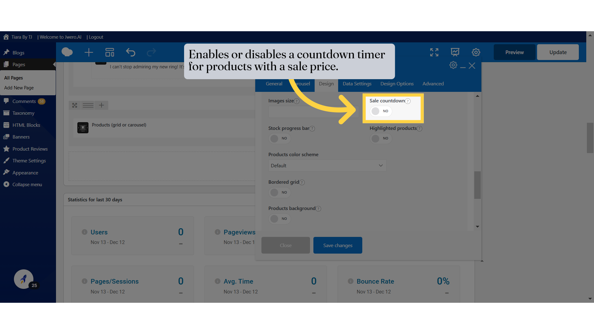
16. Enables or disables a countdown timer for products with a sale price.
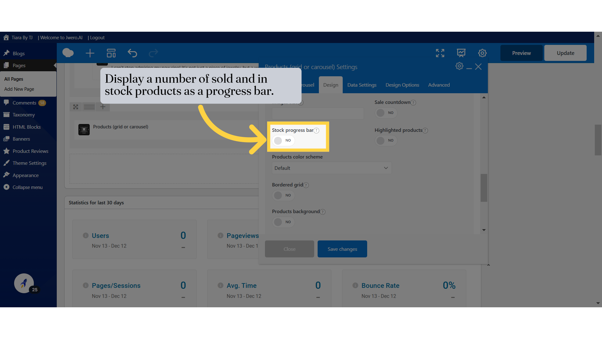
17. Display a number of sold and in stock products as a progress bar.
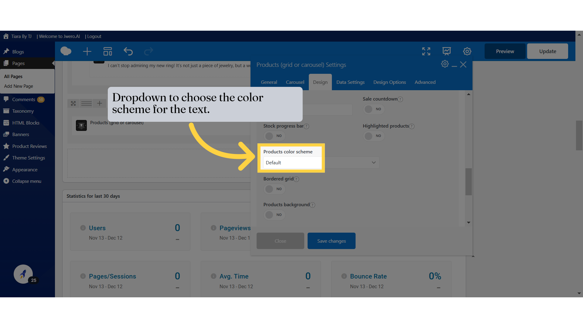
19. Dropdown to choose the color scheme for the text.
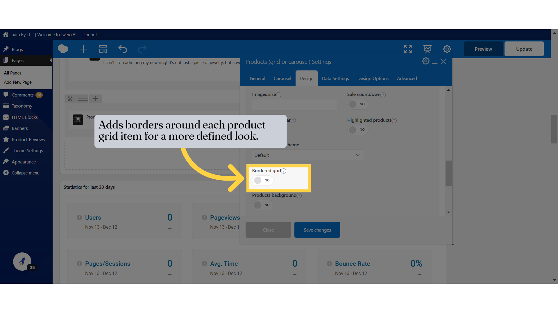
20. Adds borders around each product grid item for a more defined look.
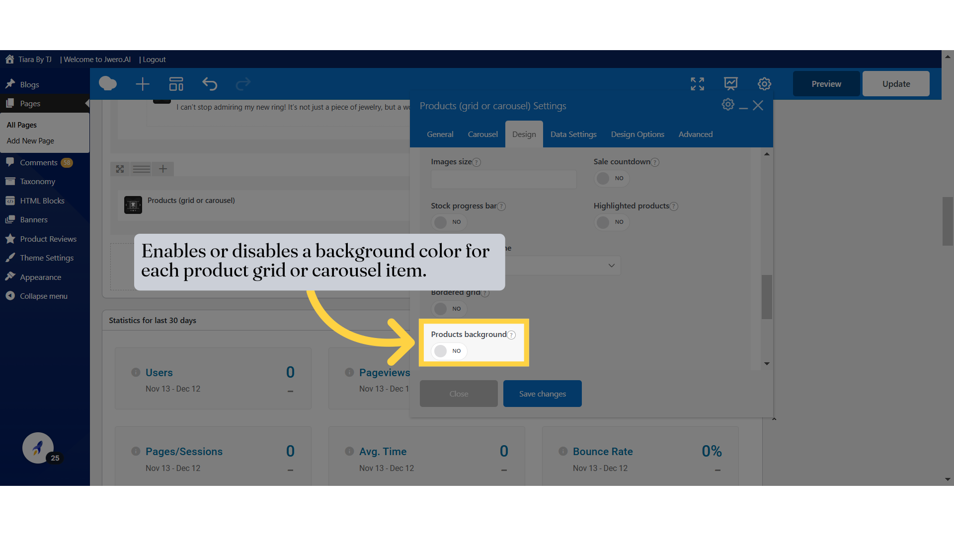
21. Enables or disables a background color for each product grid or carousel item.
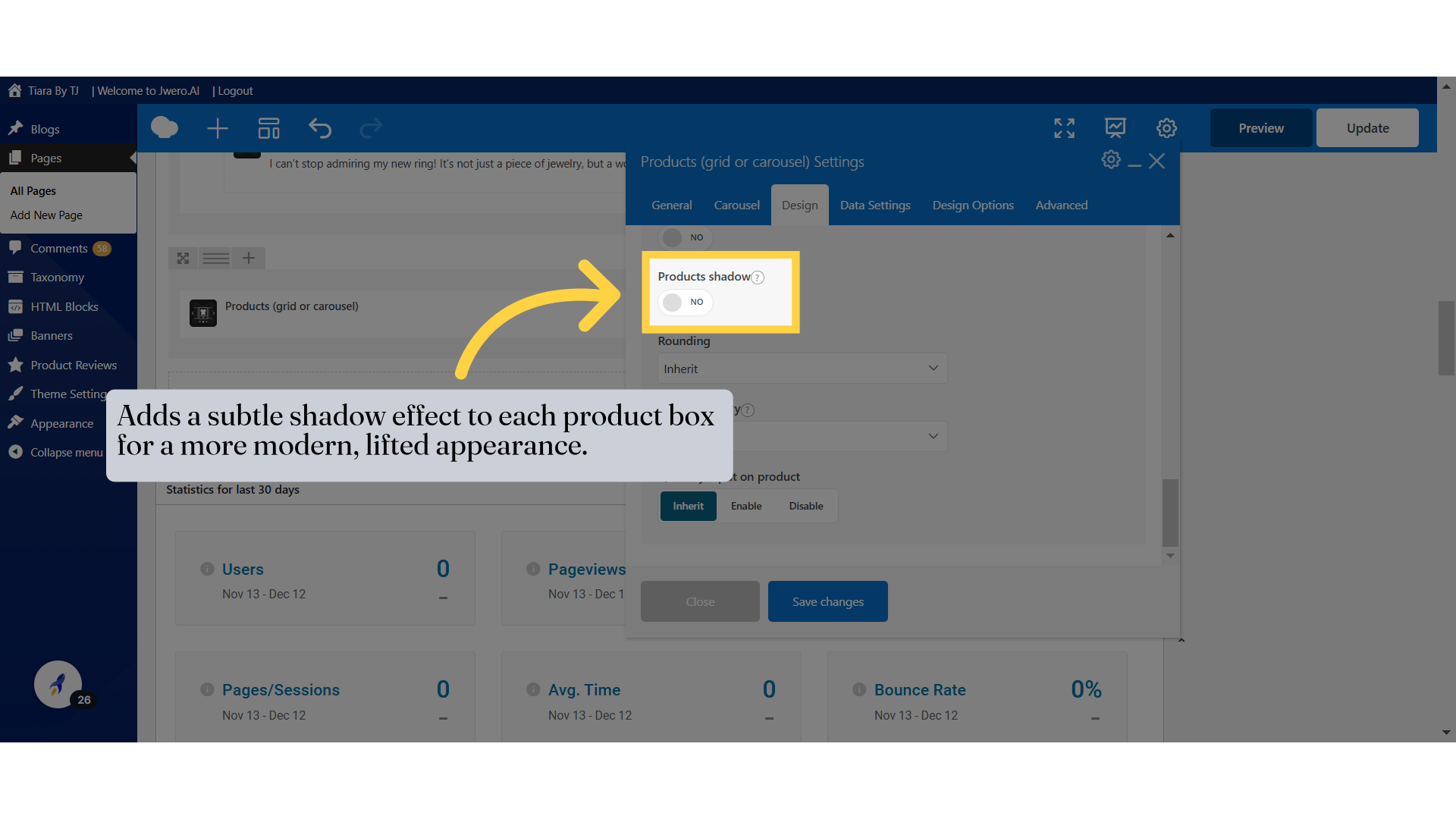
22. Adds a subtle shadow effect to each product box for a more modern, lifted appearance.
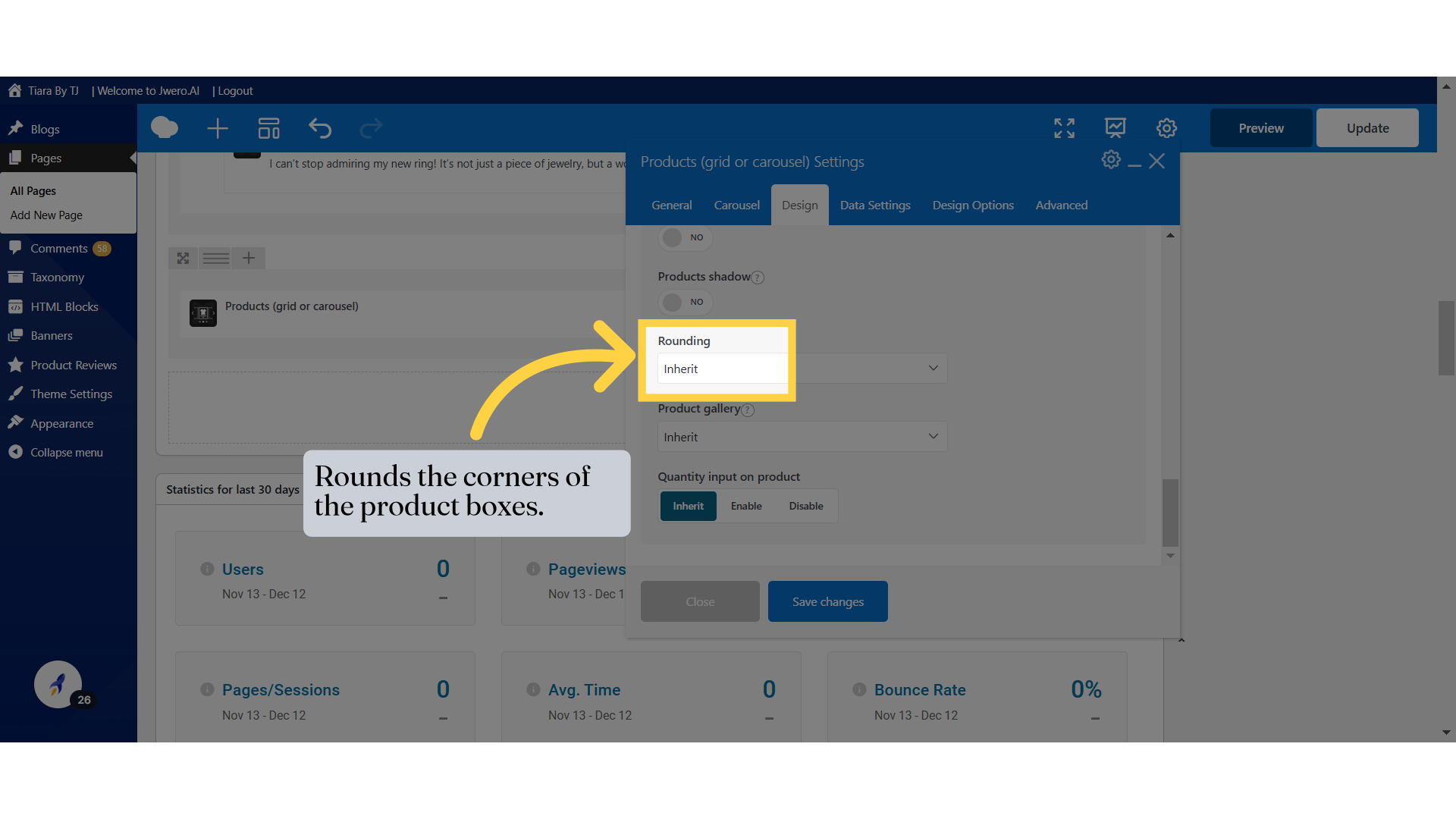
23. Rounds the corners of the product boxes.
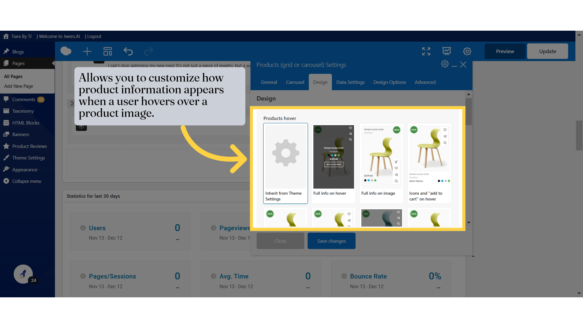
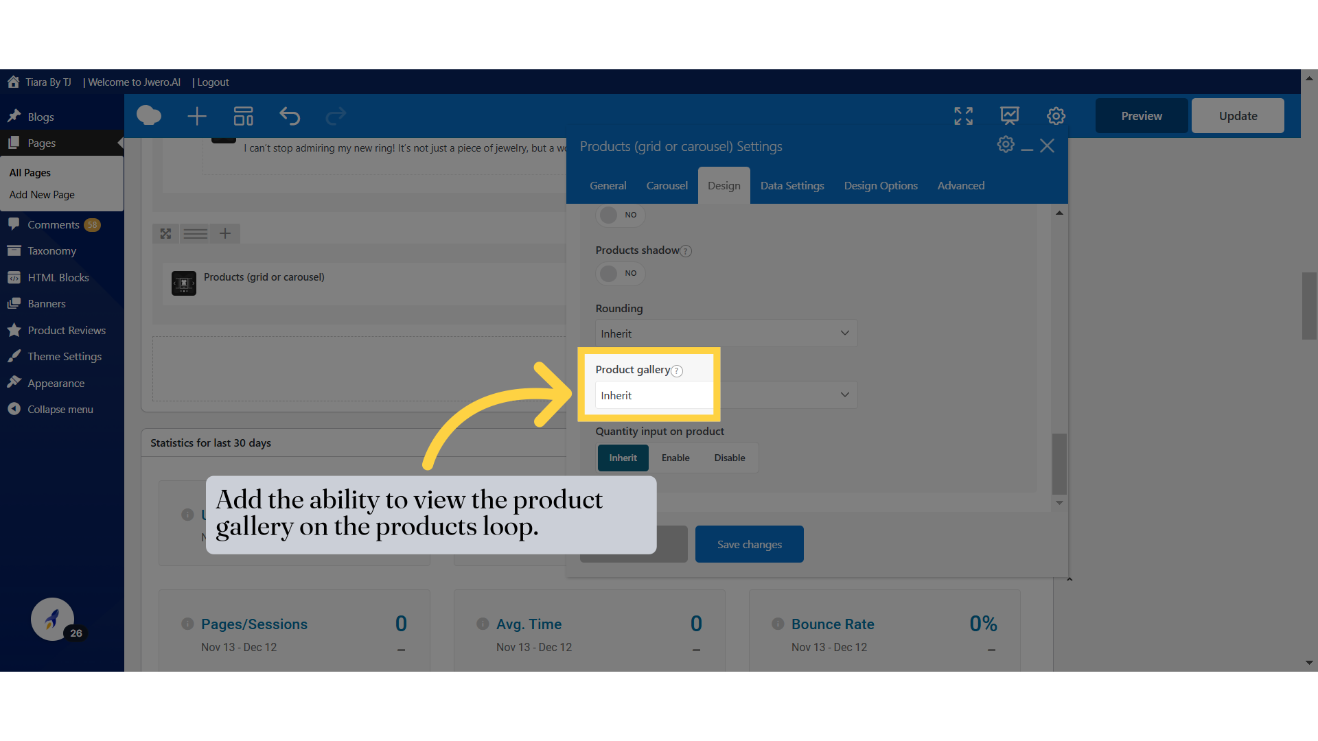
24. Add the ability to view the product gallery on the products loop.
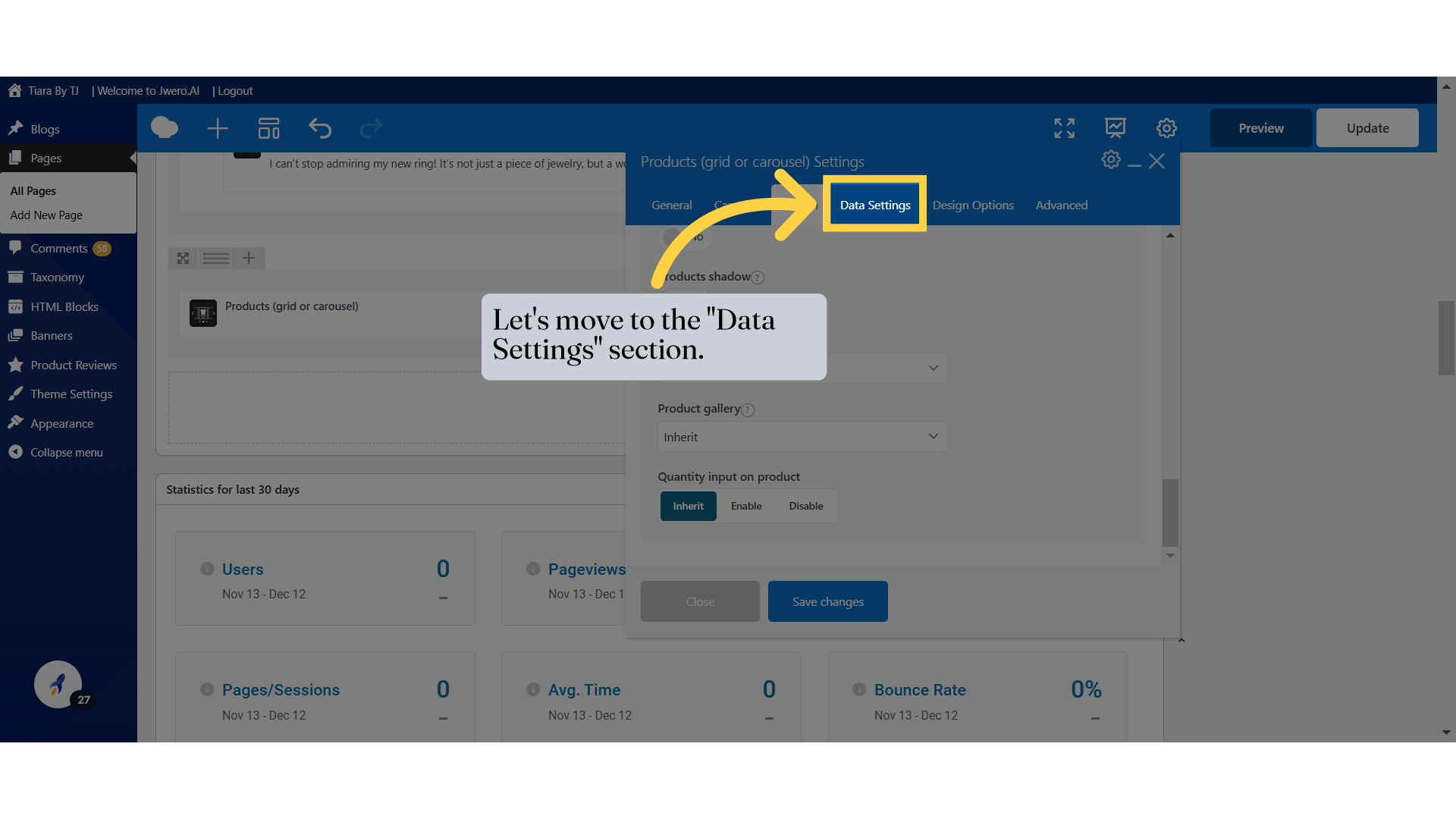
25. Let's move to the "Data Settings" section.
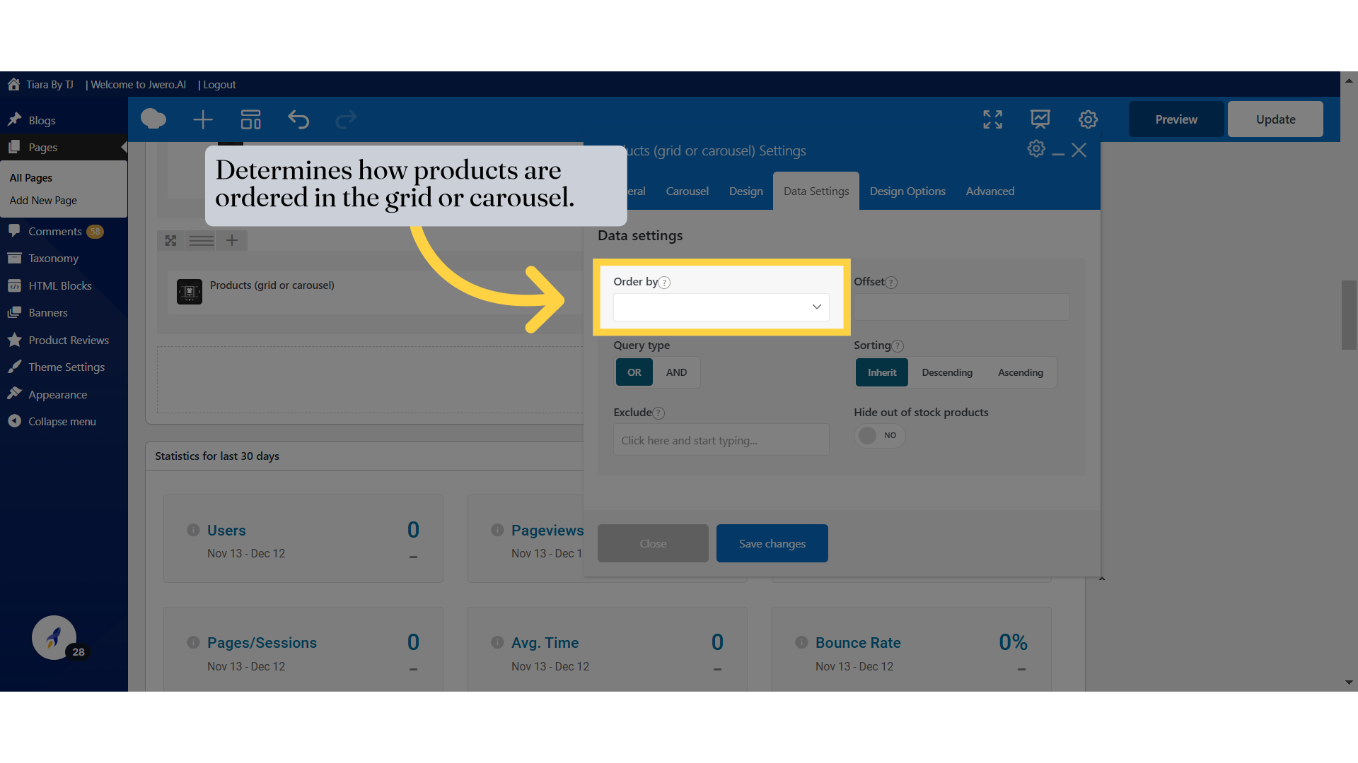
26. Determines how products are ordered in the grid or carousel.
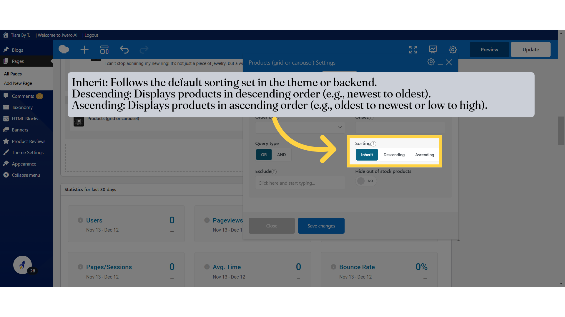
29. Inherit: Follows the default sorting set in the theme or backend.
Descending: Displays products in descending order (e.g., newest to oldest).
Ascending: Displays products in ascending order (e.g., oldest to newest or low to high).
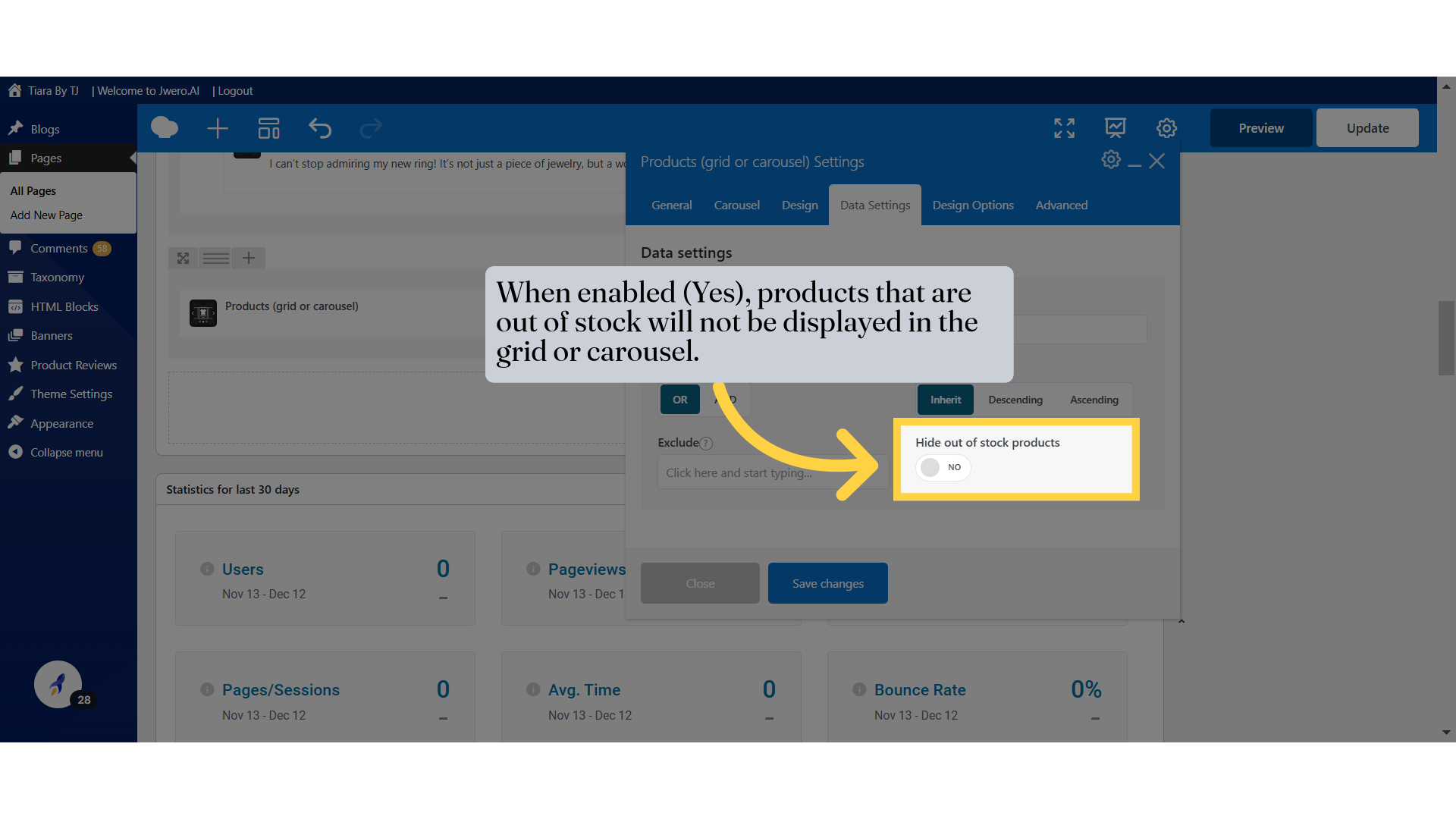
31. When enabled (Yes), products that are out of stock will not be displayed in the grid or carousel.
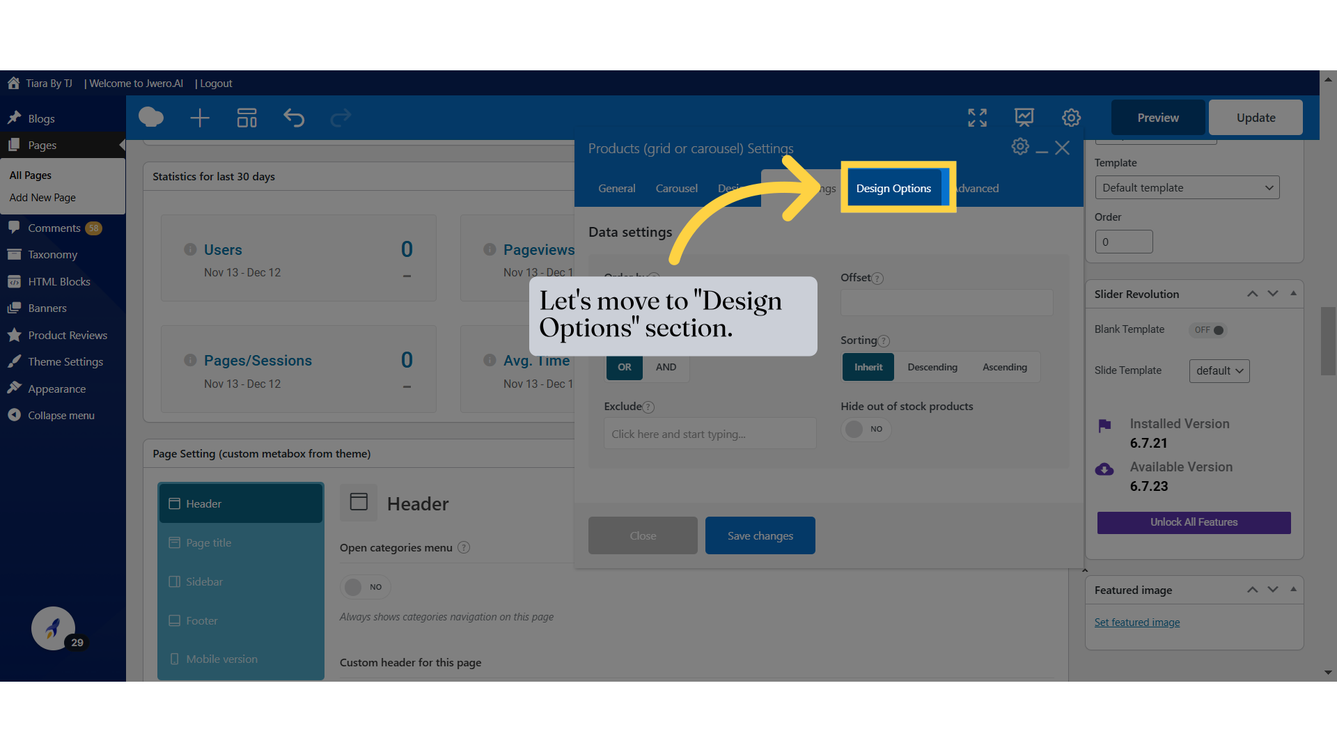
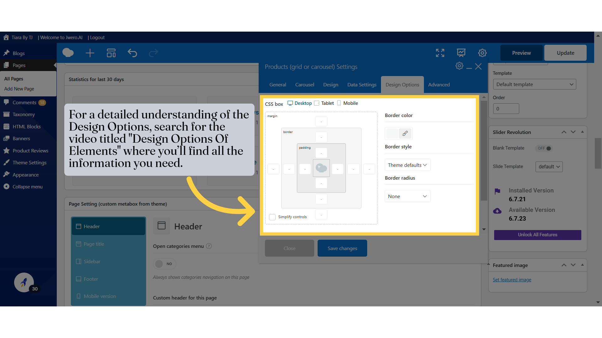
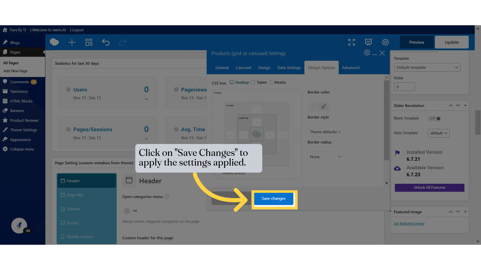
32. Let's move to "Design Options" section.
34. Click on "Save Changes" to apply the settings applied.
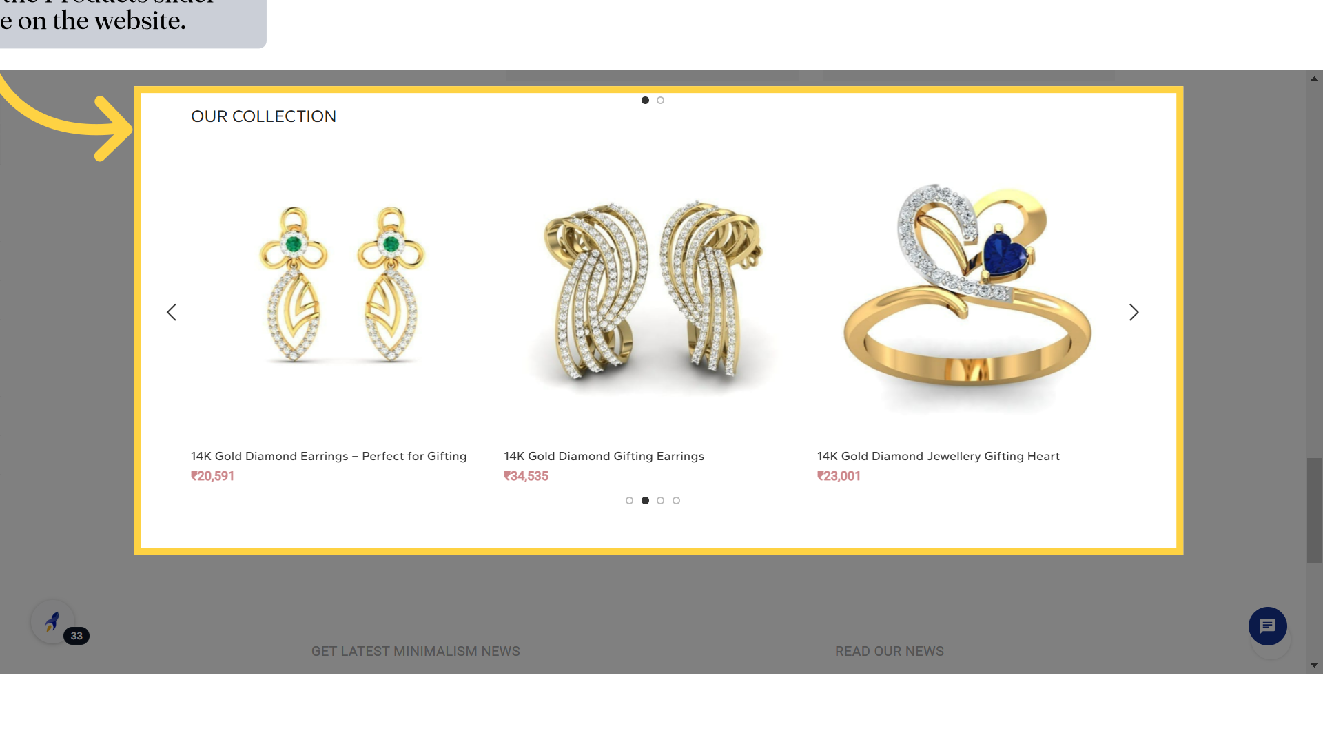
35. This is how the Products slider will look like on the website.