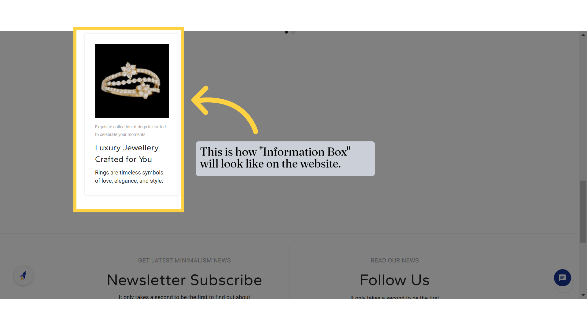
Information Box Element
Information Box Element
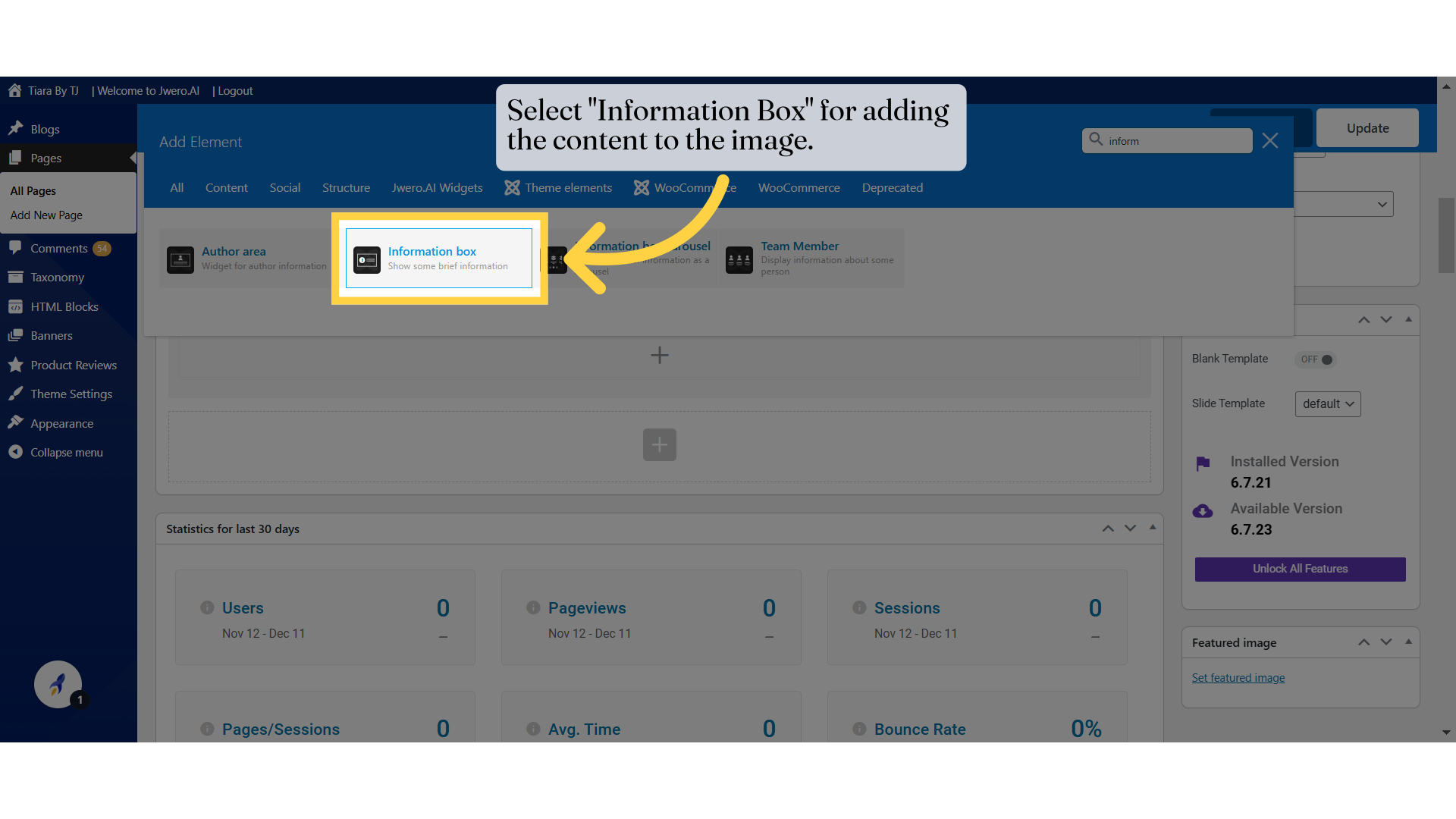
1. Select "Information Box" for adding the content to the image.
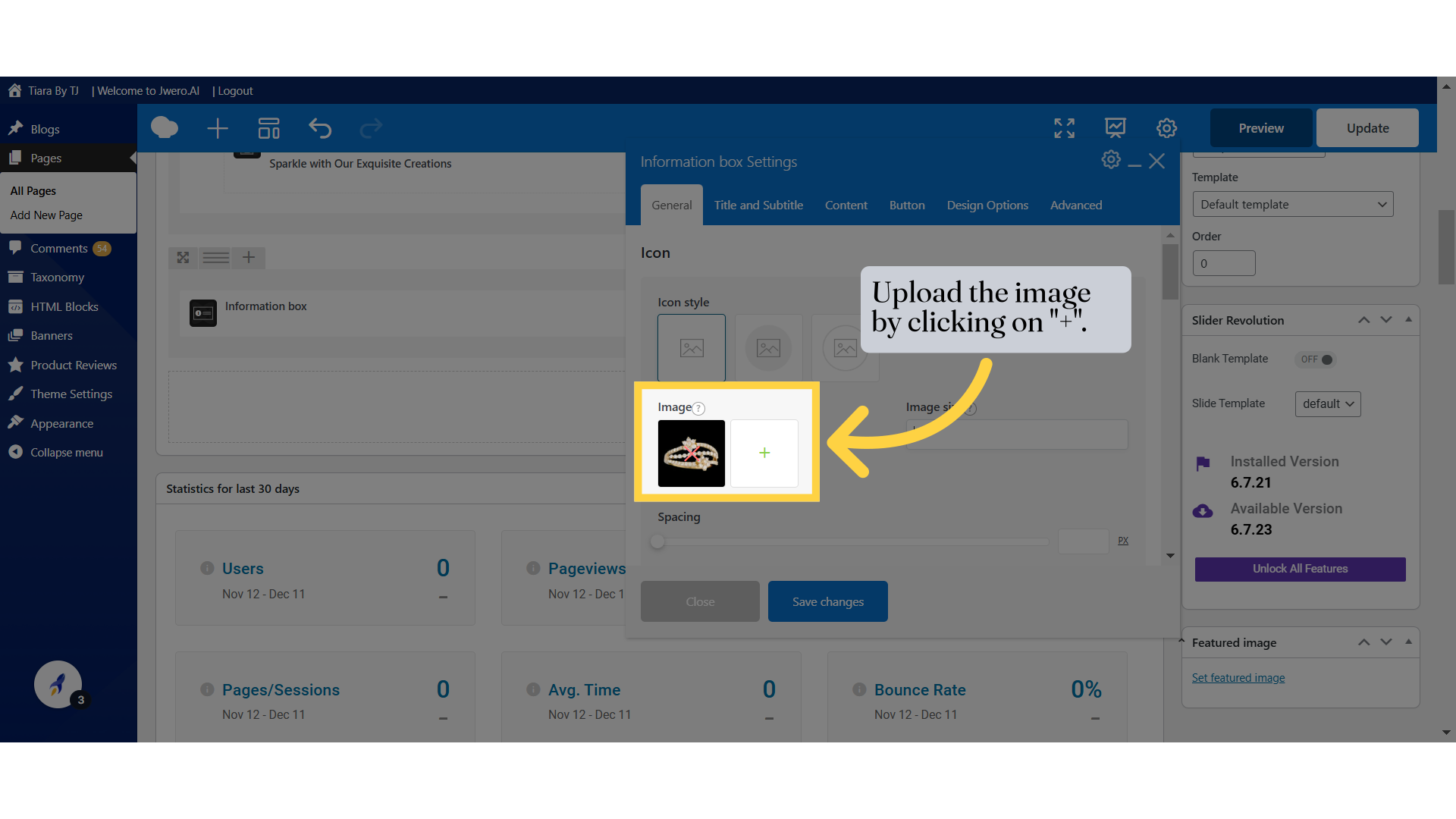
2. Upload the image by clicking on "+".
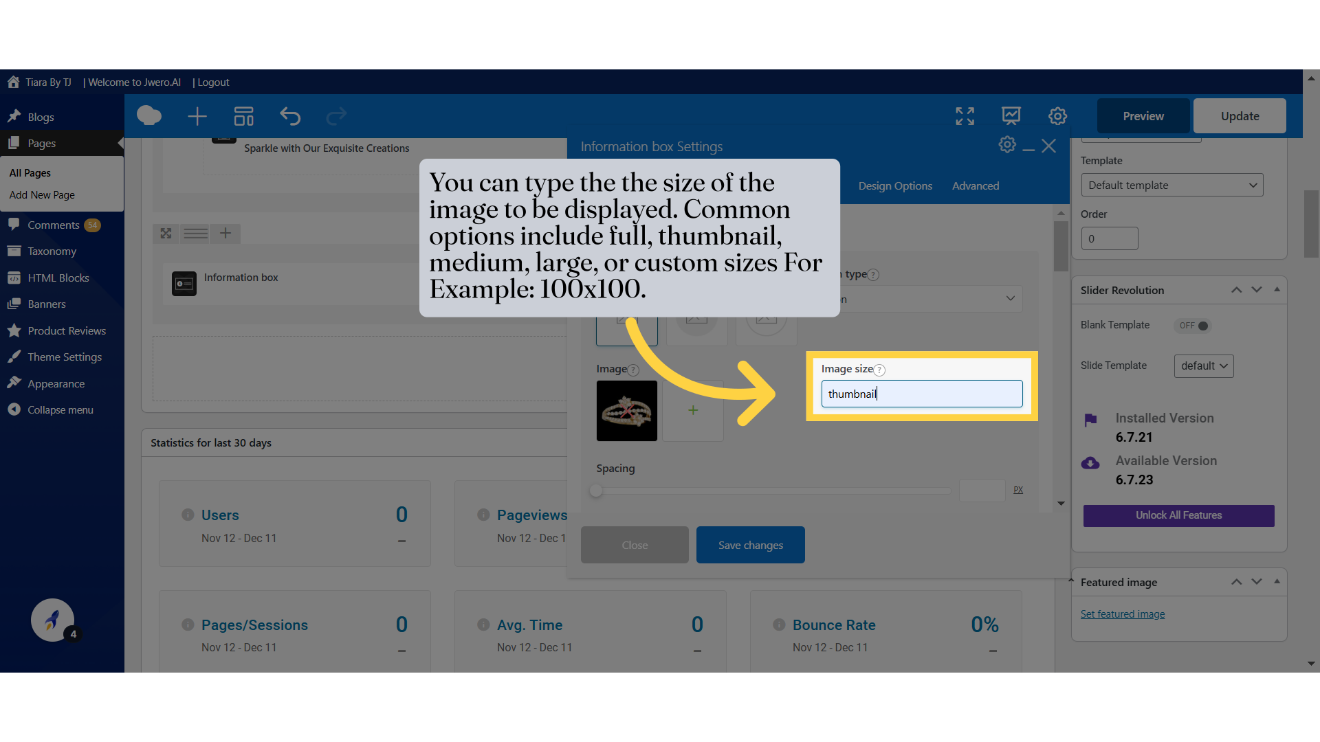
3. You can type the the size of the image to be displayed. Common options include full, thumbnail, medium, large, or custom sizes For Example: 100x100.
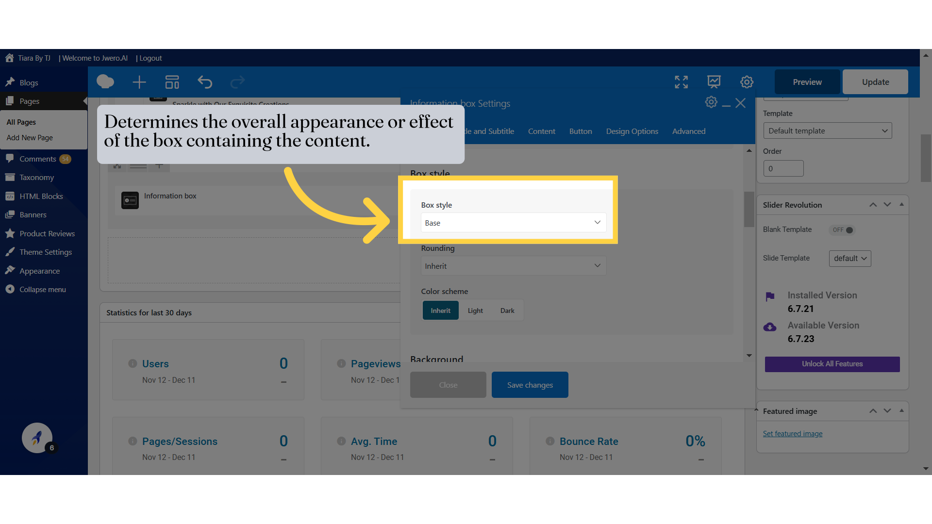
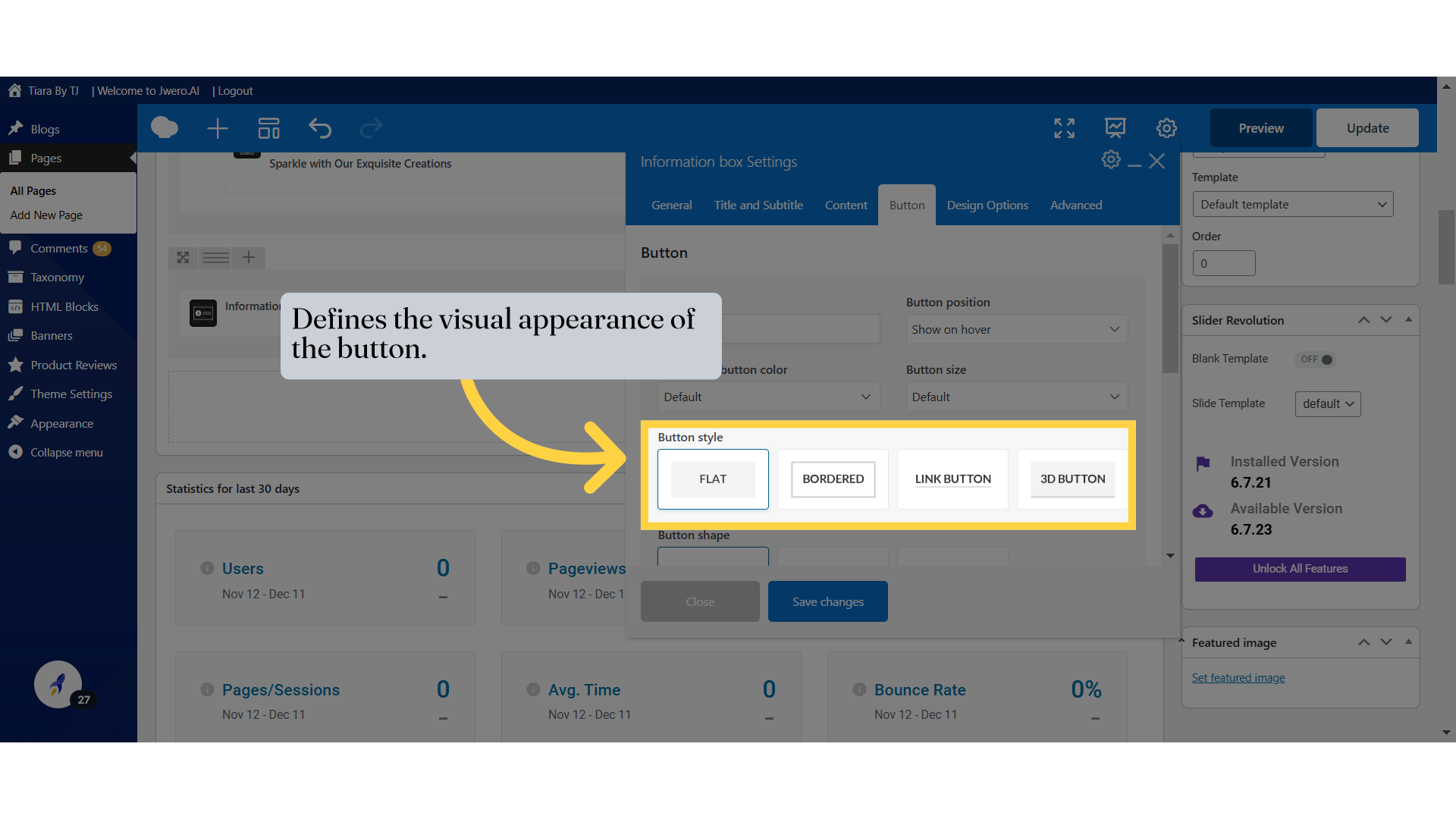
4. Determines the overall appearance or effect of the box containing the content.
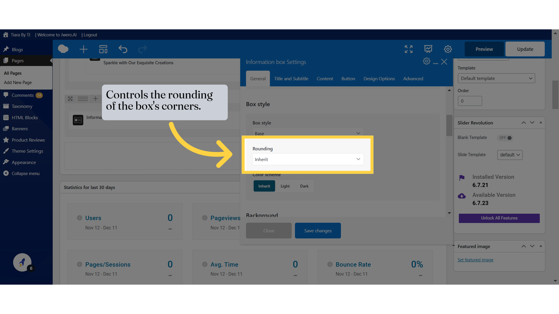
5. Controls the rounding of the box's corners.
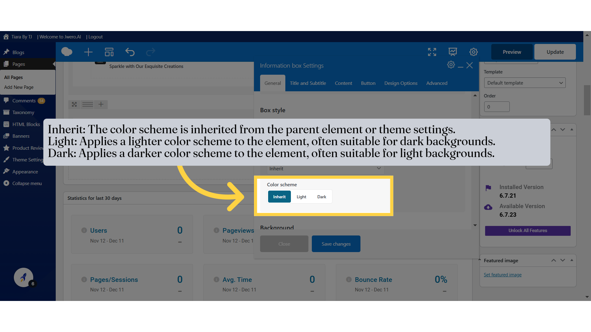
6. Inherit: The color scheme is inherited from the parent element or theme settings.
Light: Applies a lighter color scheme to the element, often suitable for dark backgrounds.
Dark: Applies a darker color scheme to the element, often suitable for light backgrounds.
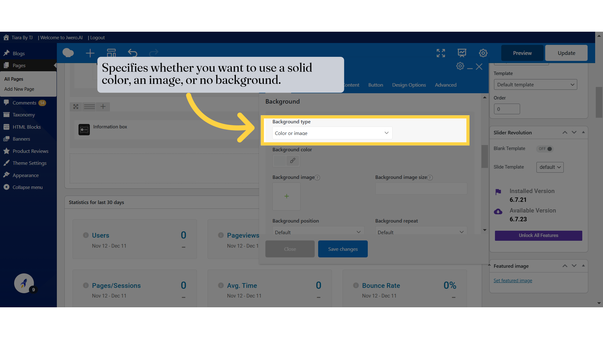
7. Specifies whether you want to use a solid color, an image, or no background.
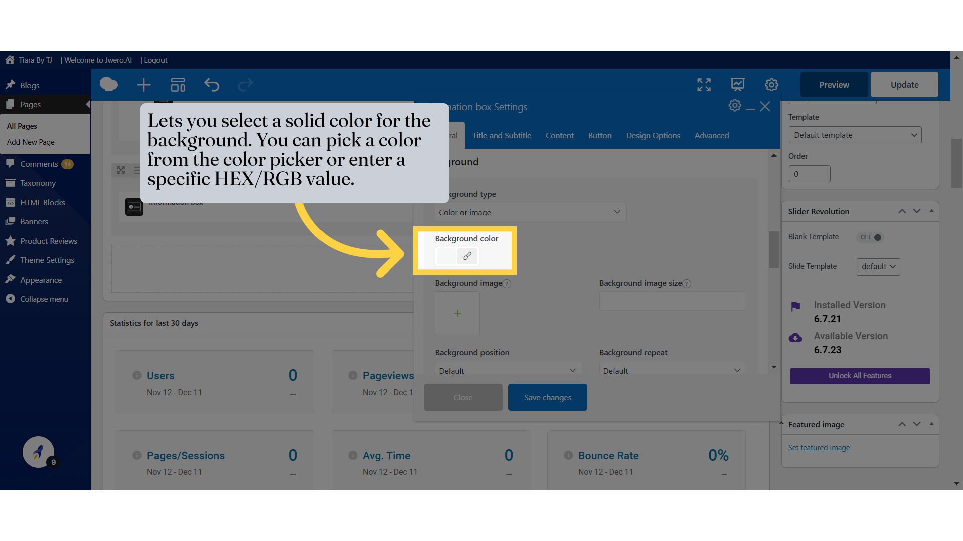
8. Lets you select a solid color for the background. You can pick a color from the color picker or enter a specific HEX/RGB value.
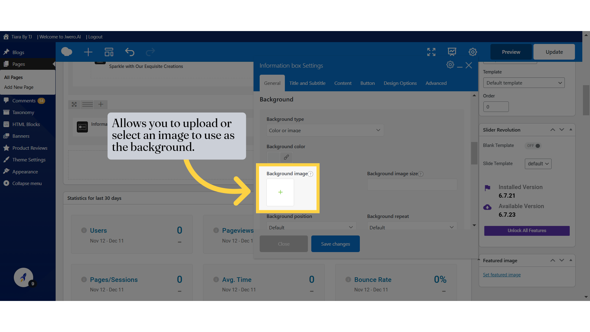
9. Allows you to upload or select an image to use as the background.
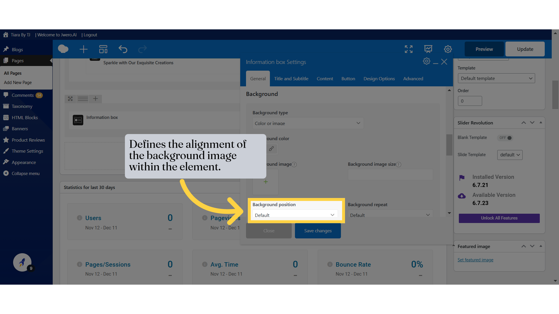
10. Defines the alignment of the background image within the element.
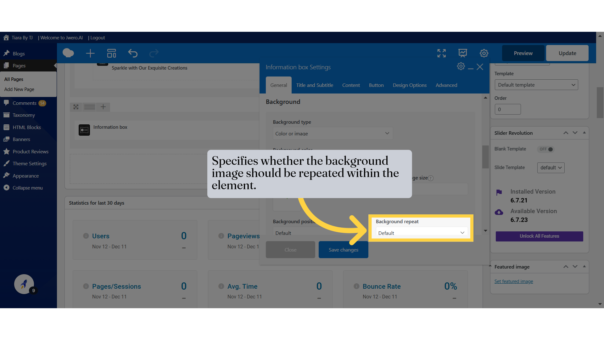
11. Specifies whether the background image should be repeated within the element.
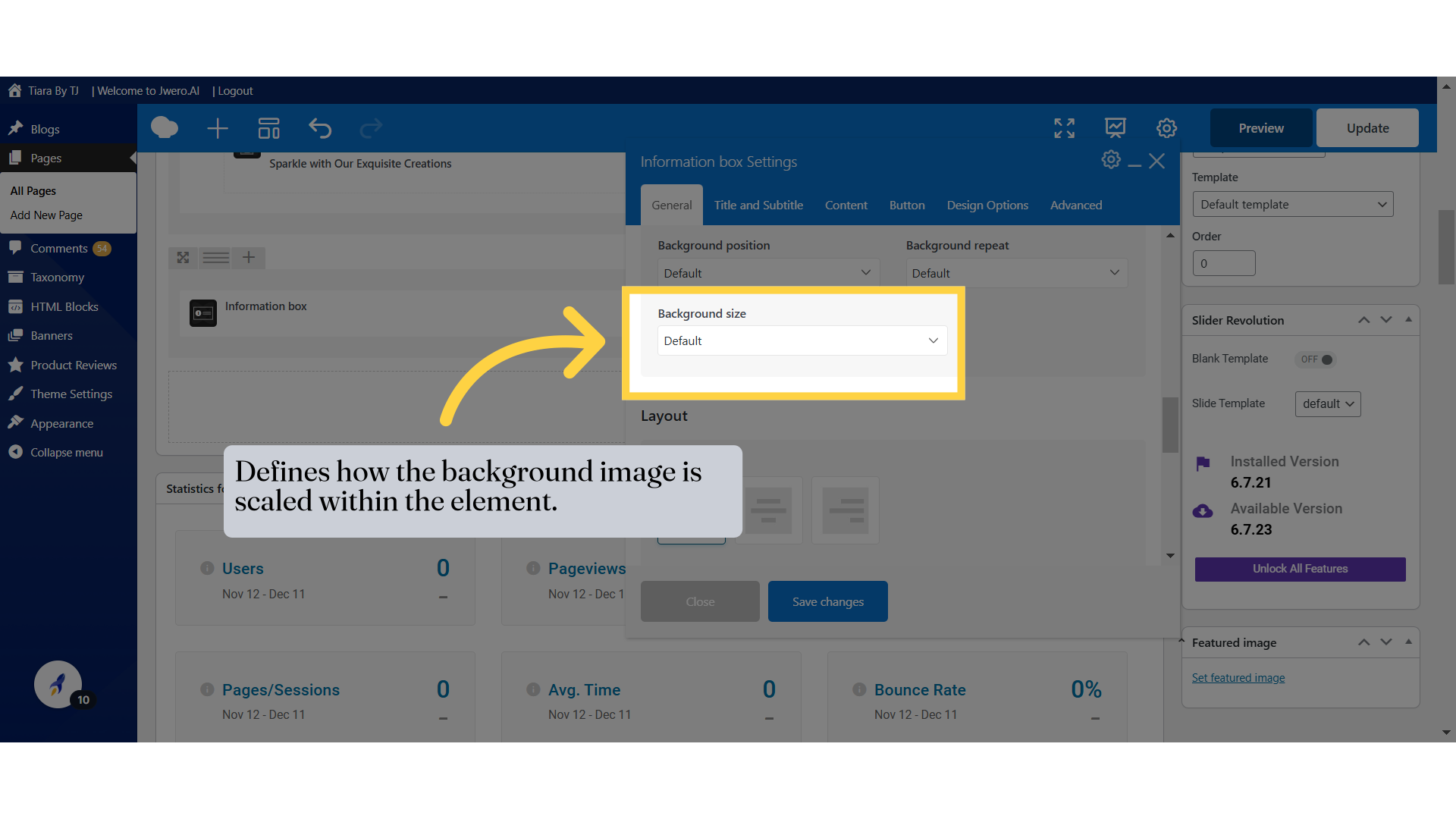
12. Defines how the background image is scaled within the element.
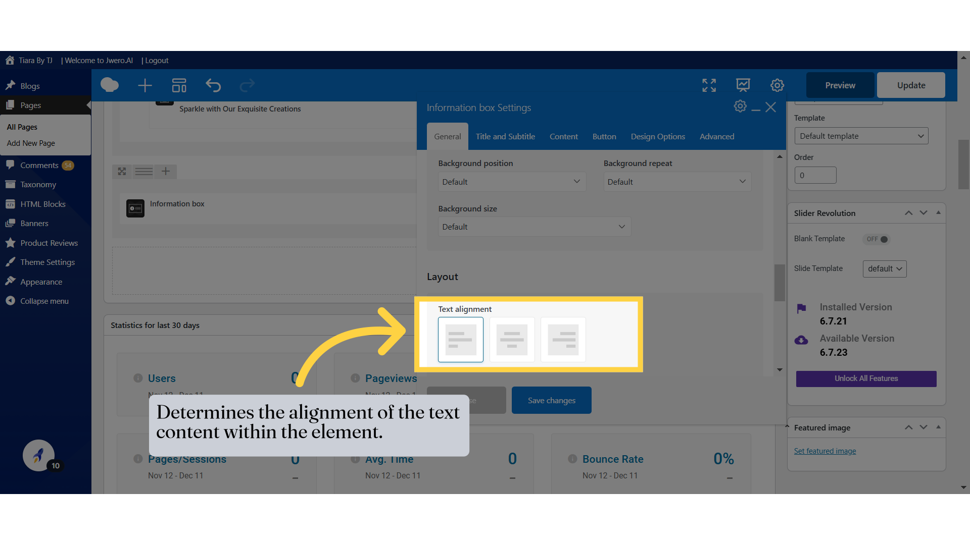
13. Determines the alignment of the text content within the element.
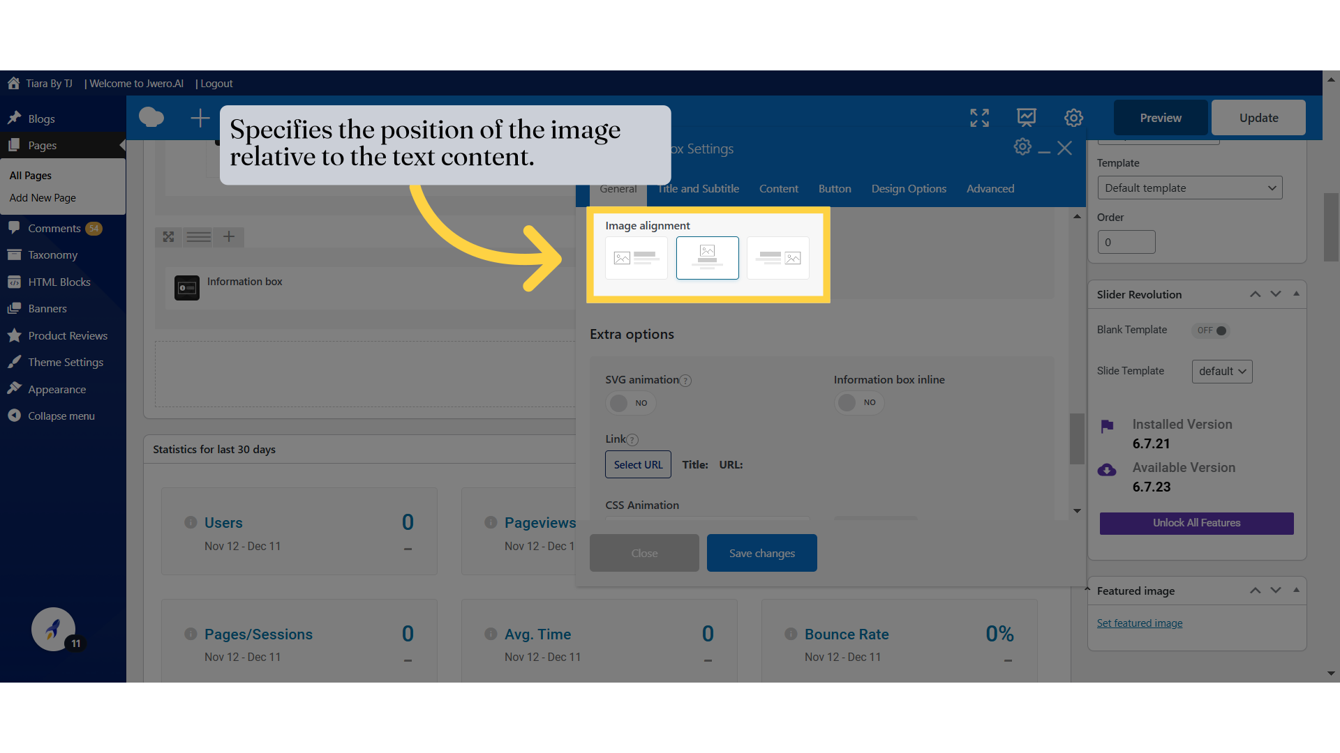
14. Specifies the position of the image relative to the text content.
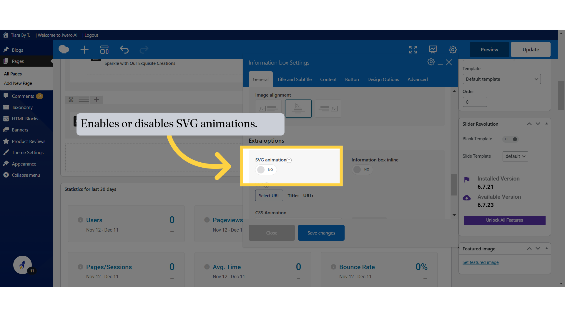
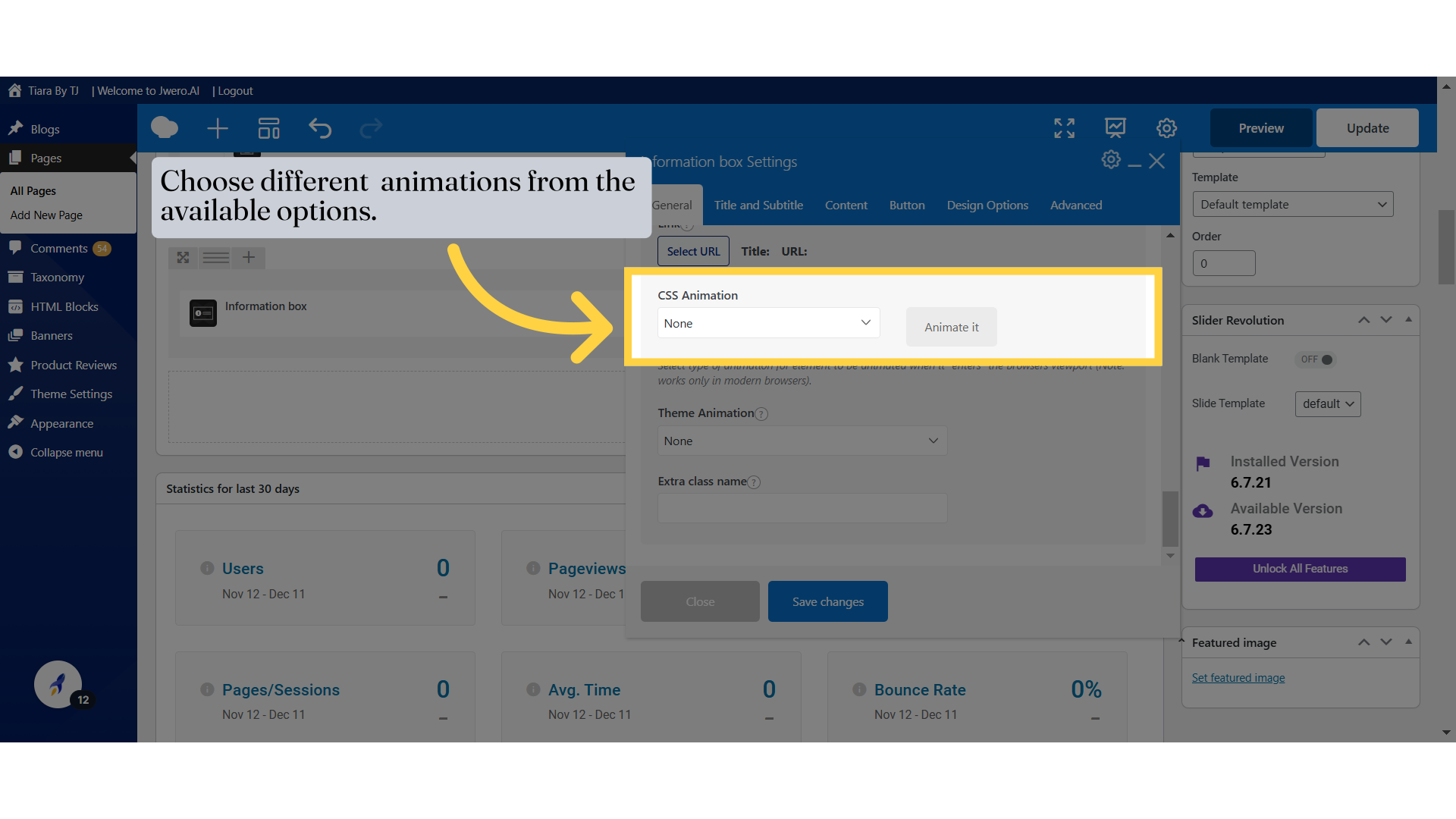
15. Enables or disables SVG animations.
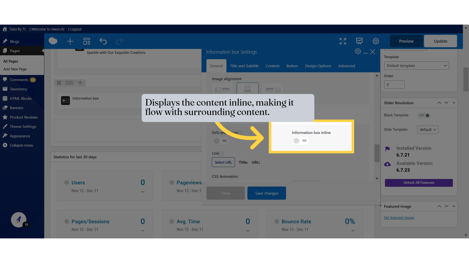
16. Displays the content inline, making it flow with surrounding content.
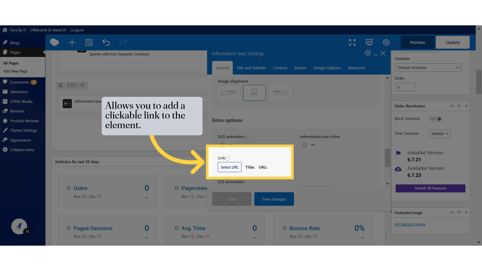
17. Allows you to add a clickable link to the element.
18. Choose different animations from the available options.
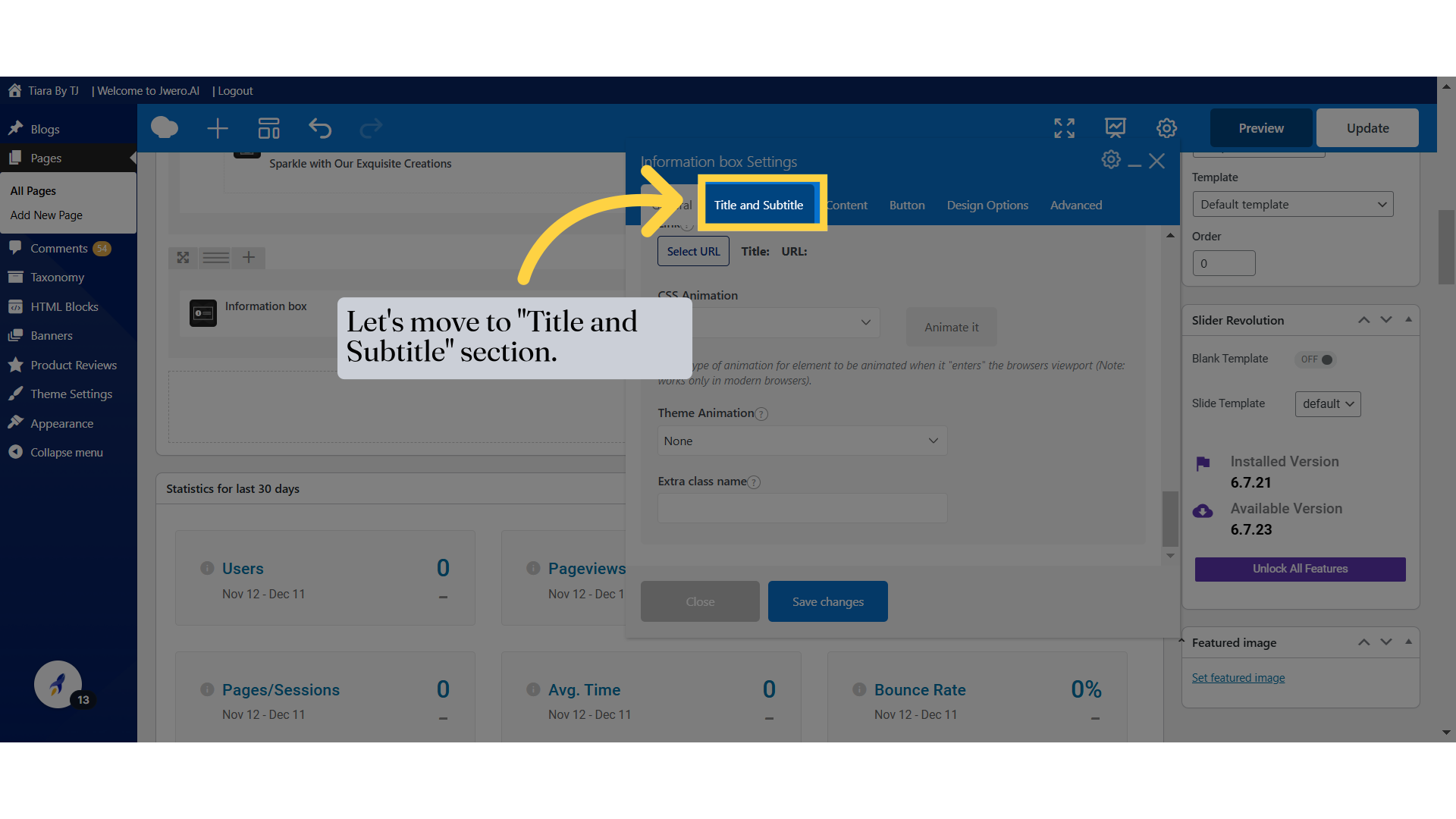
19. Let's move to "Title and Subtitle" section.
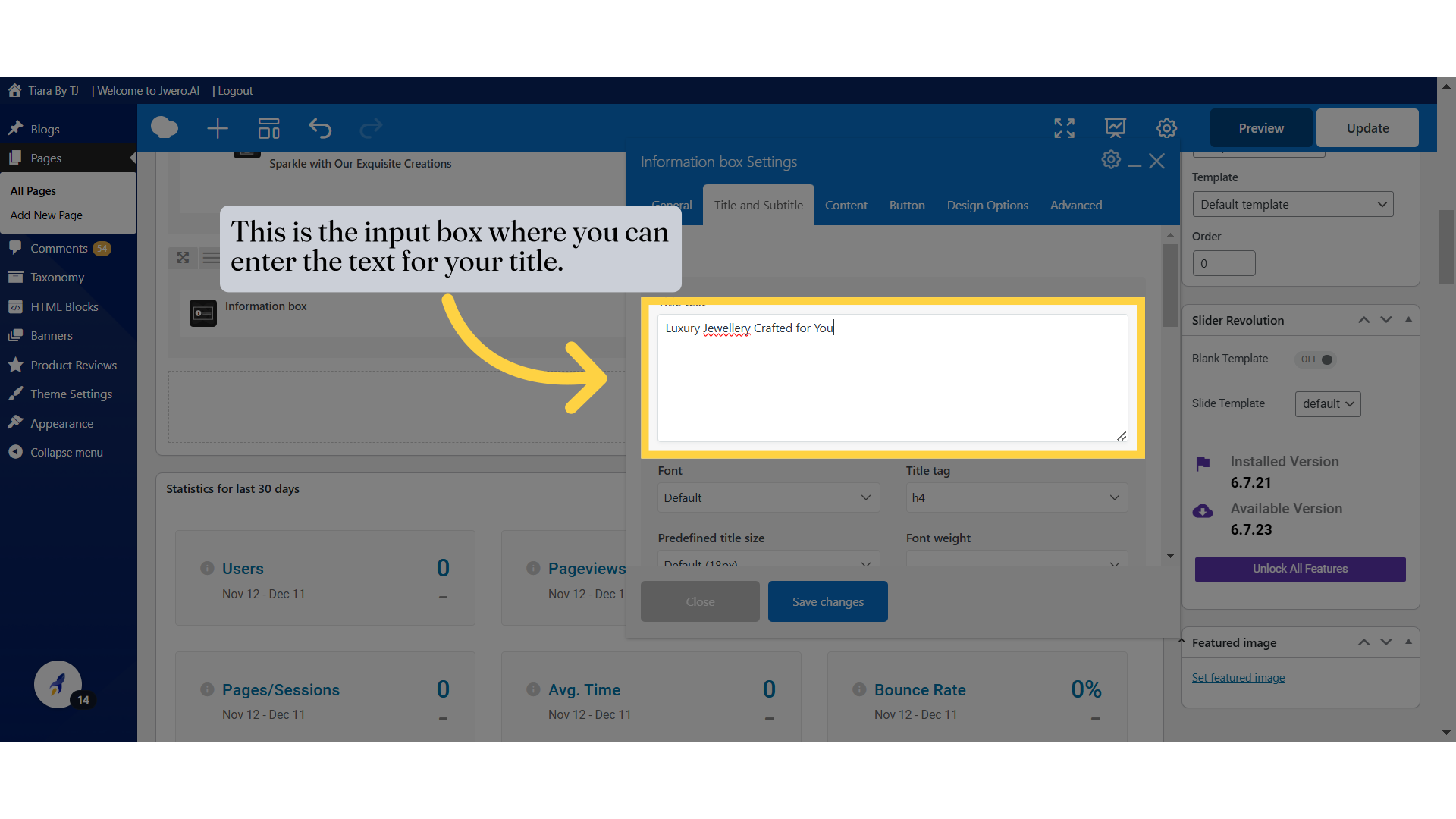
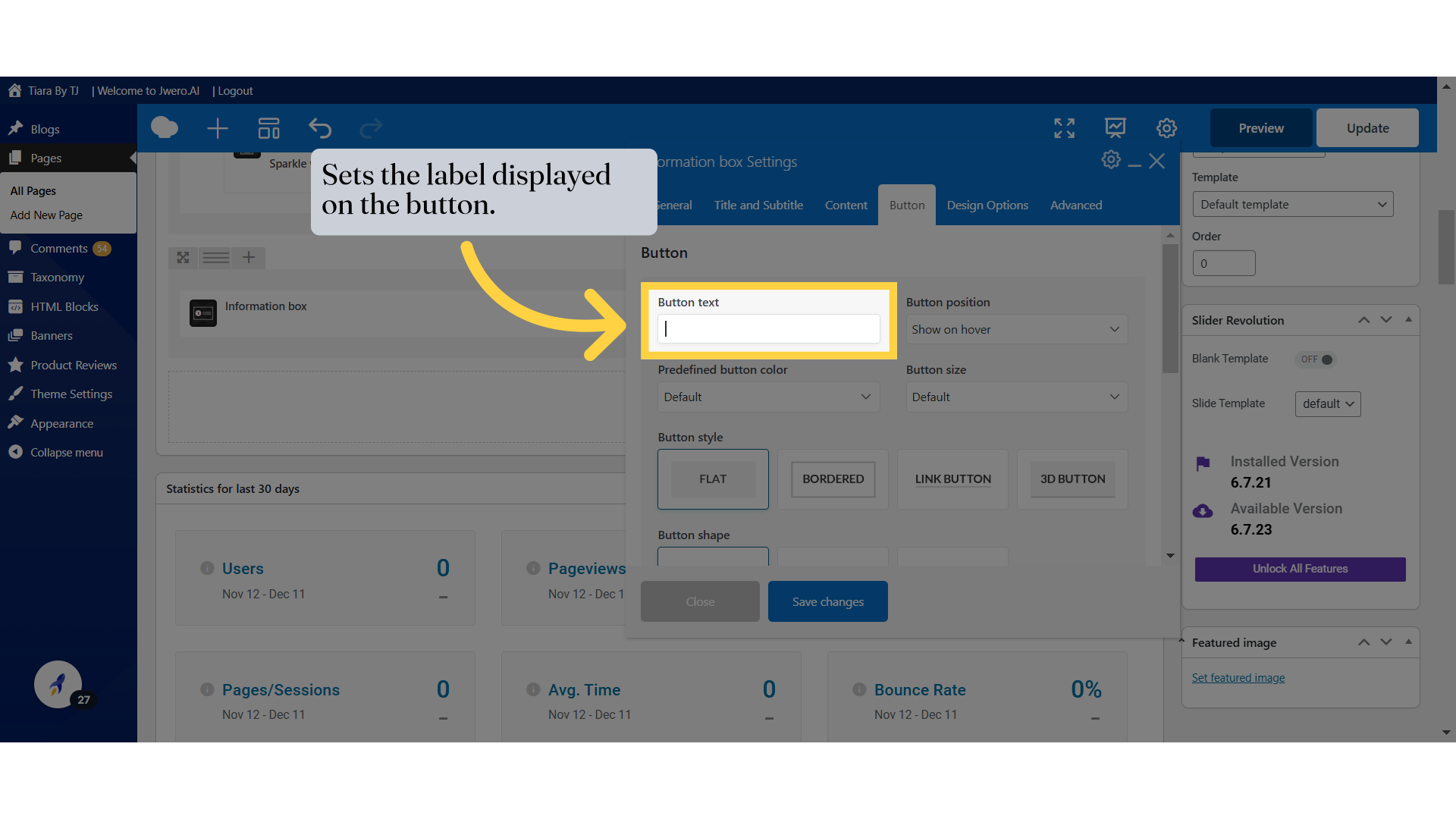
20. This is the input box where you can enter the text for your title.
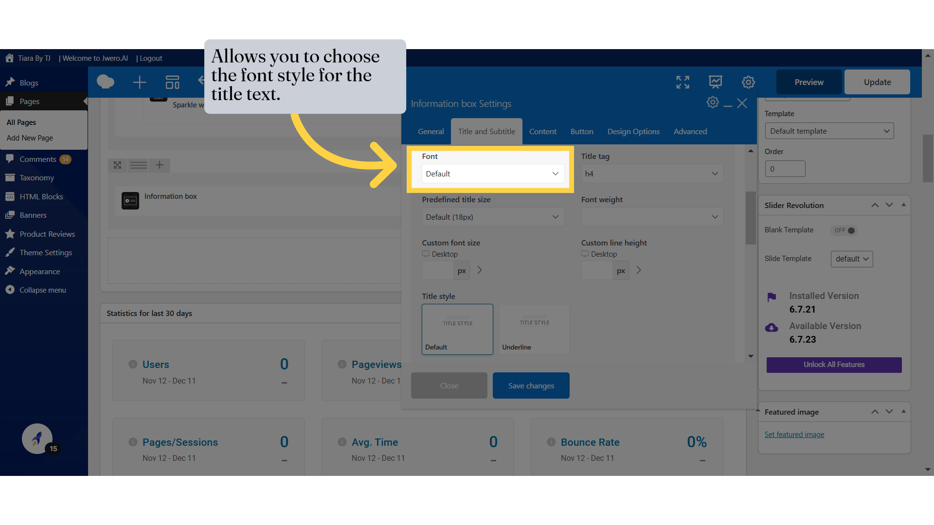
21. Allows you to choose the font style for the title text.
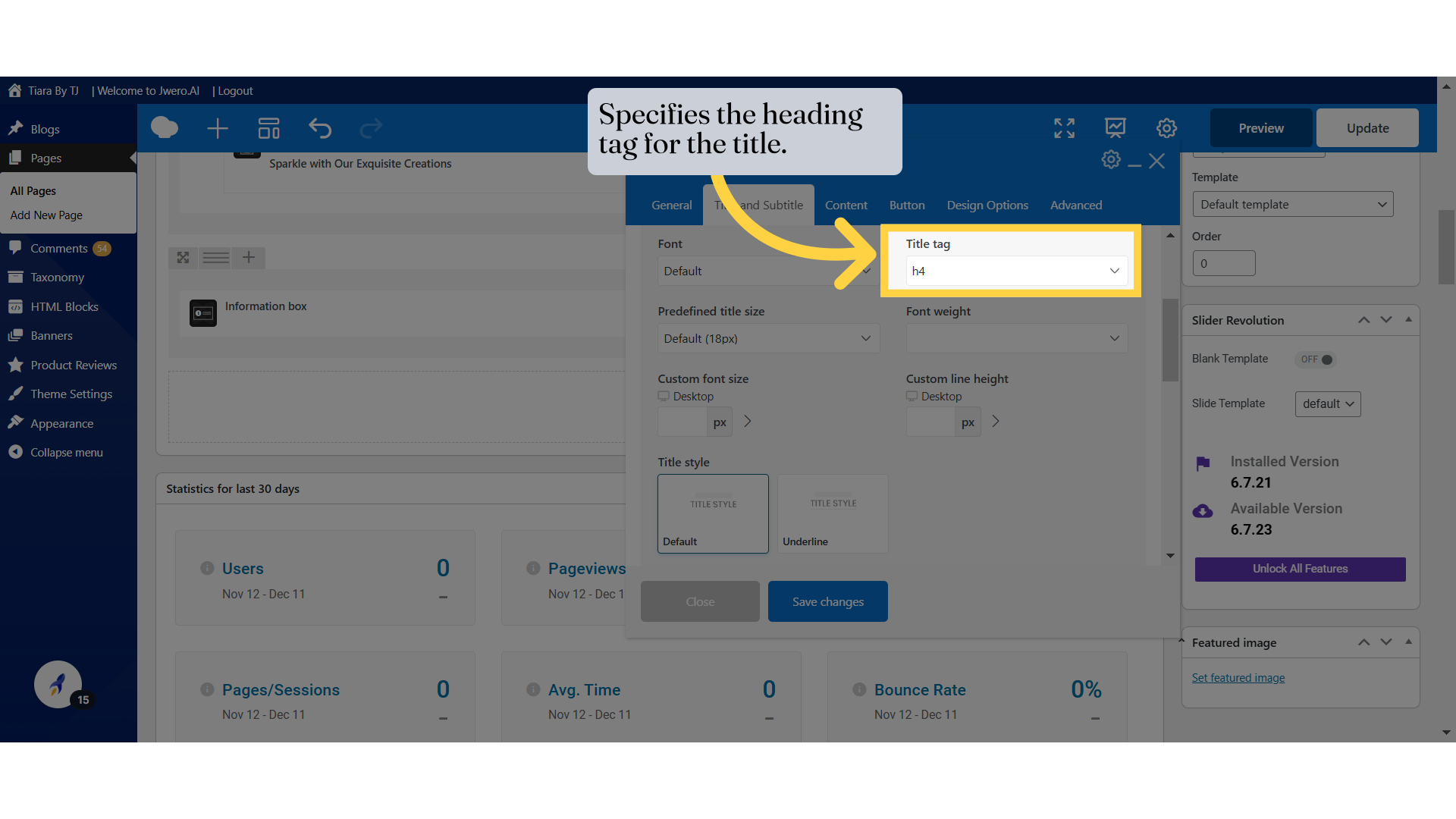
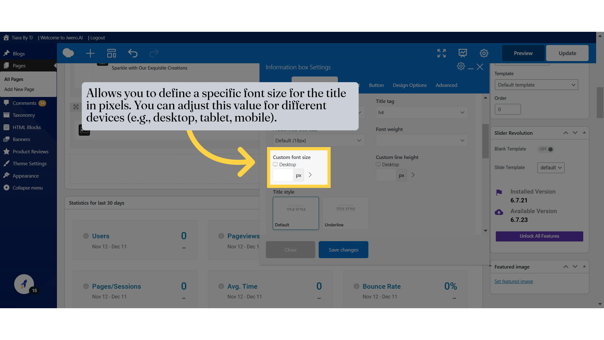
22. Specifies the heading tag for the title.
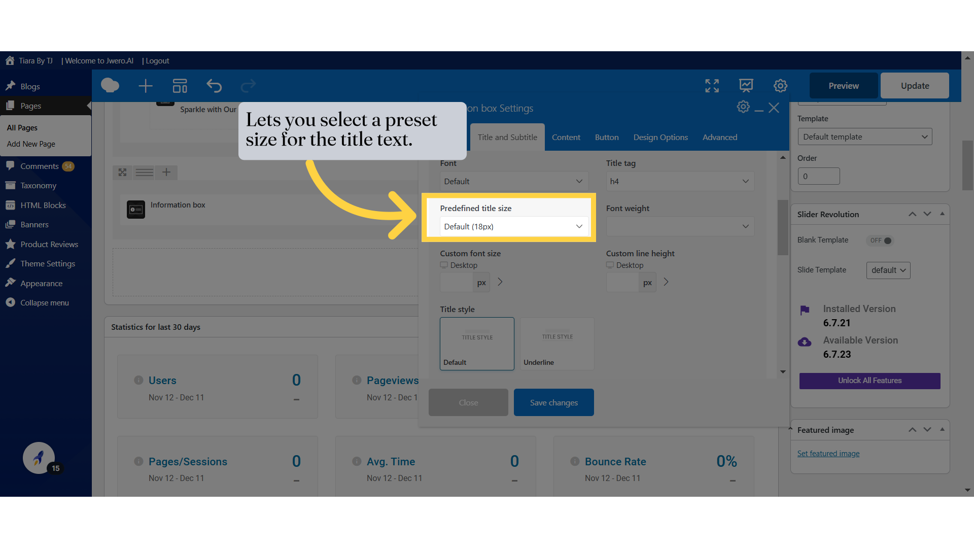
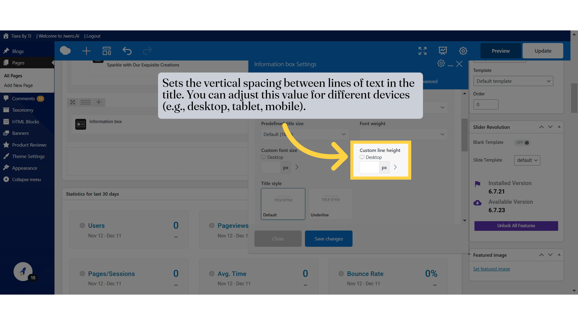
23. Lets you select a preset size for the title text.
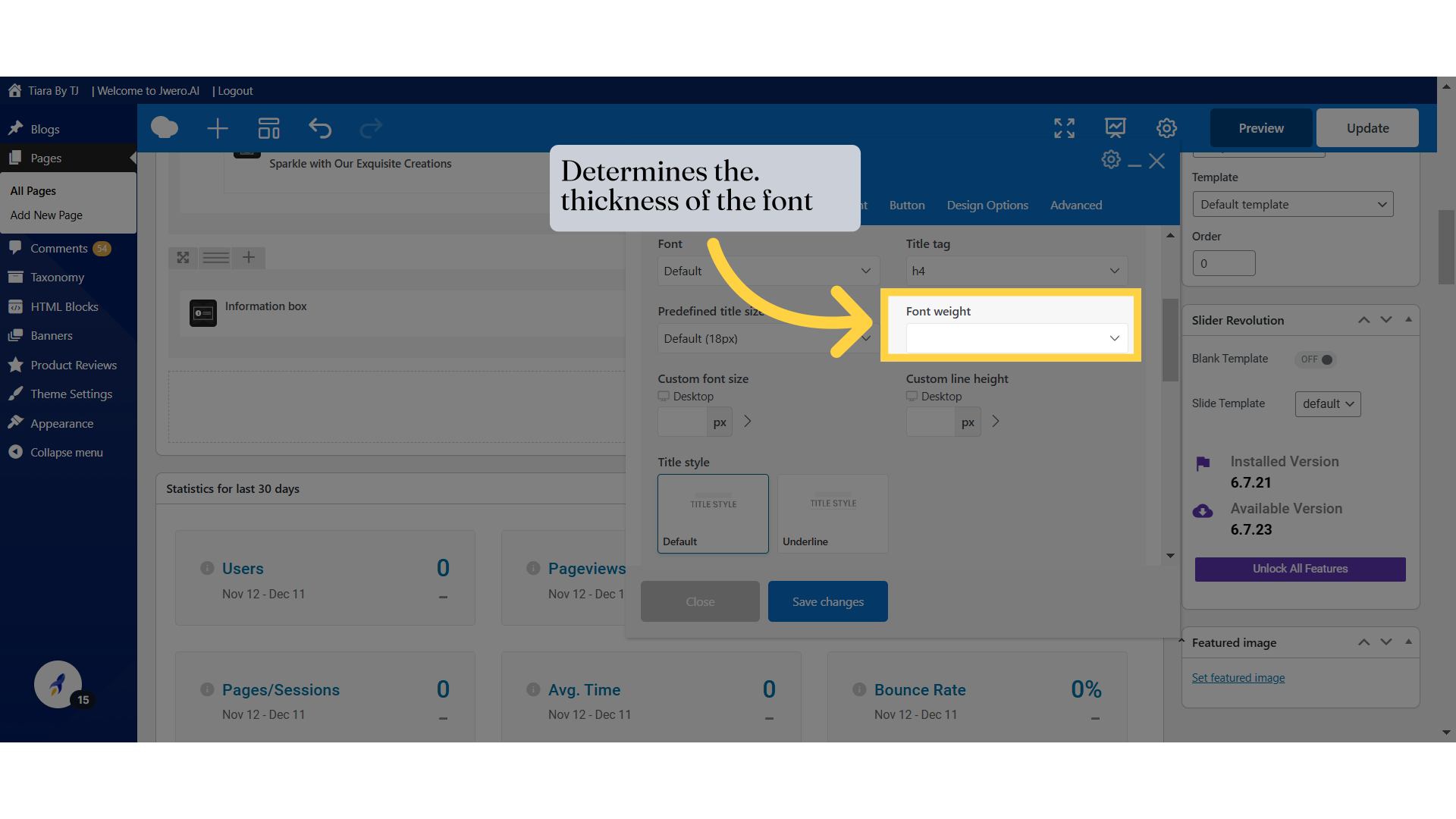
24. Determines the. thickness of the font
25. Allows you to define a specific font size for the title in pixels. You can adjust this value for different devices (e.g., desktop, tablet, mobile).
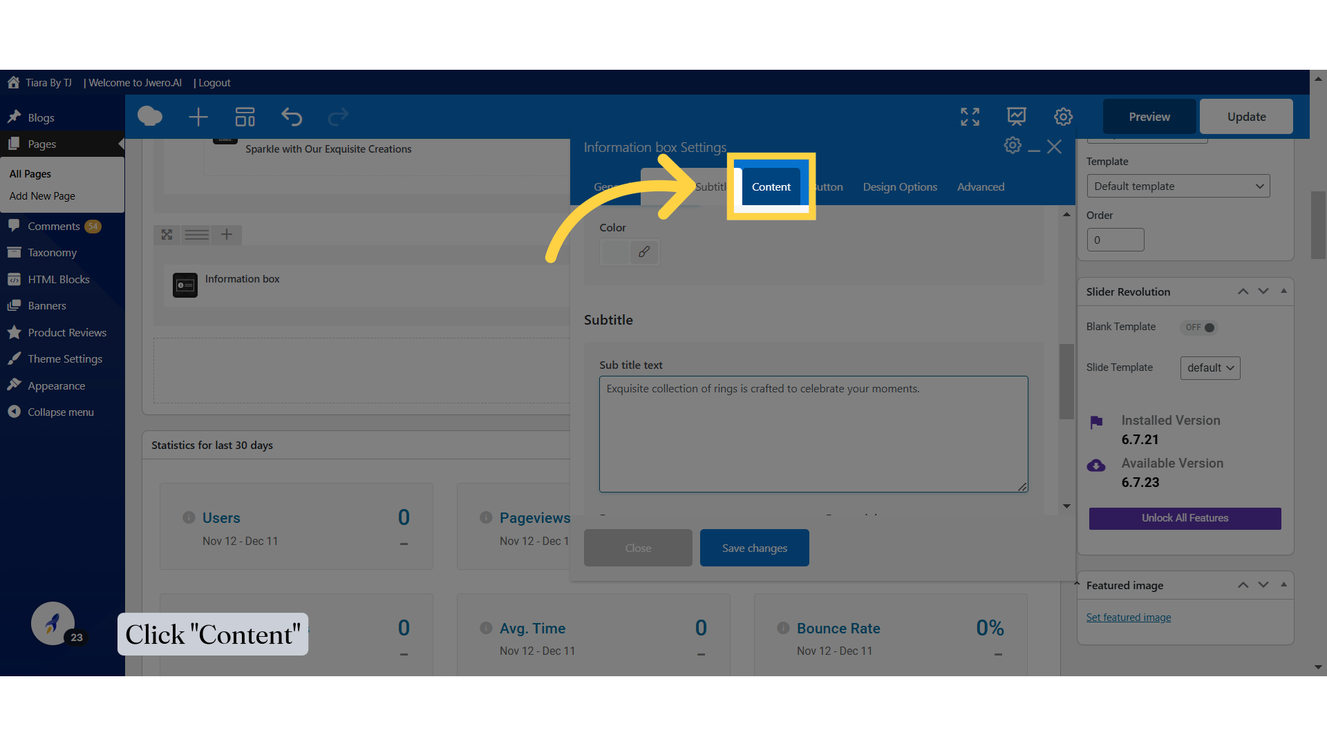
26. Sets the vertical spacing between lines of text in the title. You can adjust this value for different devices (e.g., desktop, tablet, mobile).
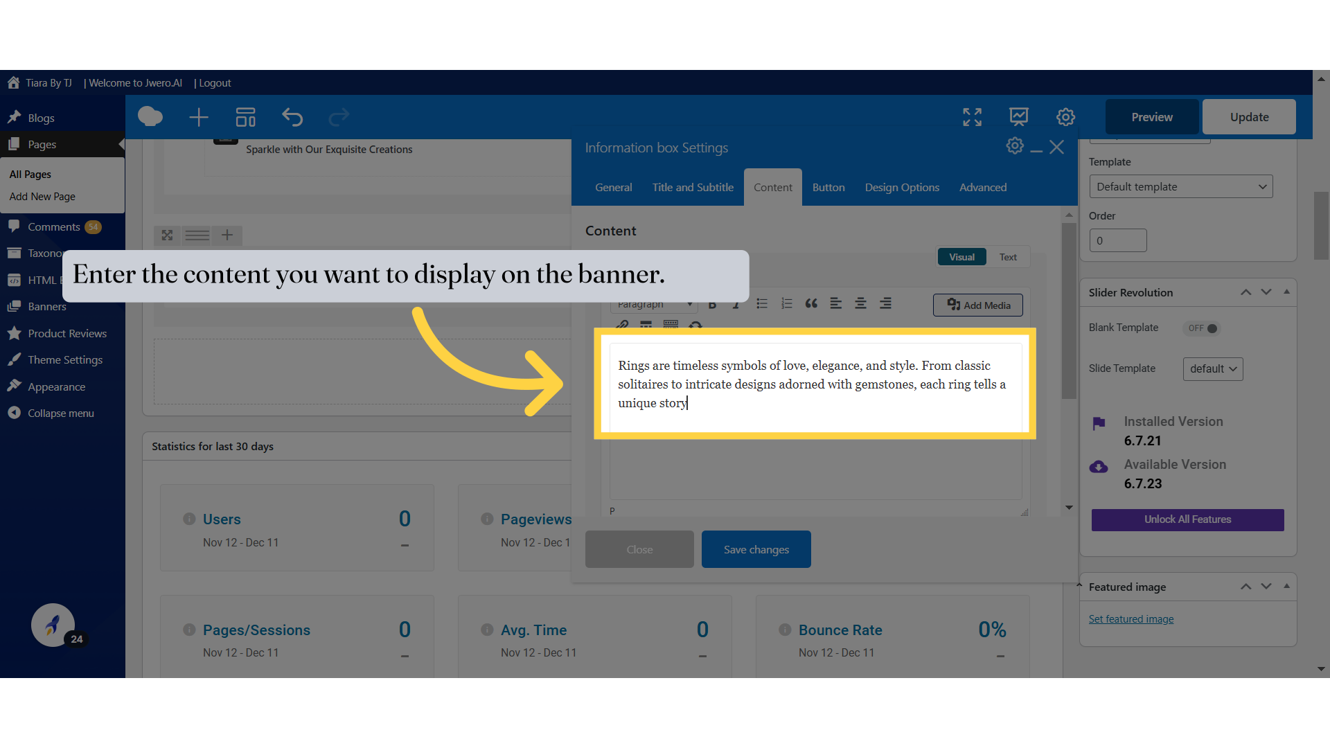
27. Let's move to "Content" section.
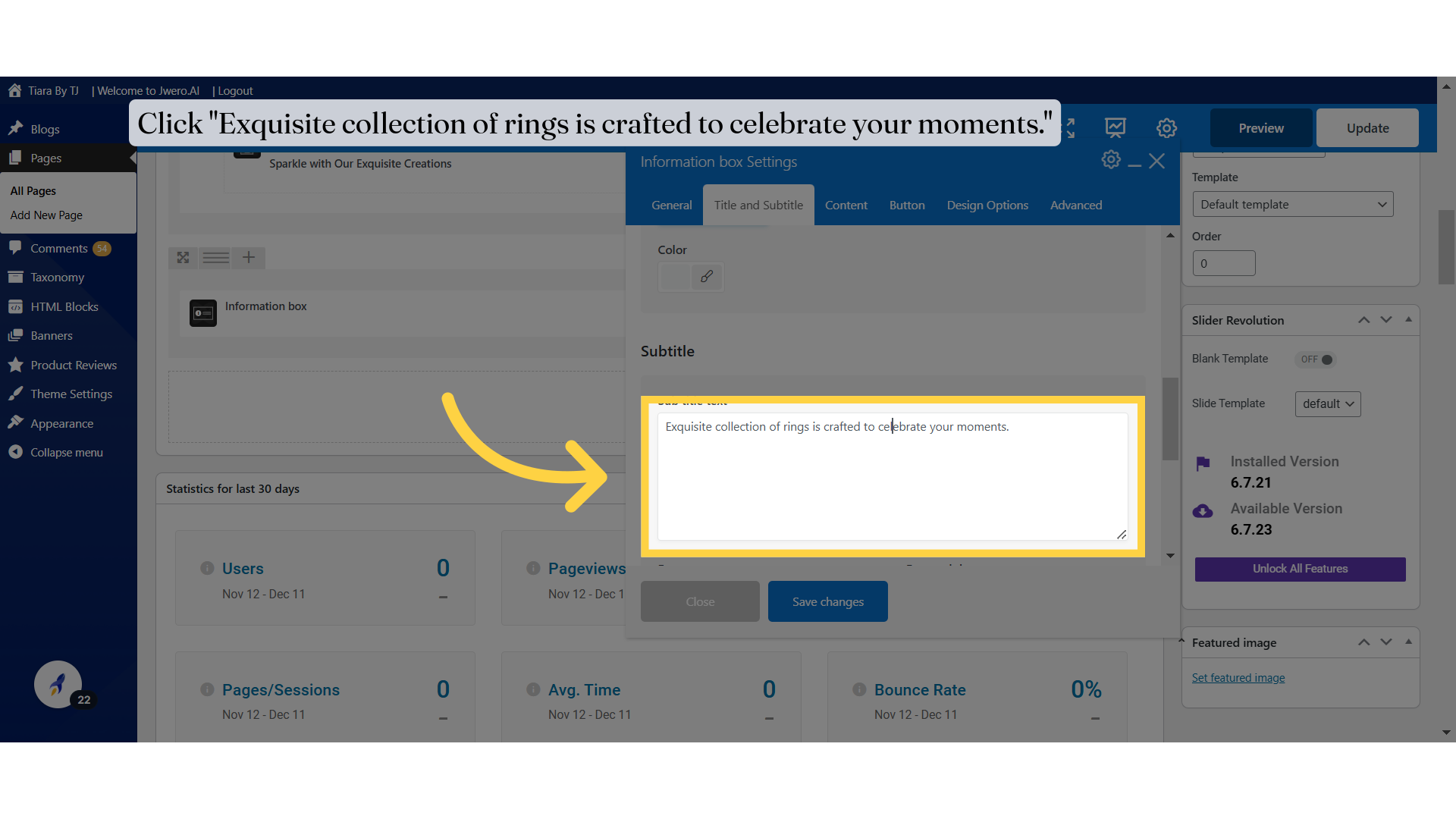
28. Click "Exquisite collection of rings is crafted to celebrate your moments."
29. Click "Content"
30. Enter the content you want to display on the banner.
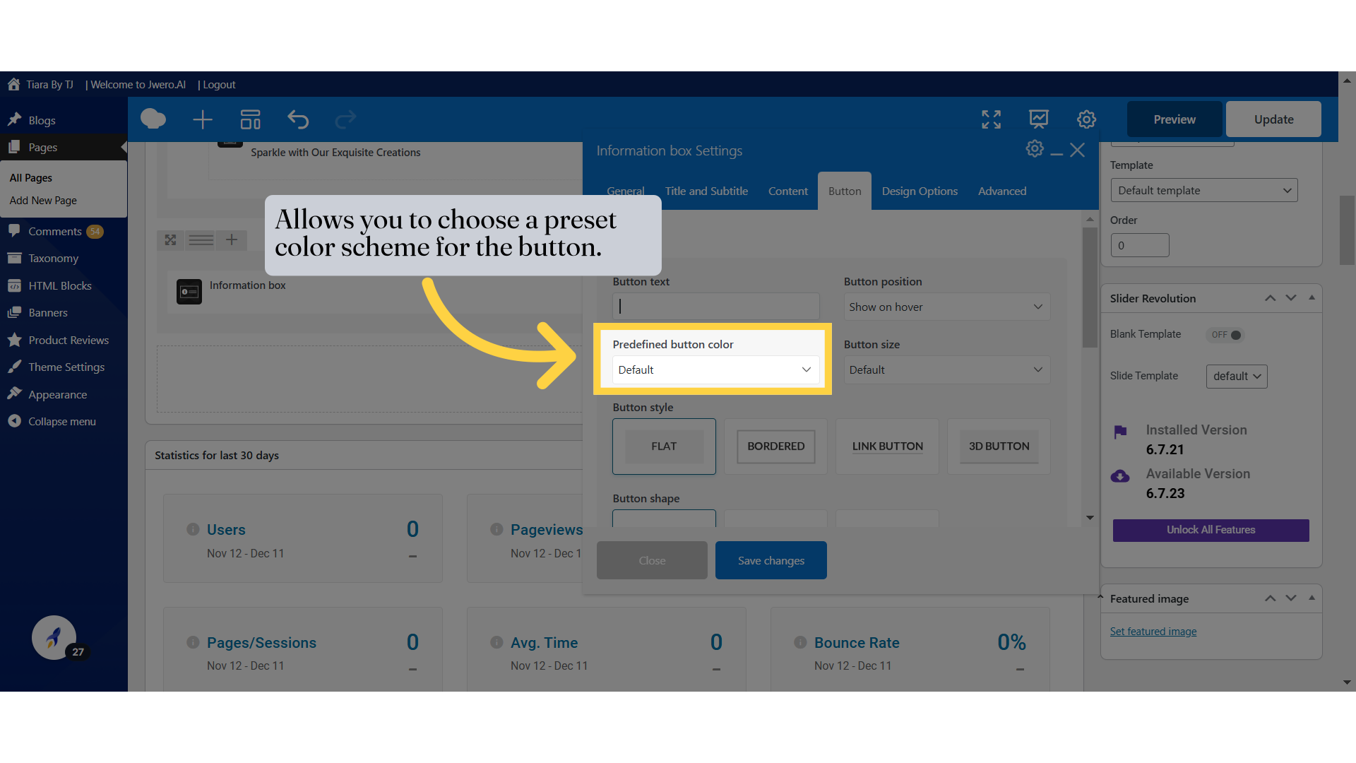
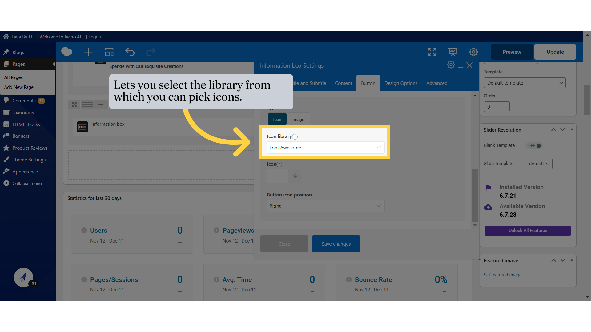
39. Lets you select the library from which you can pick icons.
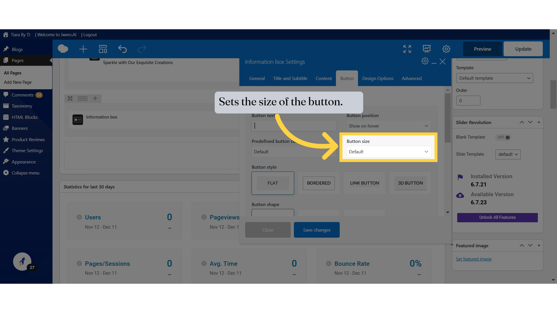
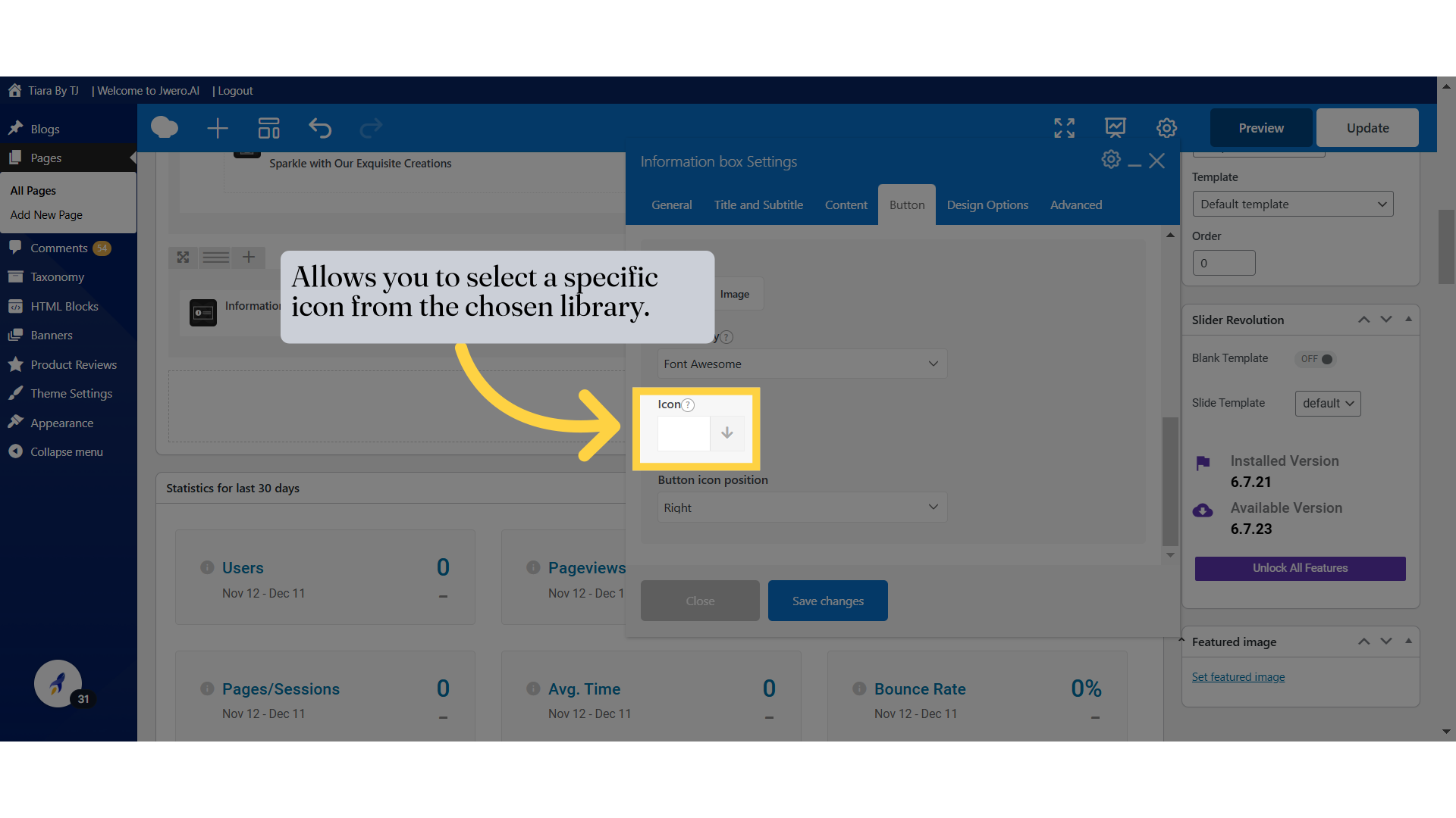
40. Allows you to select a specific icon from the chosen library.
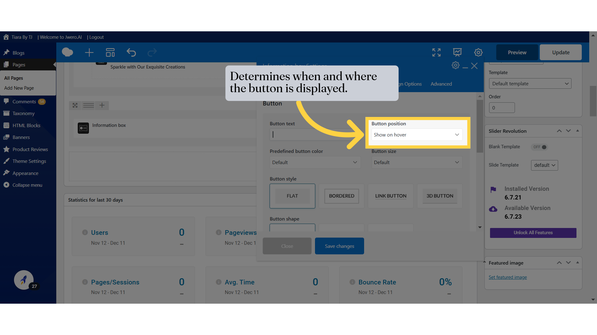
41. Determines where the icon will appear relative to the text on the button.
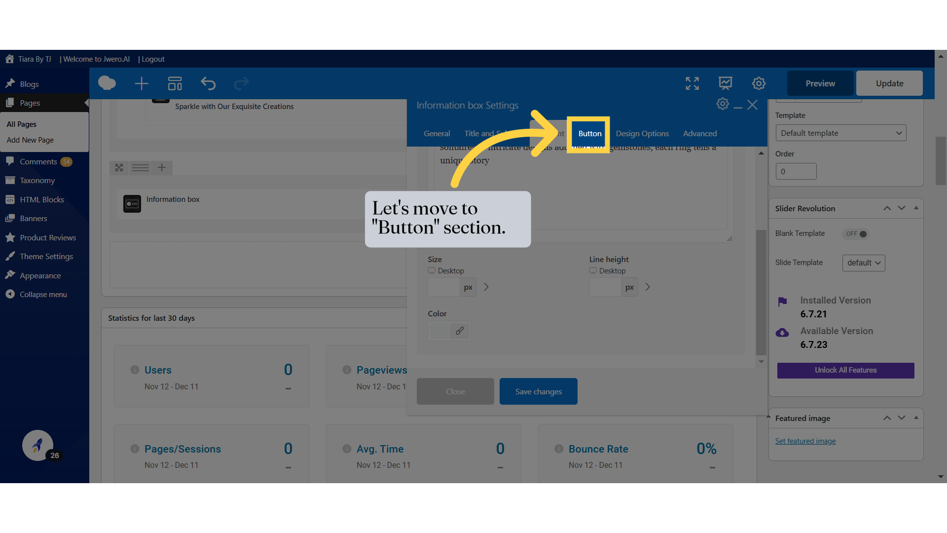
42. Let's move to "Design Options" section.
43. To learn more about "Design Options", search for the video "Design Options Of Elements".
44. Once all configurations are complete, click on "Save Changes" to apply them.