Image Element
Image Element
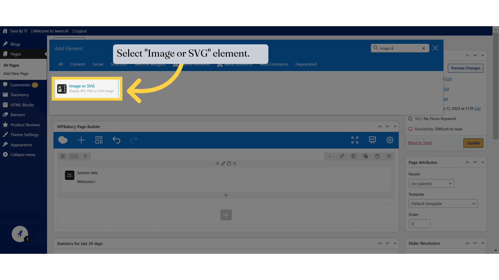
1. Select "Image or SVG" element.
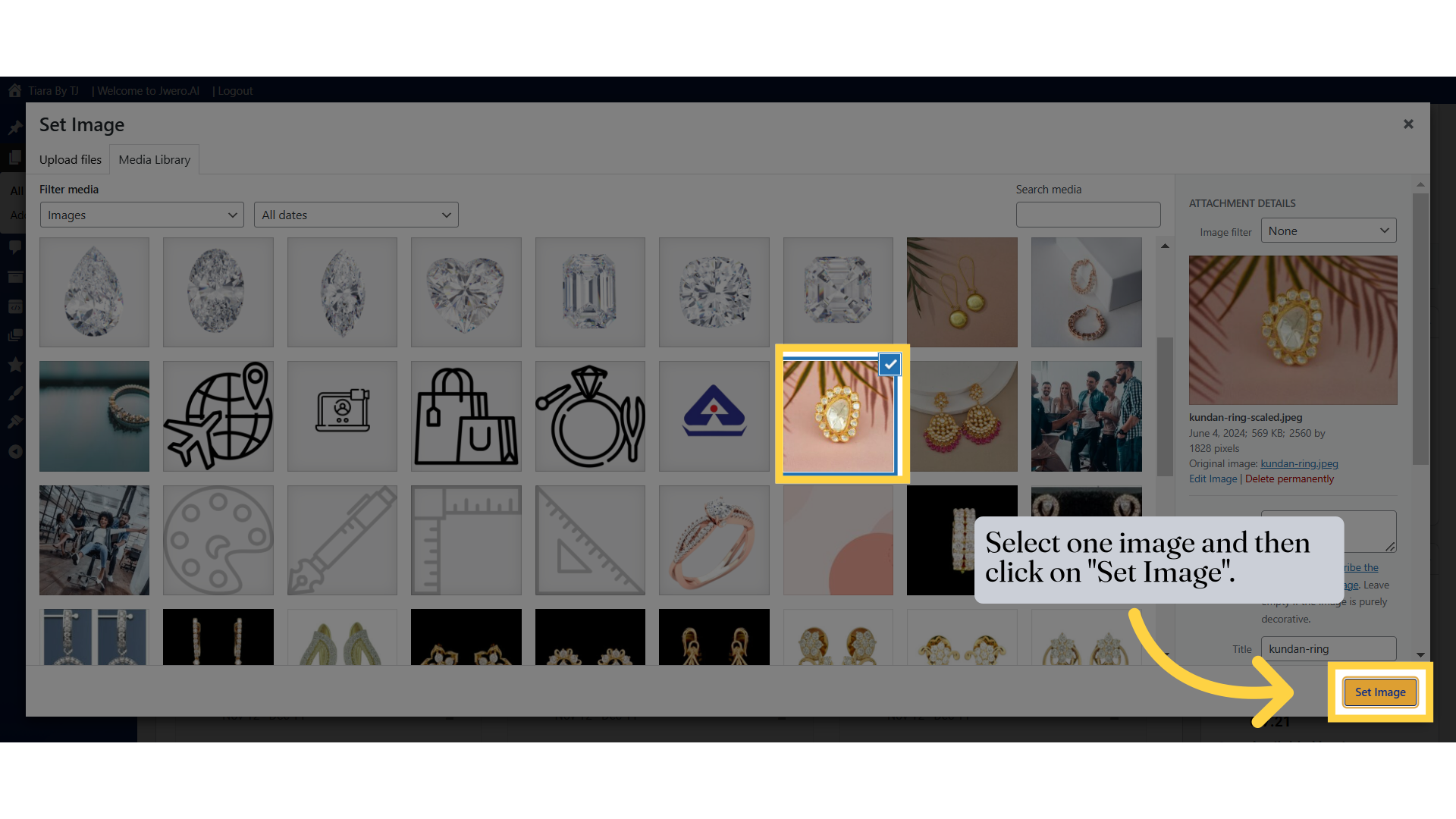
3. Select one image and then click on "Set Image".
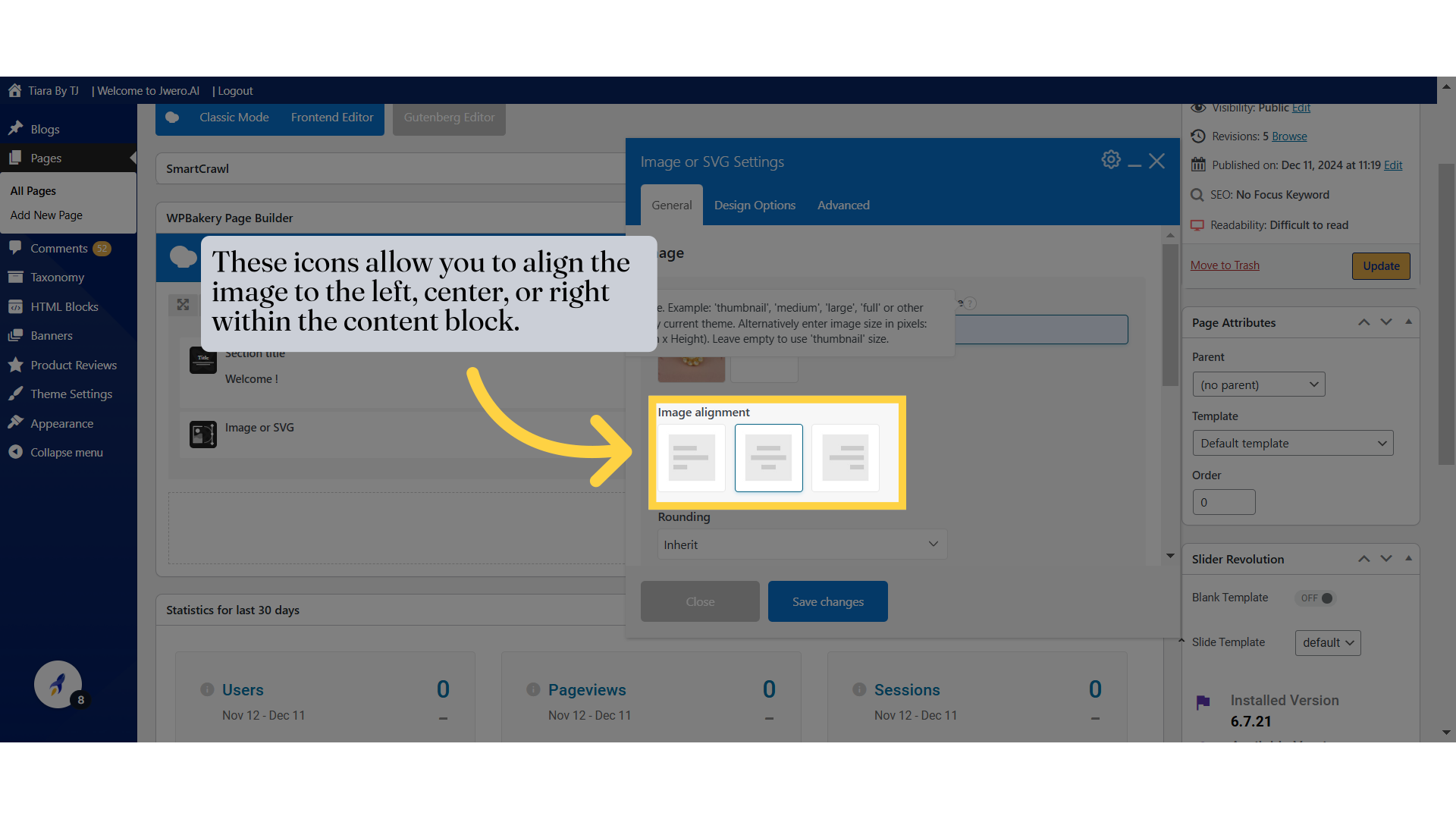
4. Click "Image alignmentLeftCenterRight"
5. These icons allow you to align the image to the left, center, or right within the content block.
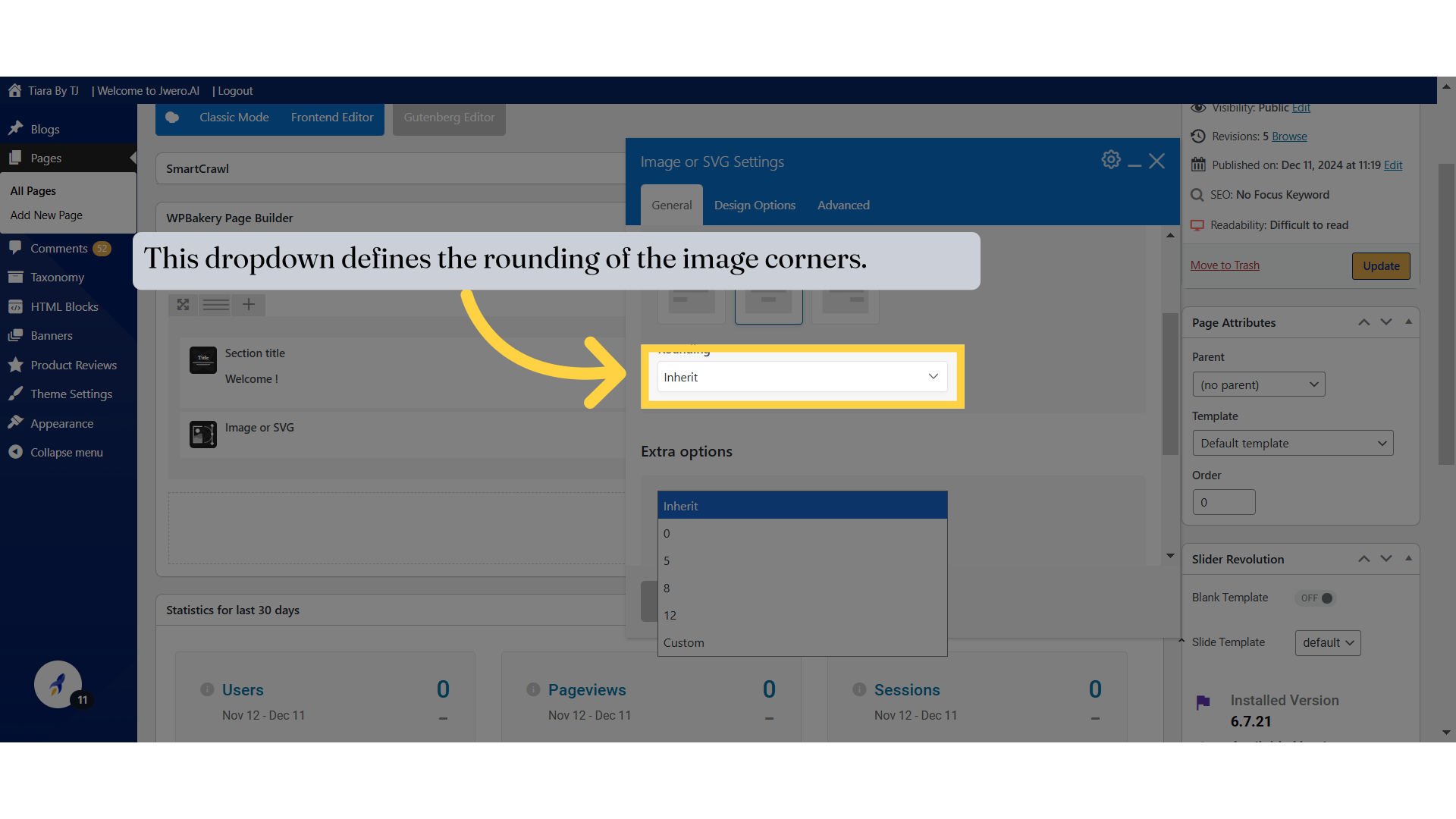
6. This dropdown defines the rounding of the image corners.
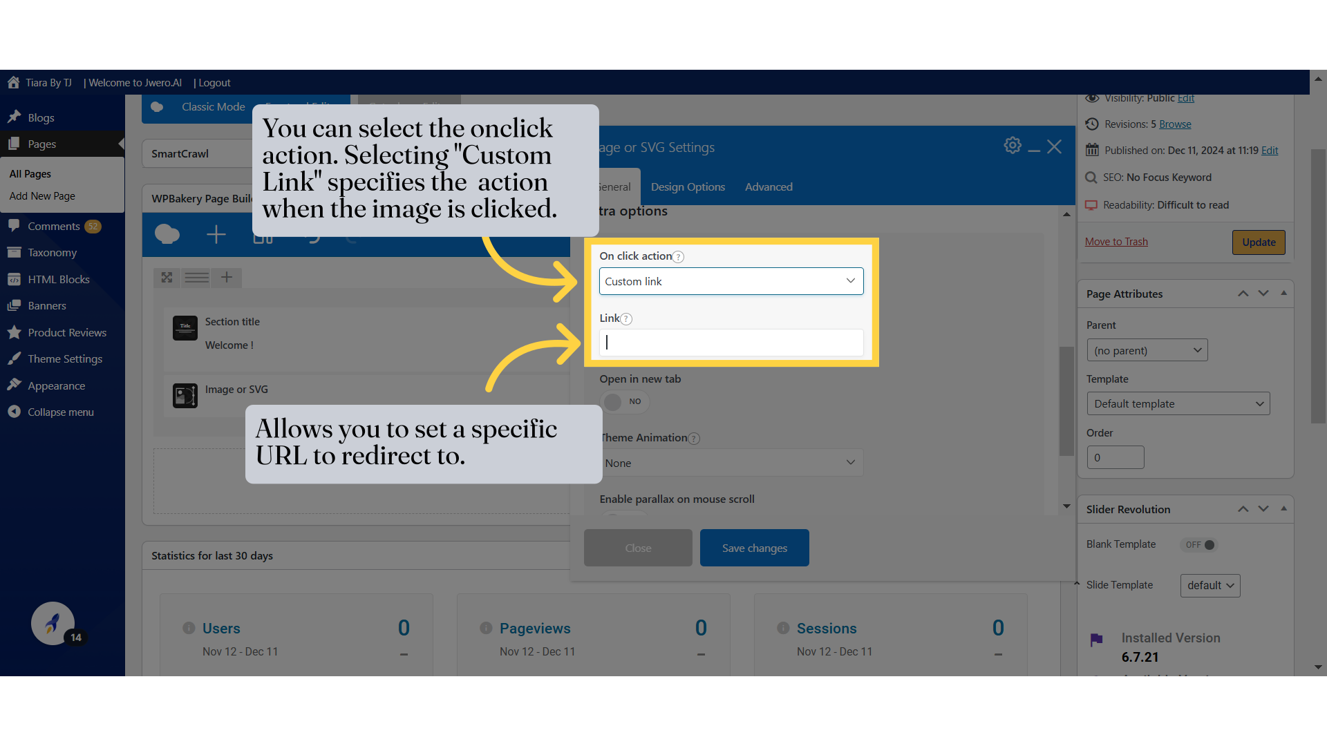
7. You can select the onclick action. Selecting "Custom Link" specifies the action when the image is clicked.
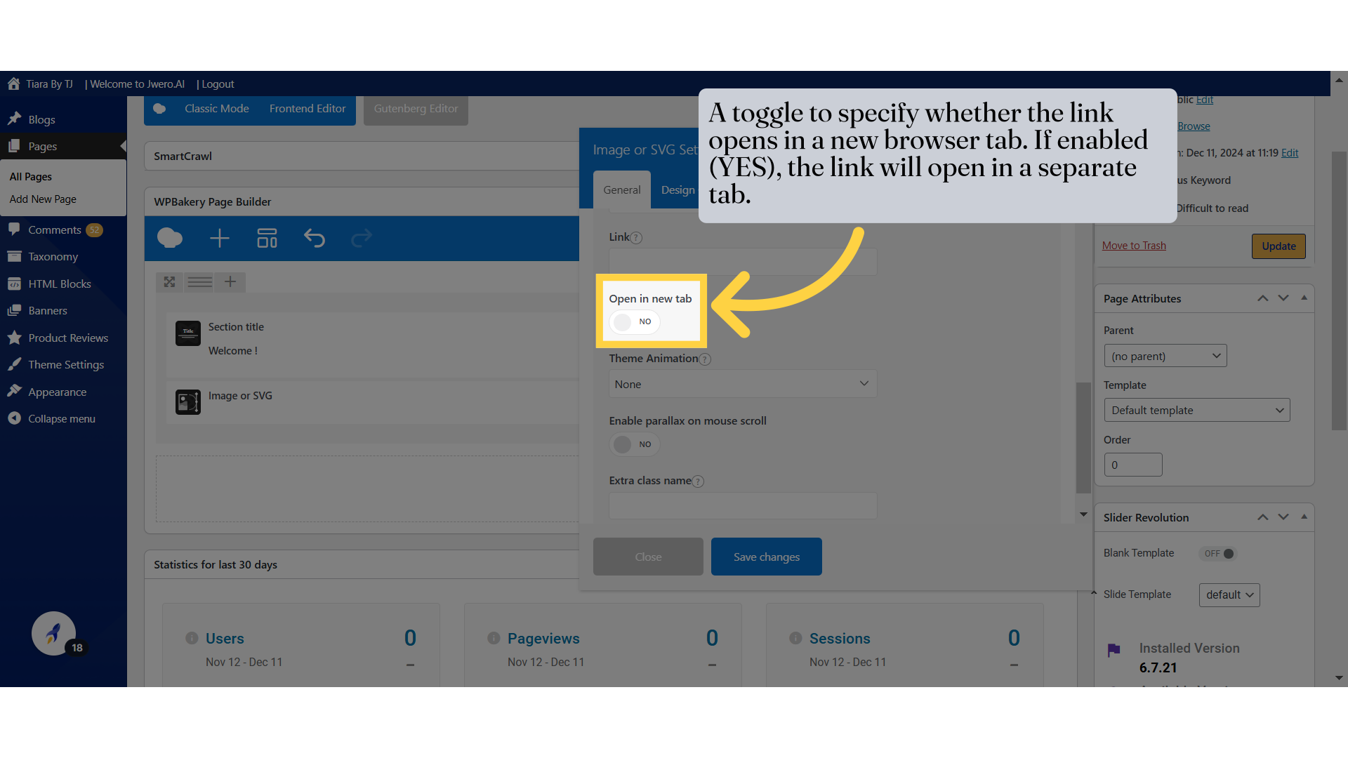
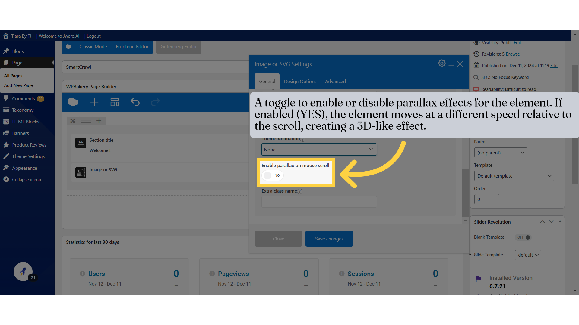
8. A toggle to specify whether the link opens in a new browser tab. If enabled (YES), the link will open in a separate tab.
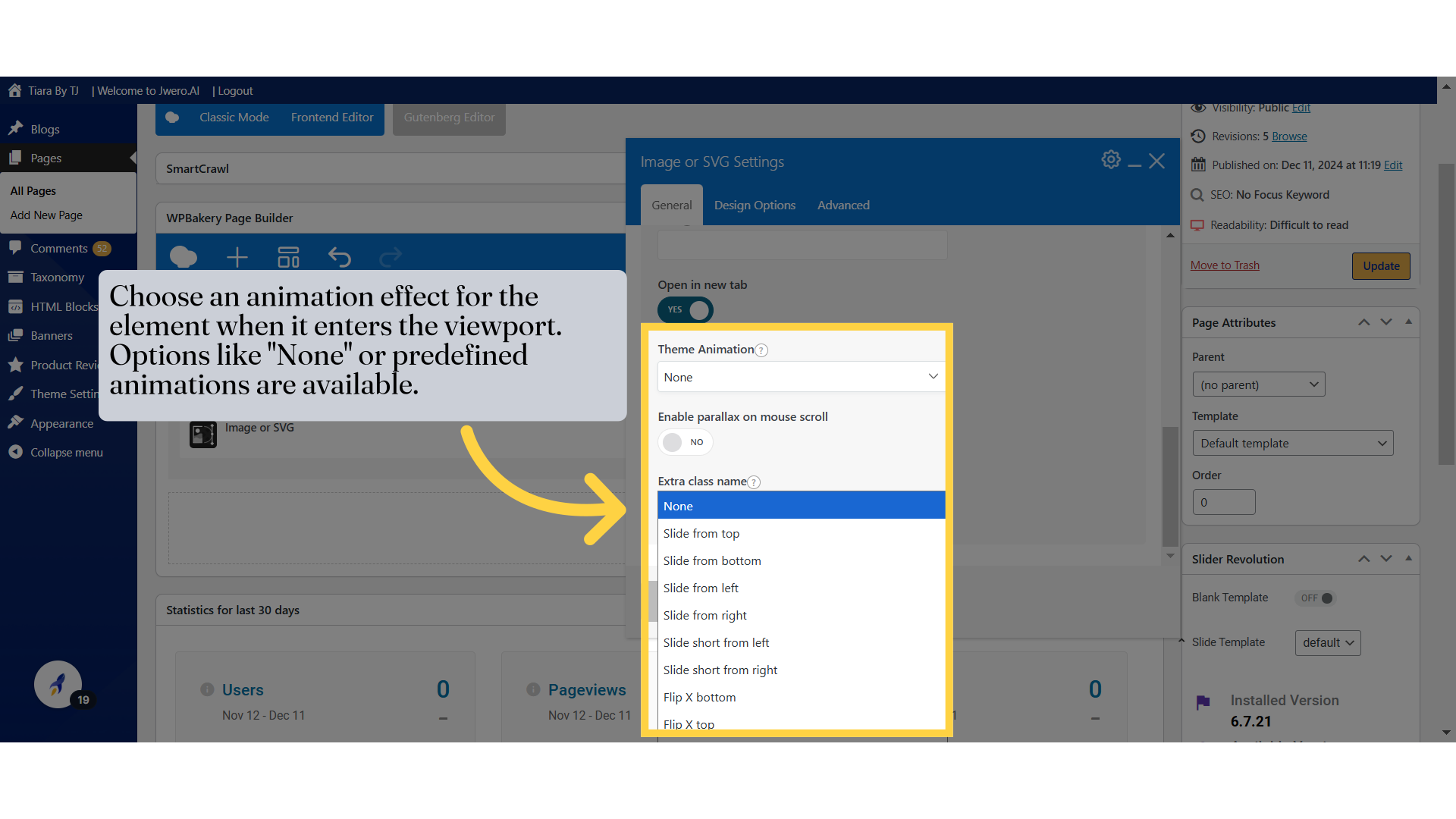
9. Choose an animation effect for the element when it enters the viewport. Options like "None" or predefined animations are available.
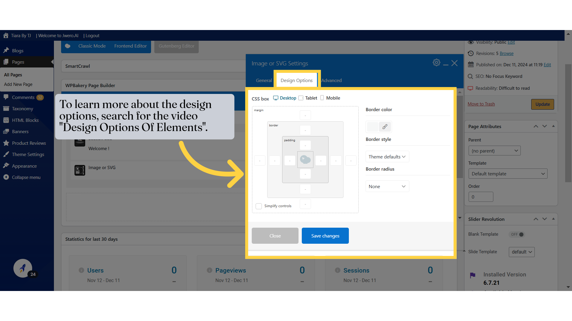
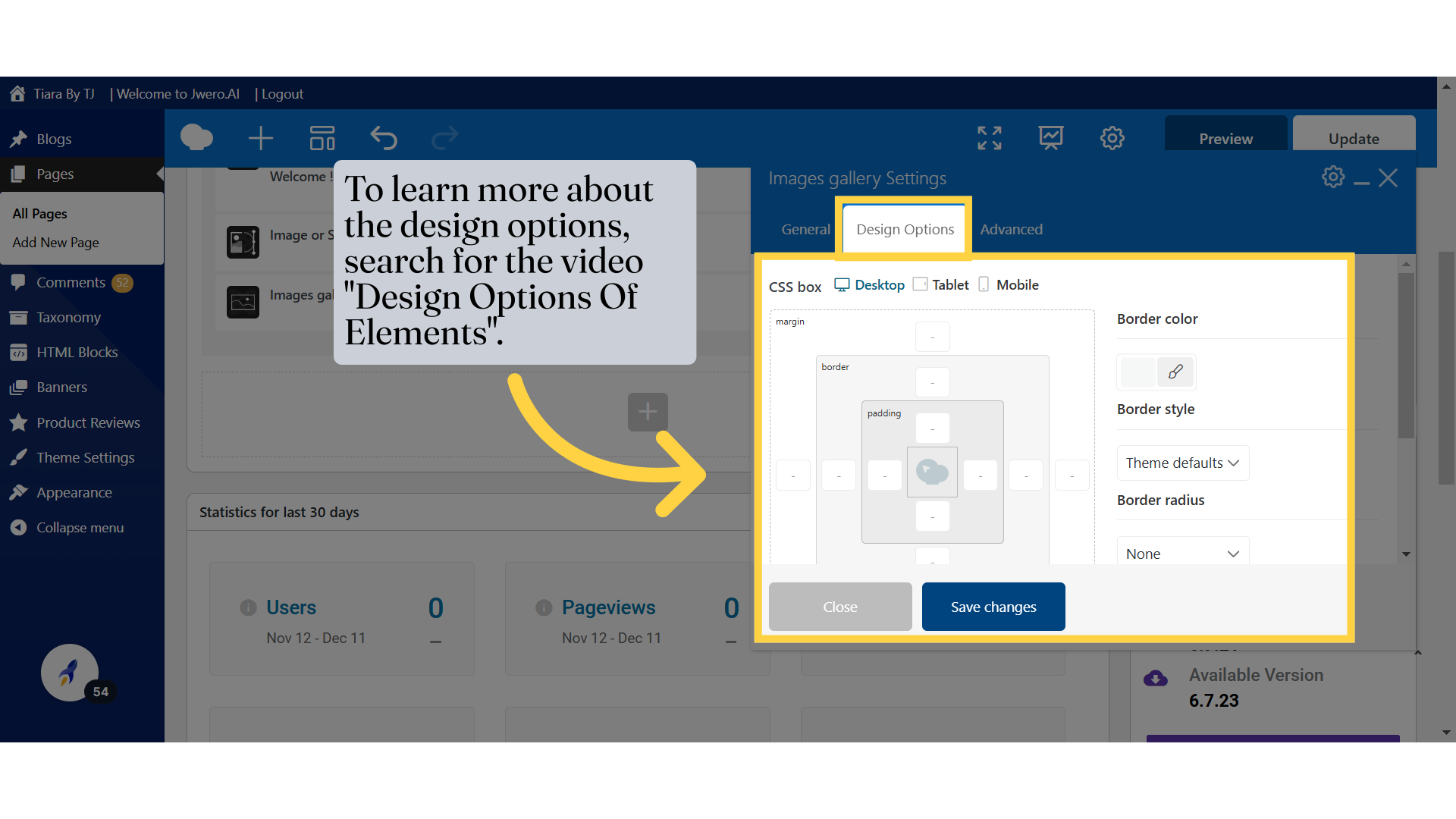
11. To learn more about the design options, search for the video "Design Options Of Elements".
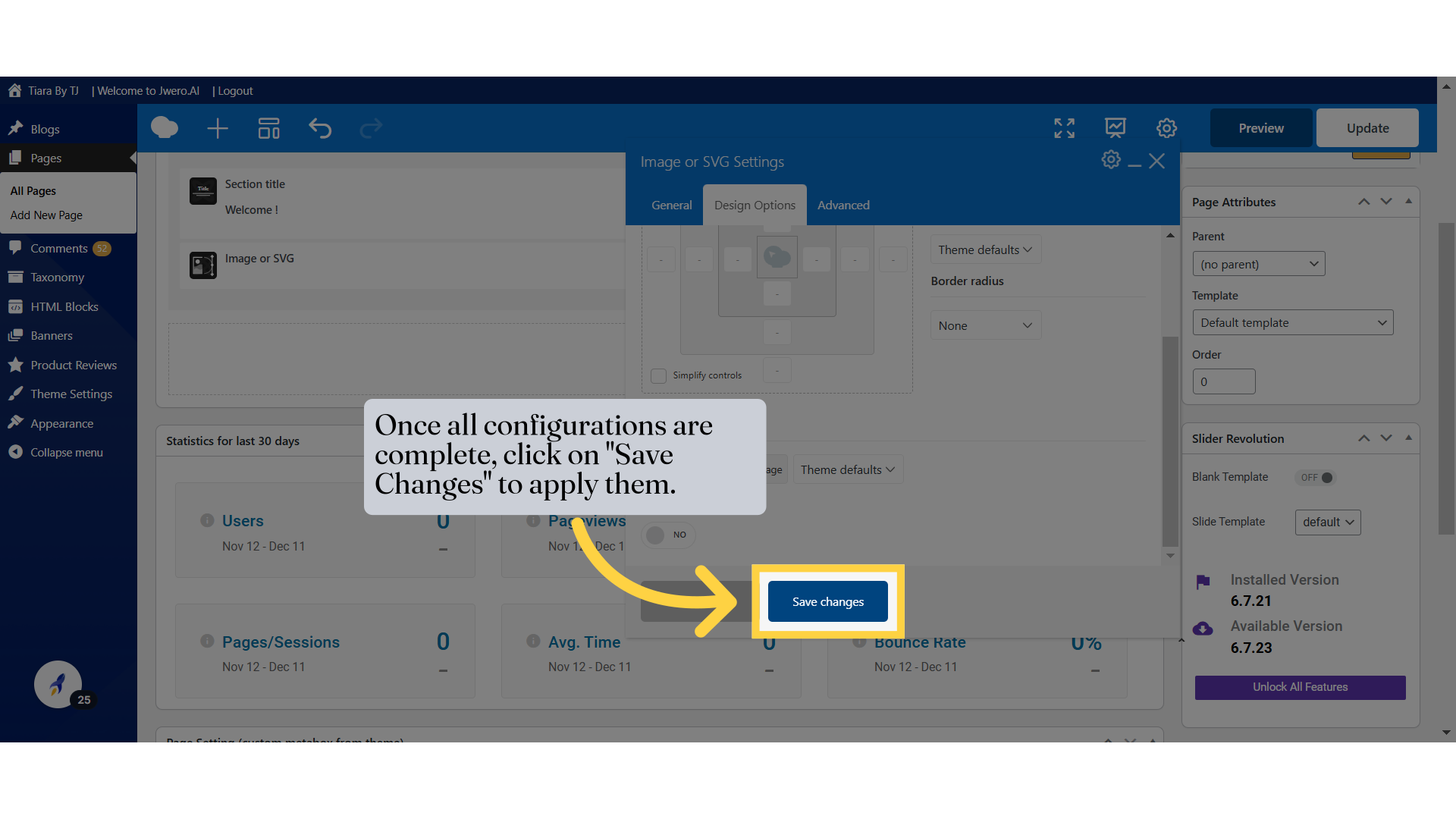
12. Once all configurations are complete, click on "Save Changes" to apply them.
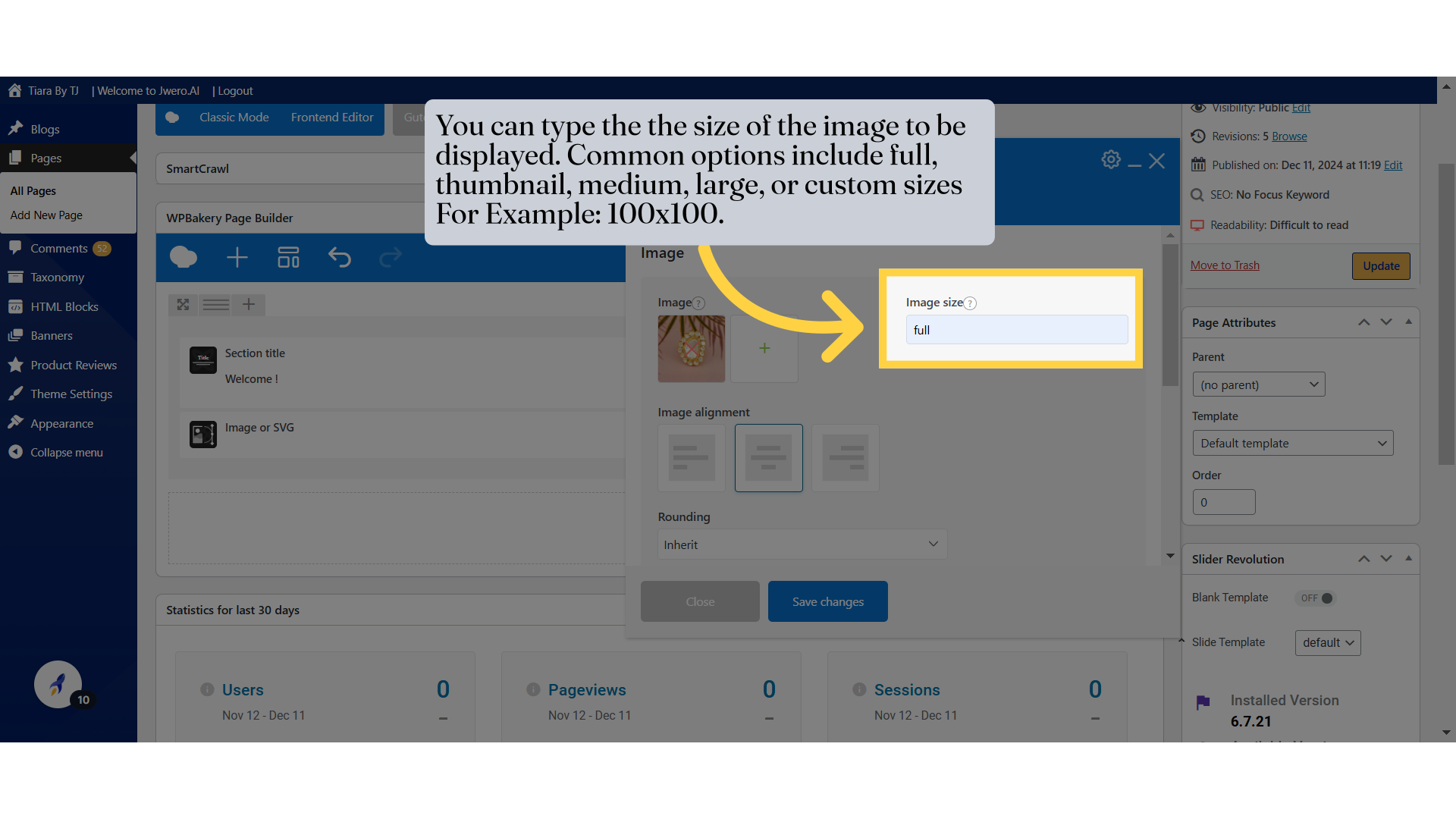
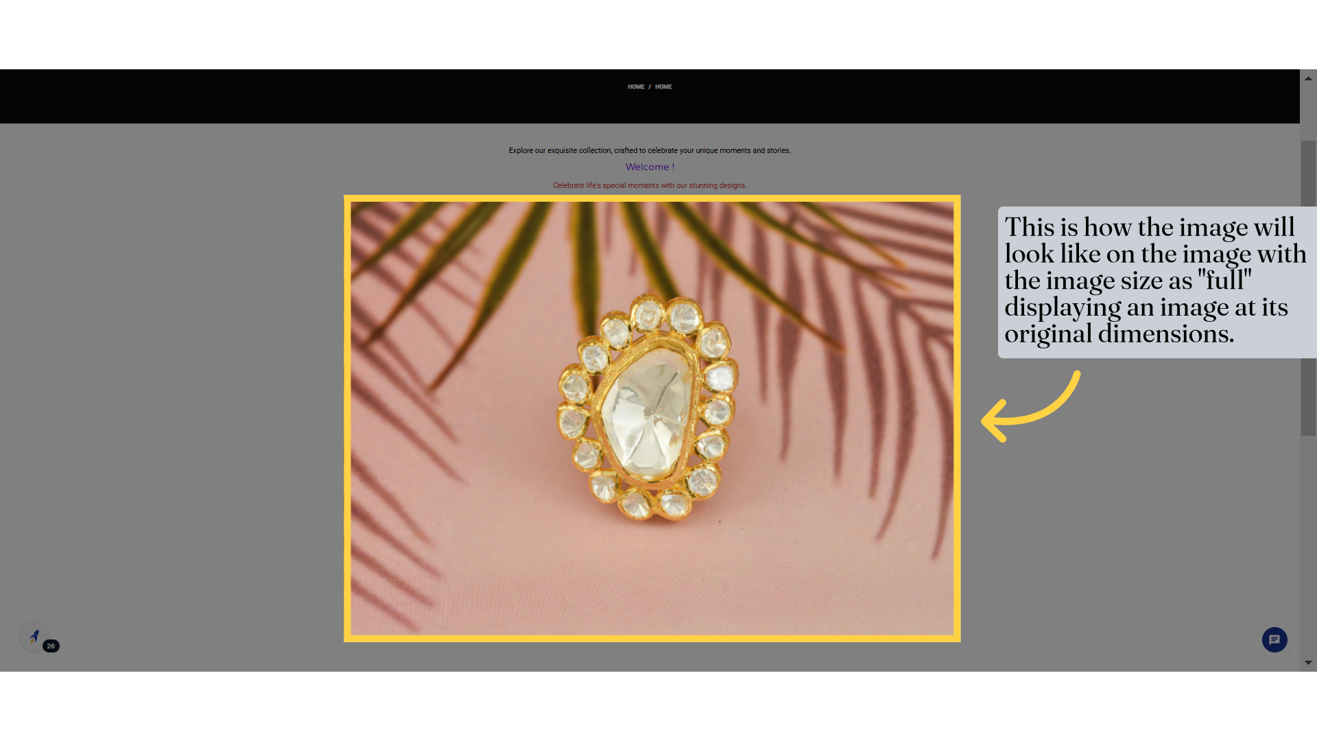
13. This is how the image will look like on the image with the image size as "full" displaying an image at its original dimensions.
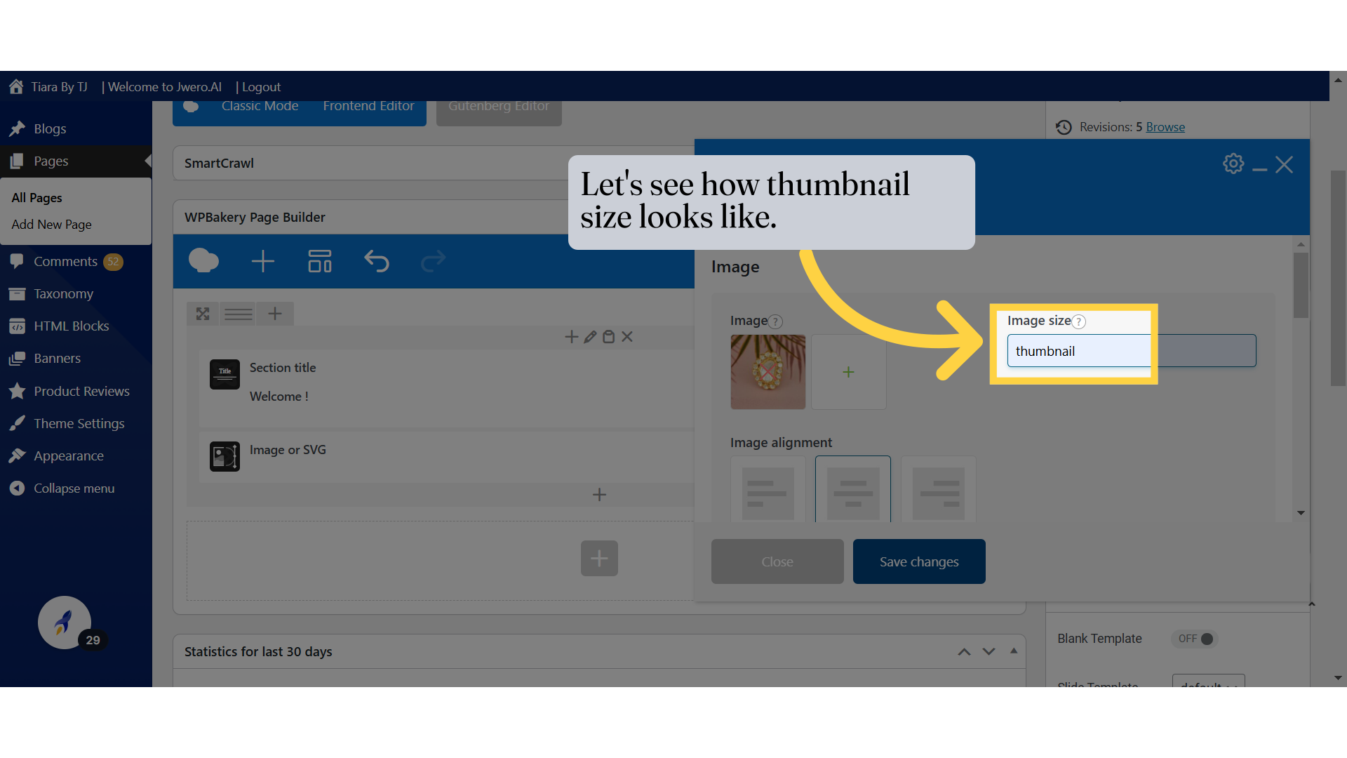
14. Let's see how thumbnail size looks like.
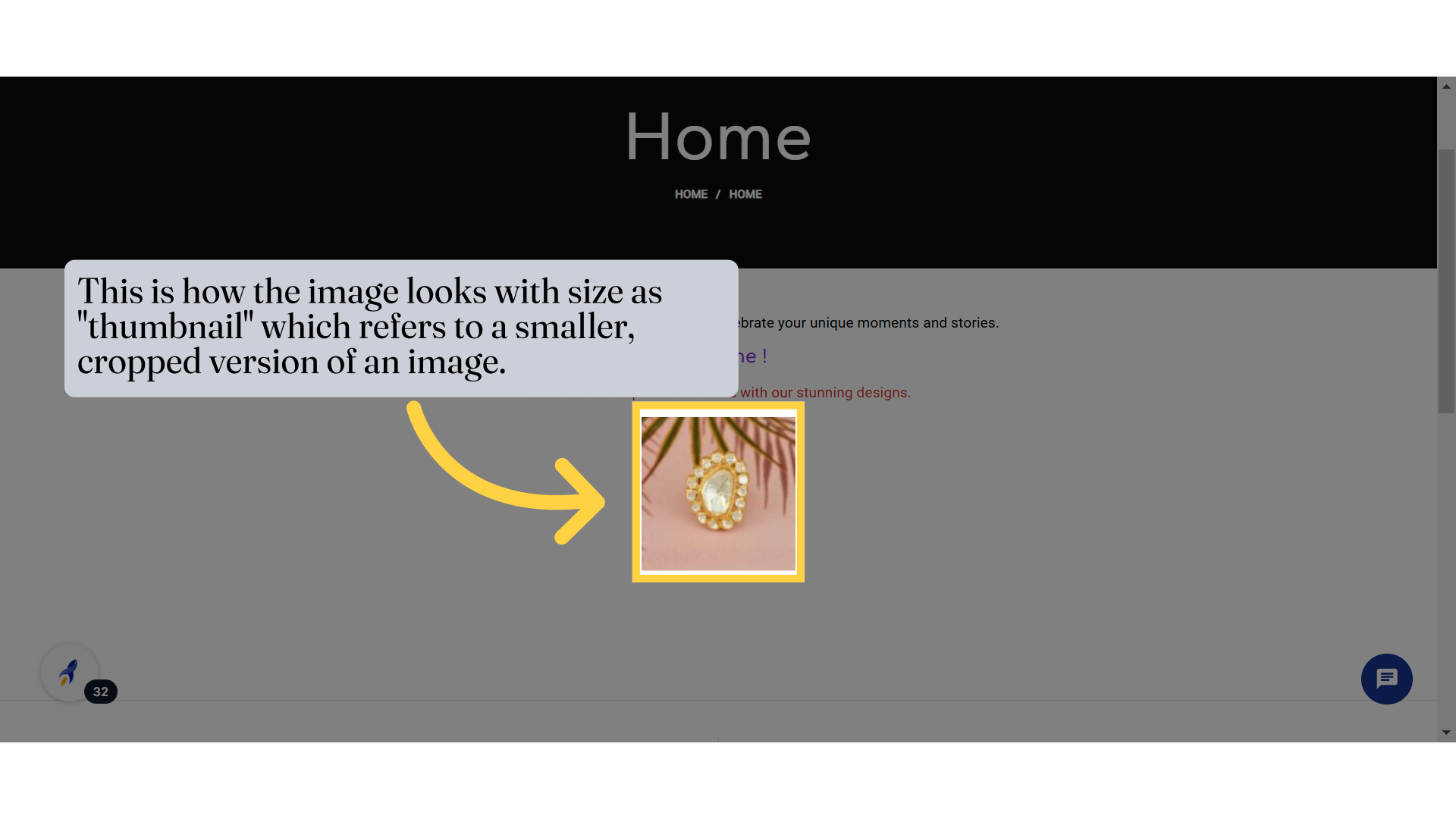
15. This is how the image looks with size as "thumbnail" which refers to a smaller, cropped version of an image.
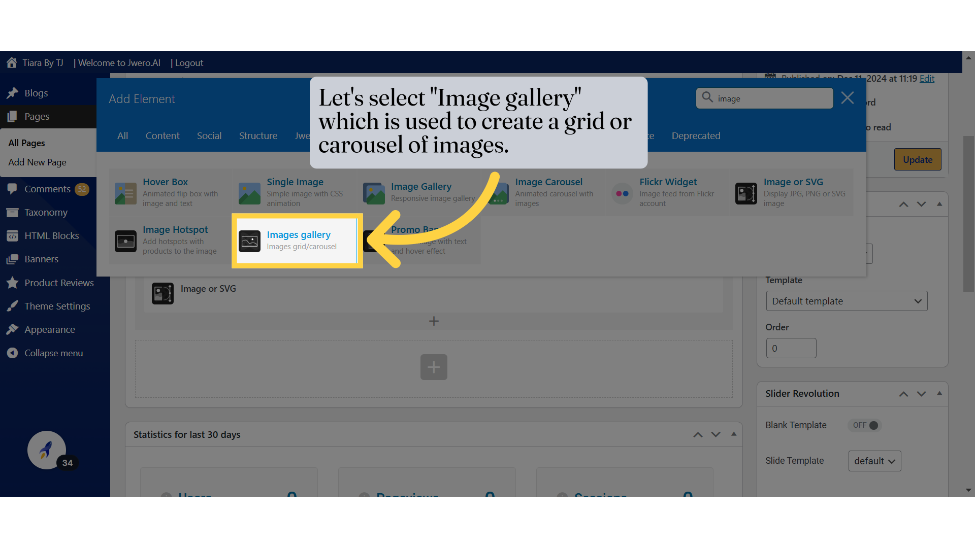
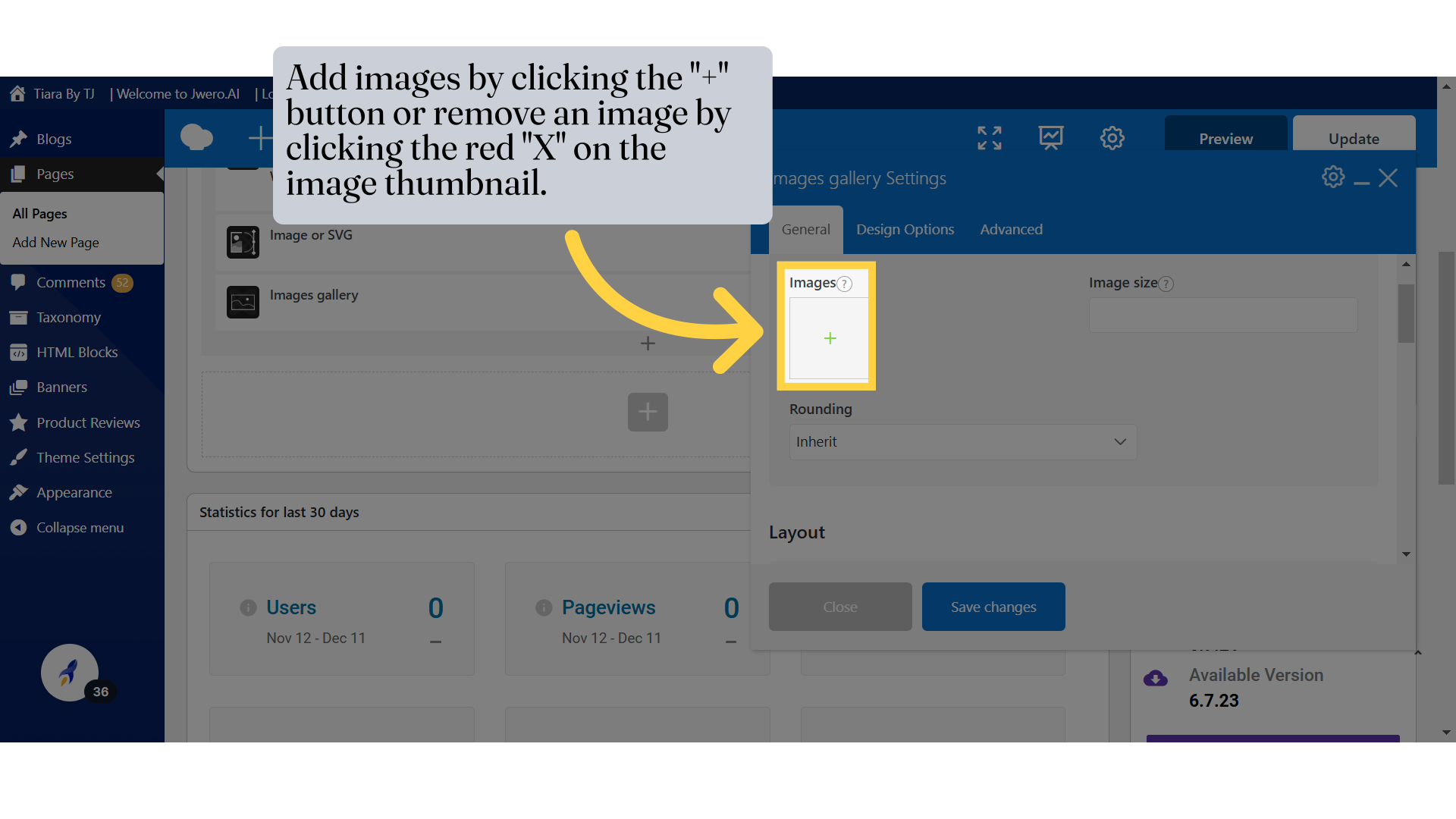
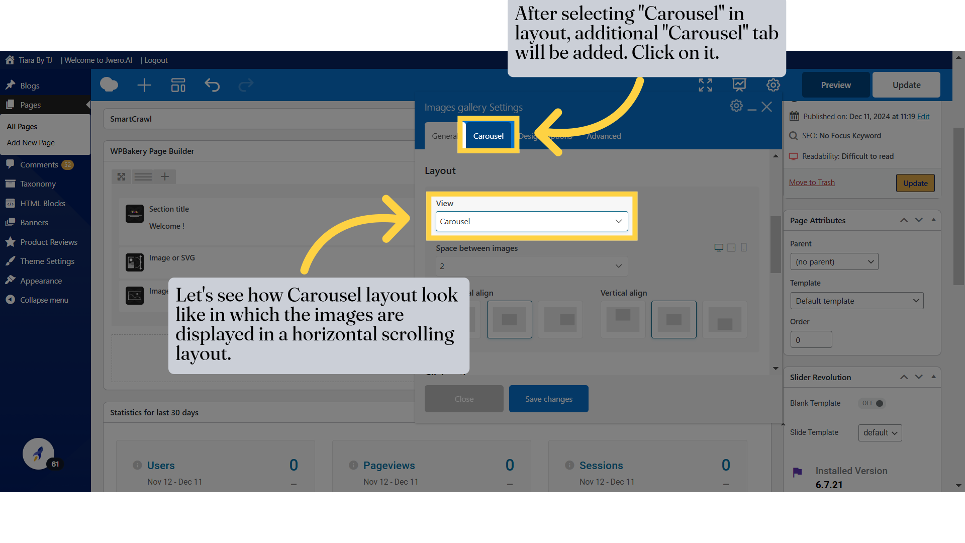
16. Let's select "Image gallery" which is used to create a grid or carousel of images.
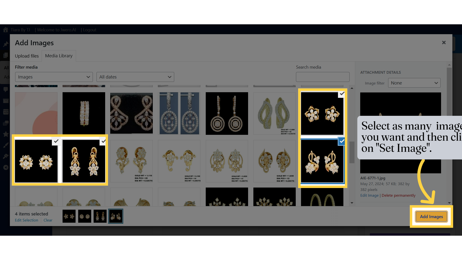
18. Select as many image you want and then click on "Set Image".
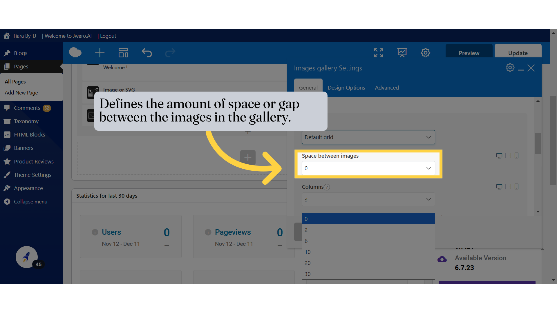
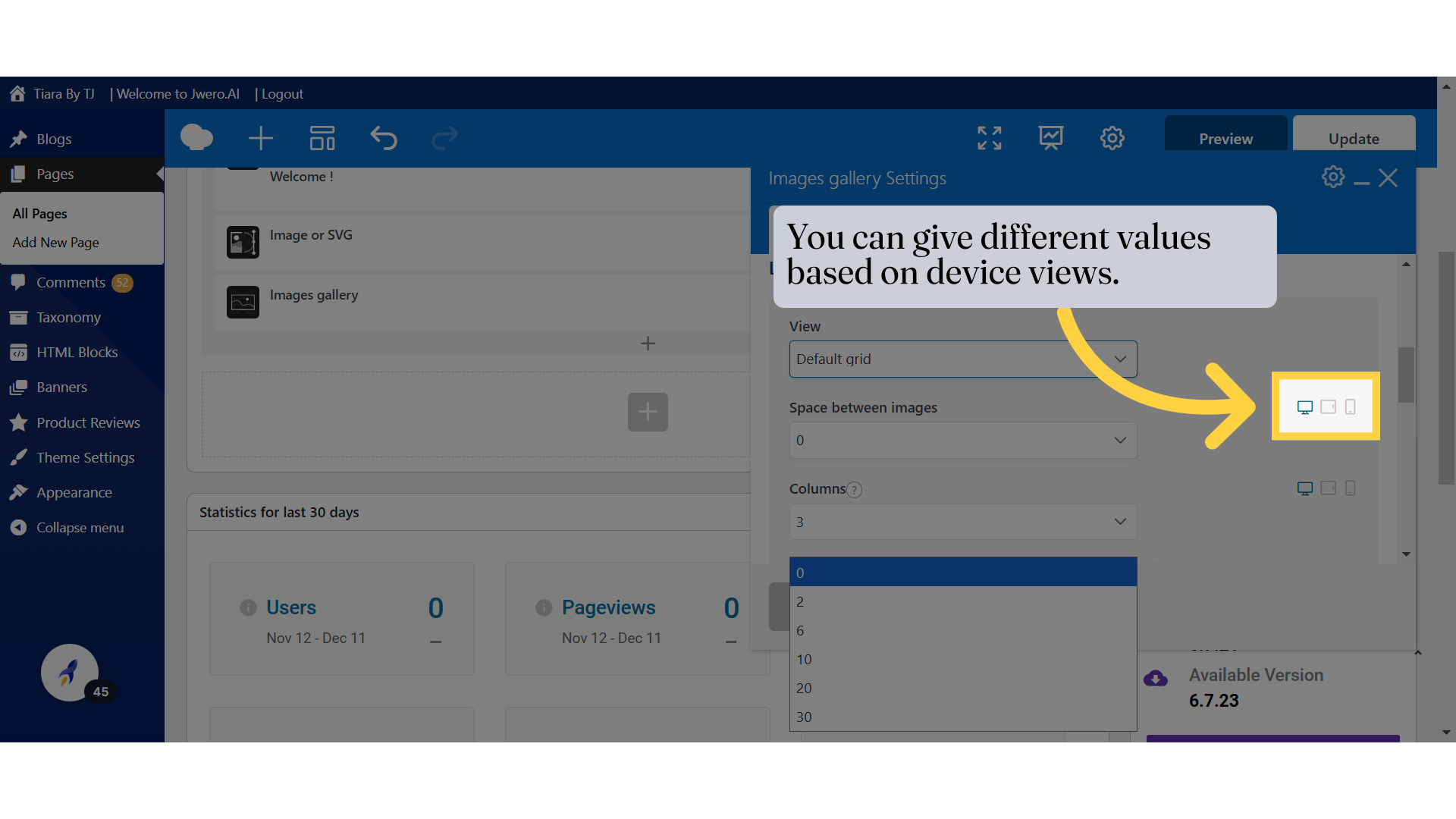
20. Defines the amount of space or gap between the images in the gallery.
21. You can give different values based on device views.
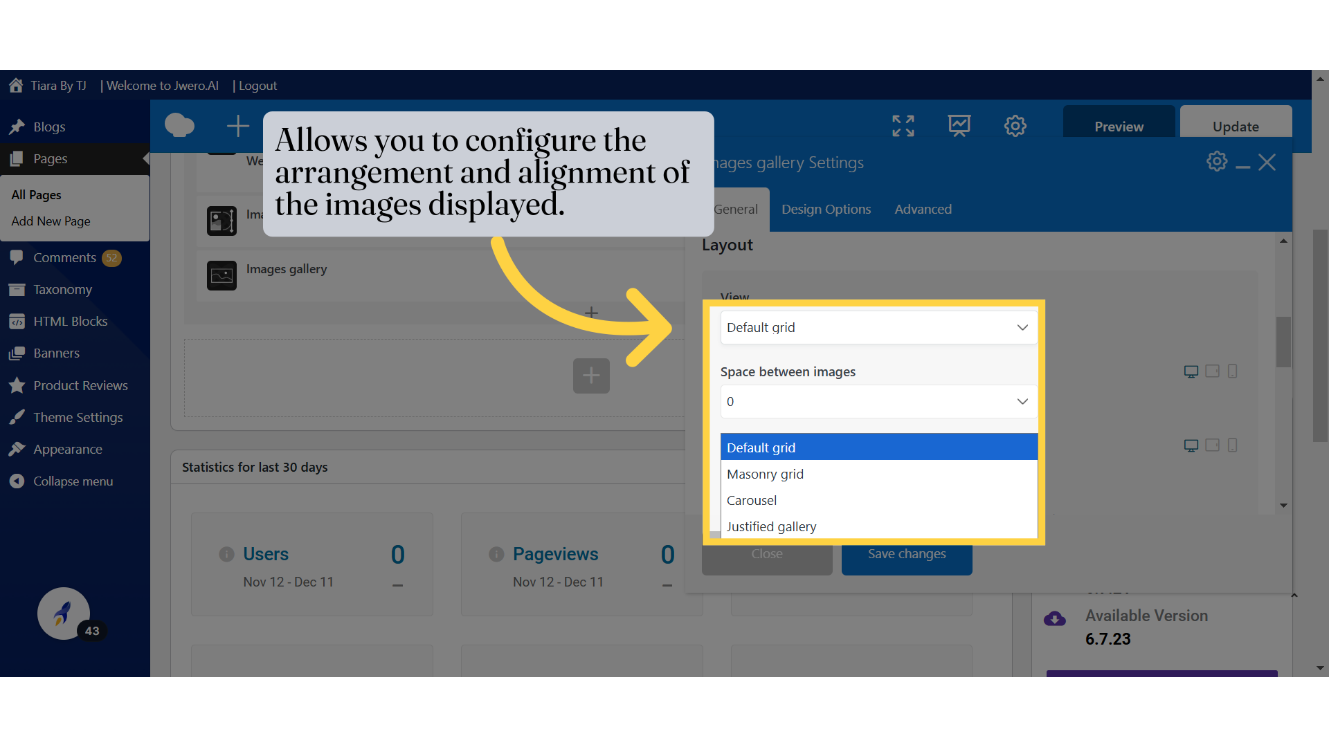
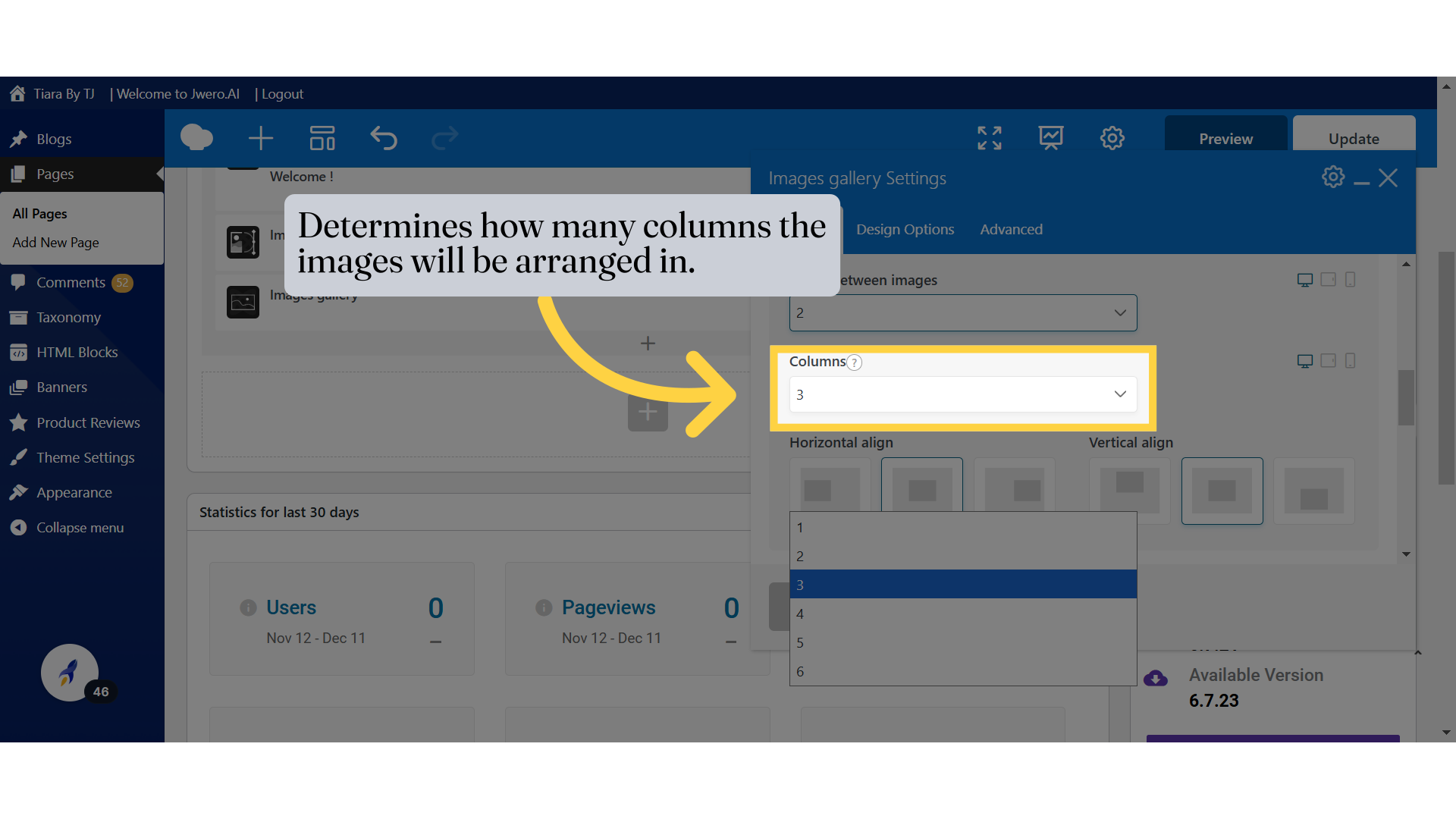
22. Determines how many columns the images will be arranged in.
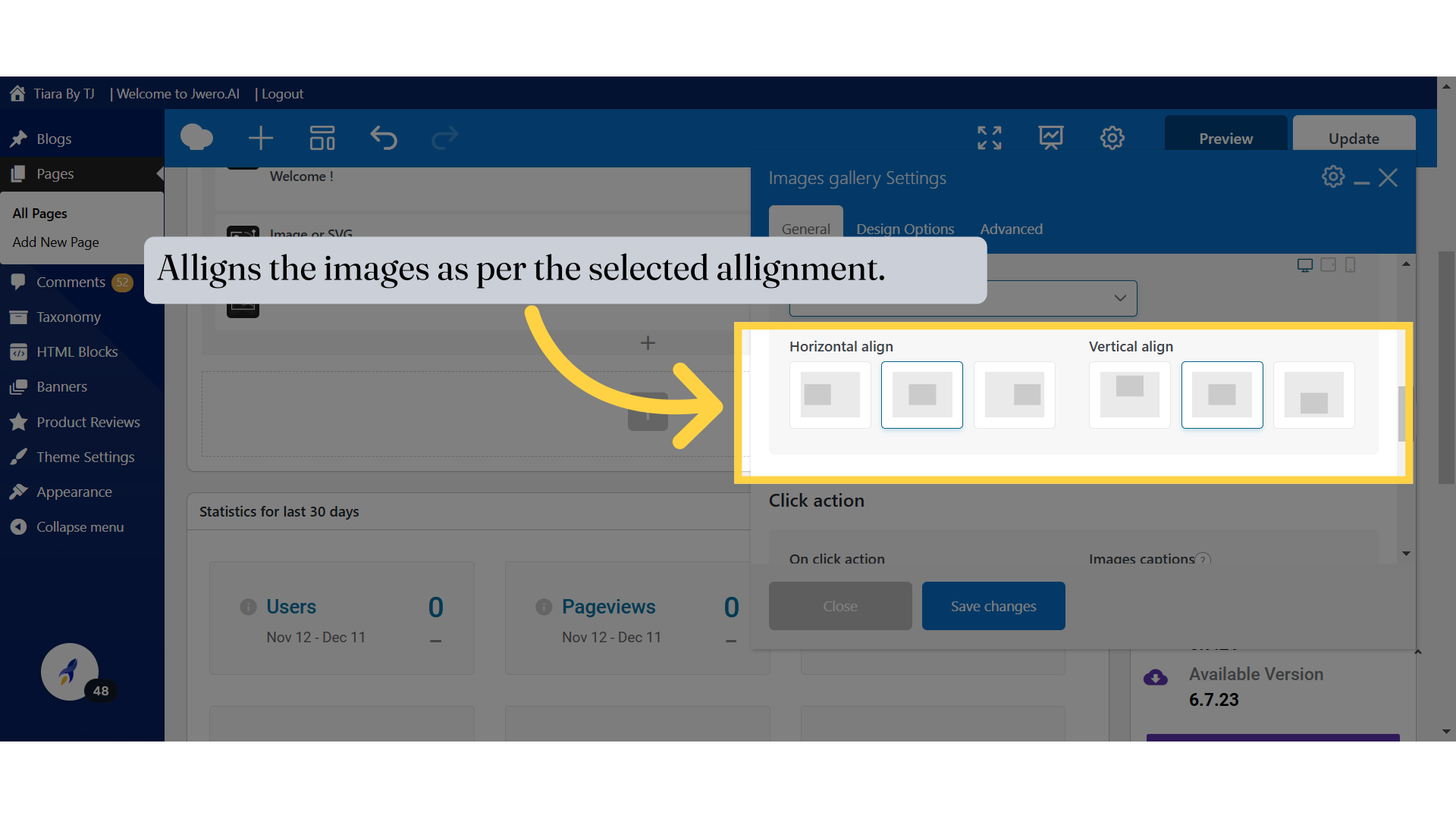
23. Alligns the images as per the selected allignment.
24. To learn more about the design options, search for the video "Design Options Of Elements".
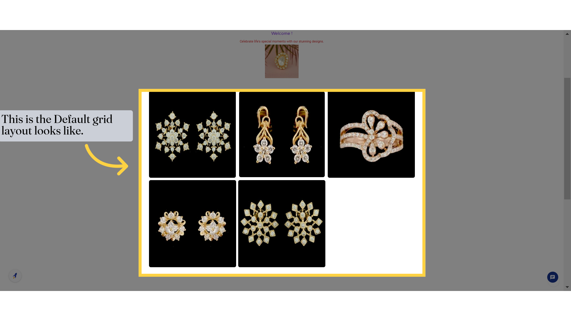
25. This is the Default grid layout looks like.
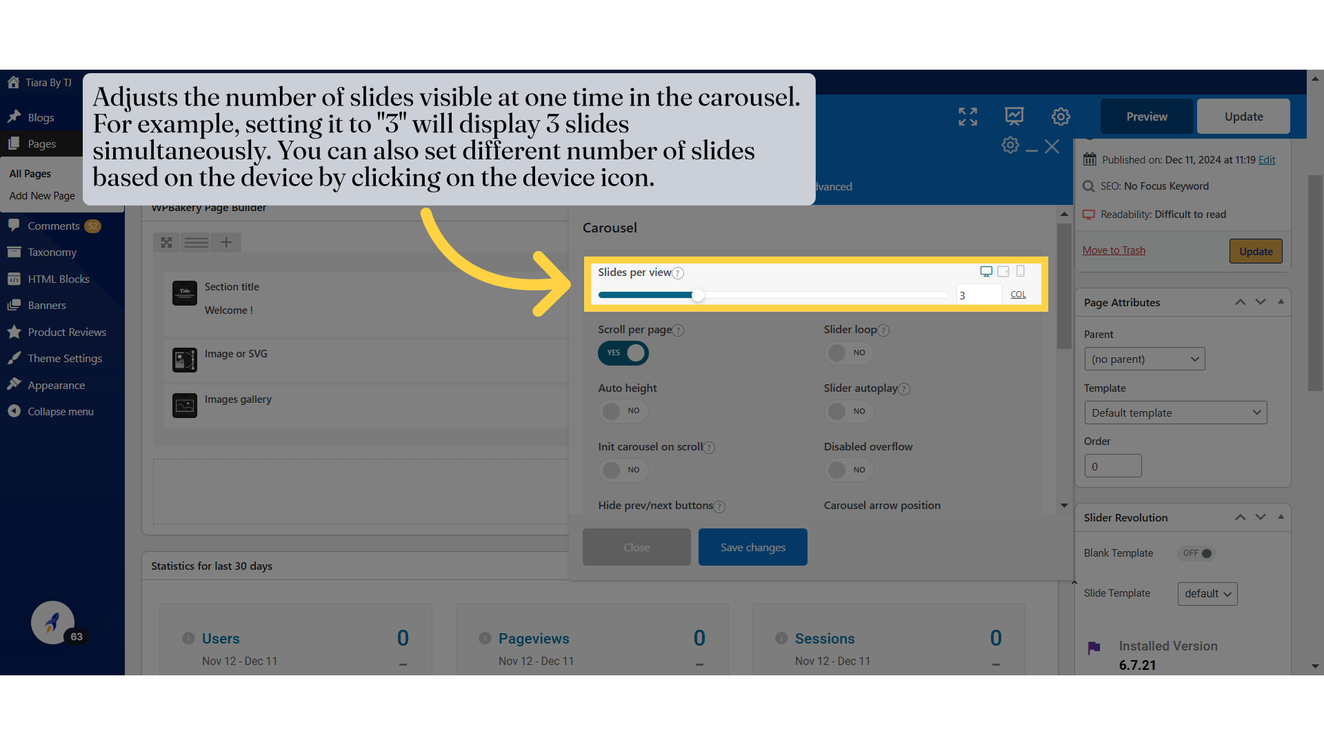
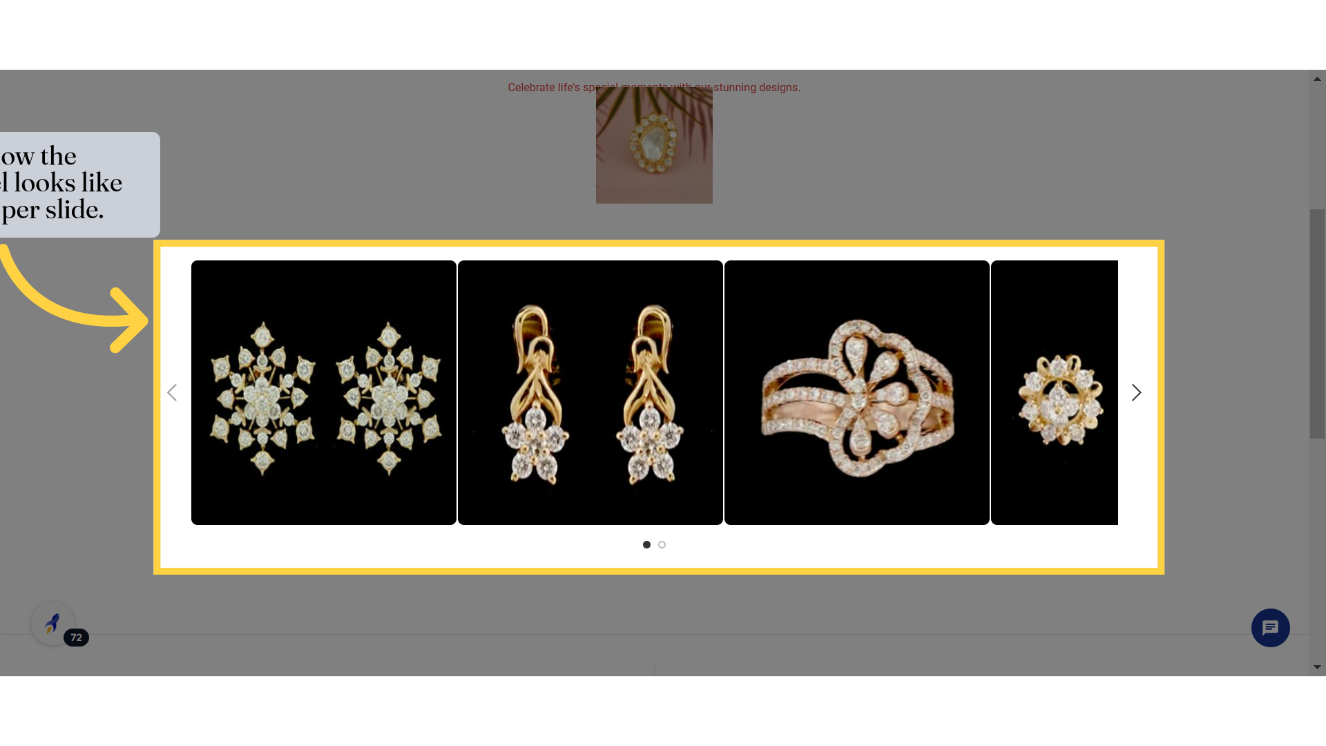
27. Adjusts the number of slides visible at one time in the carousel. For example, setting it to "3" will display 3 slides simultaneously. You can also set different number of slides based on the device by clicking on the device icon.
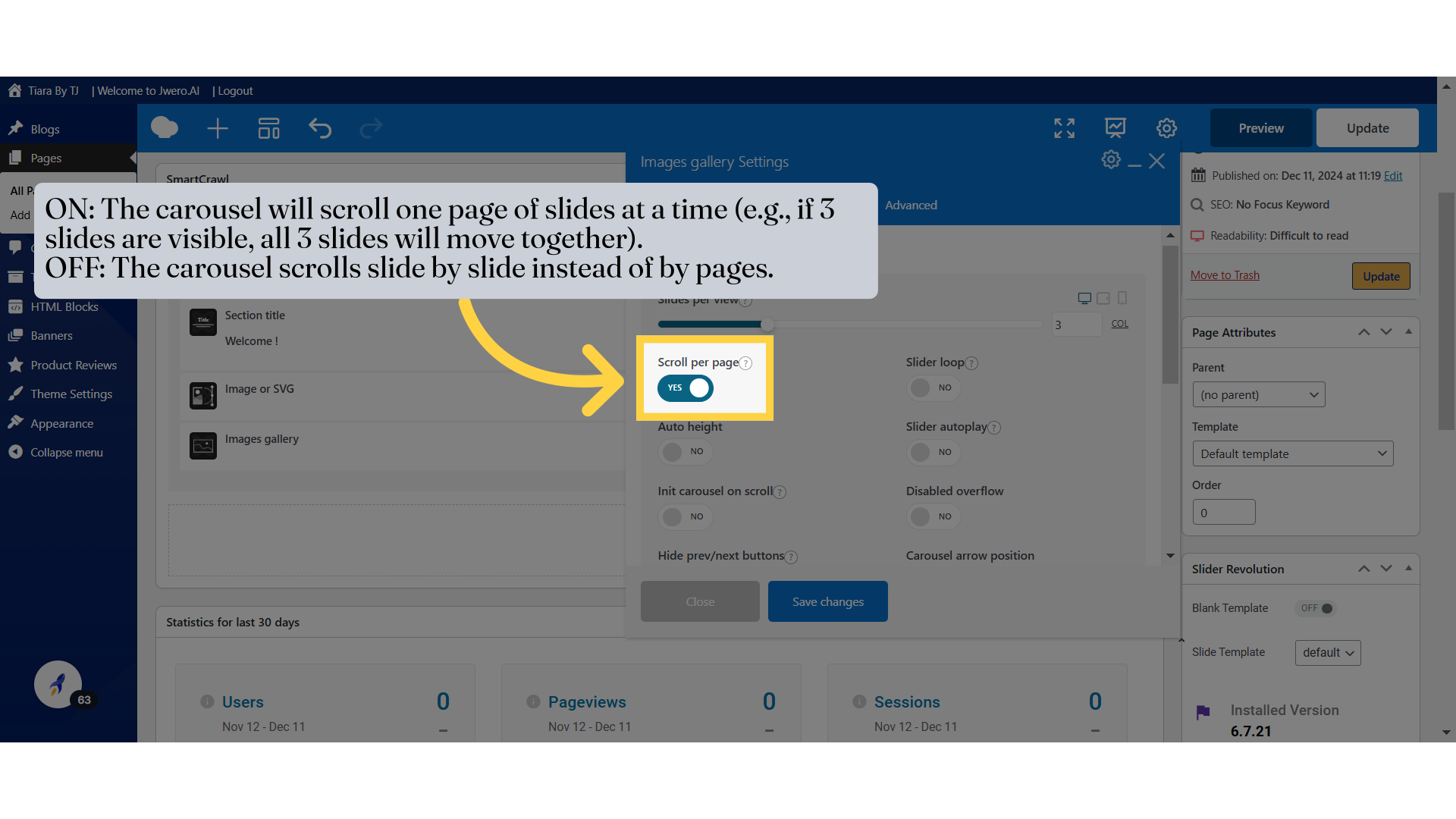
28. ON: The carousel will scroll one page of slides at a time (e.g., if 3 slides are visible, all 3 slides will move together).
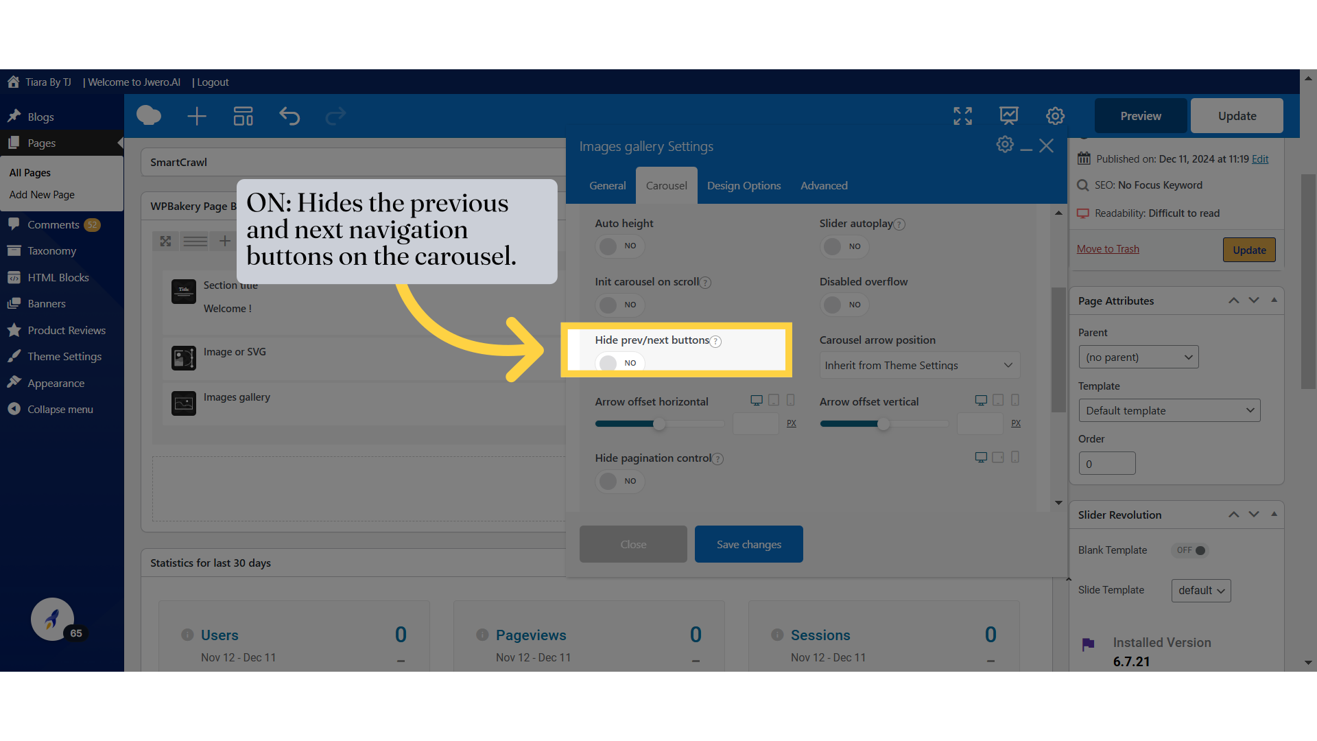
OFF: The carousel scrolls slide by slide instead of by pages.
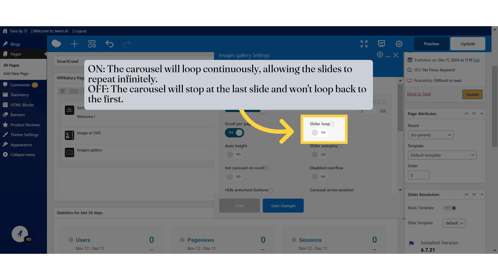
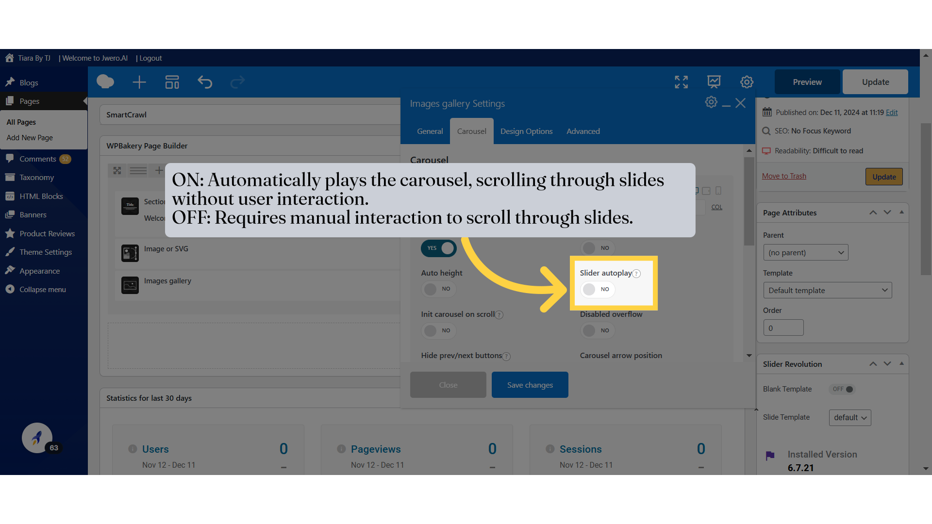
29. ON: The carousel will loop continuously, allowing the slides to repeat infinitely.
OFF: The carousel will stop at the last slide and won't loop back to the first.
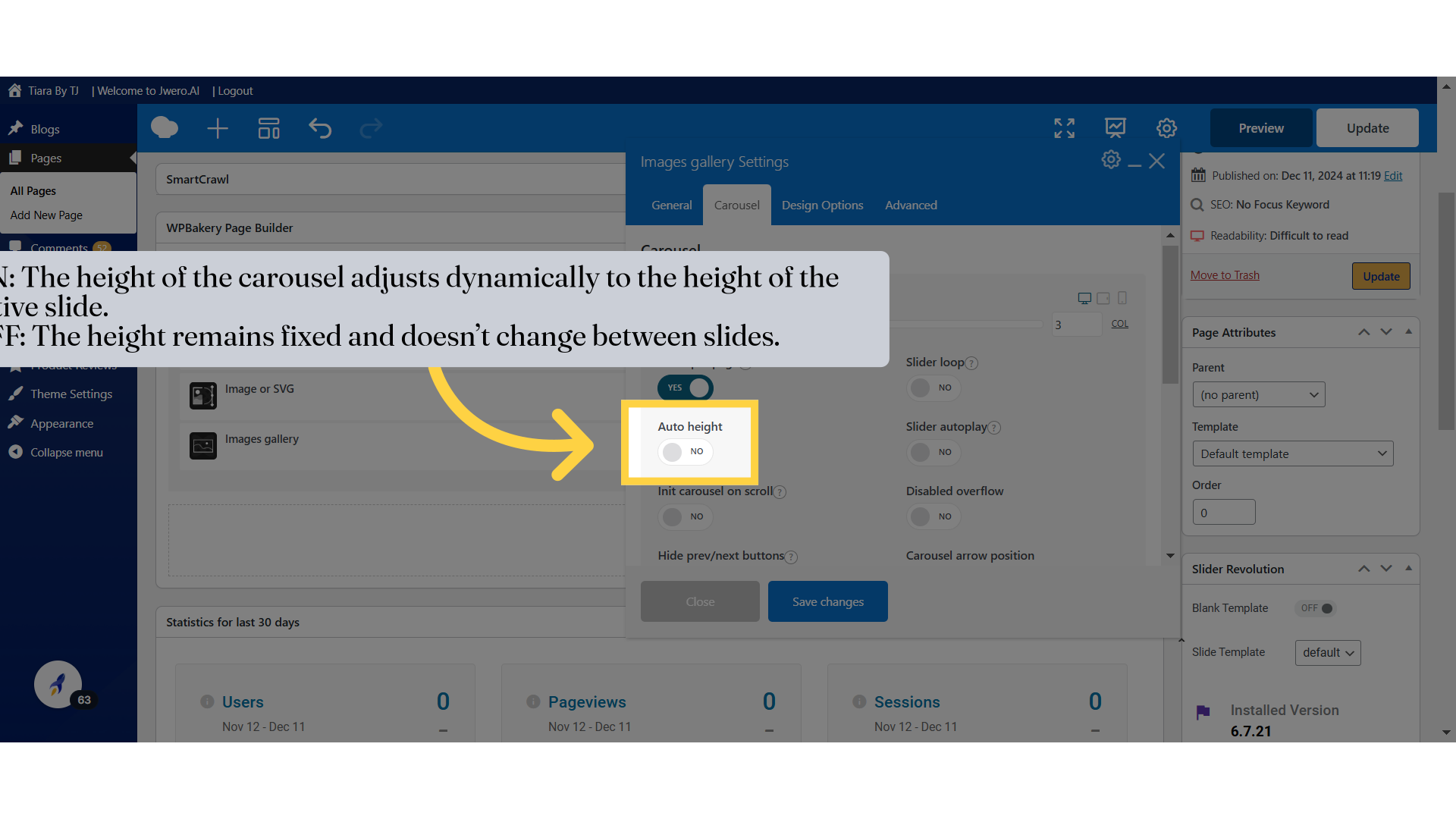
30. ON: The height of the carousel adjusts dynamically to the height of the active slide.
OFF: The height remains fixed and doesn’t change between slides.
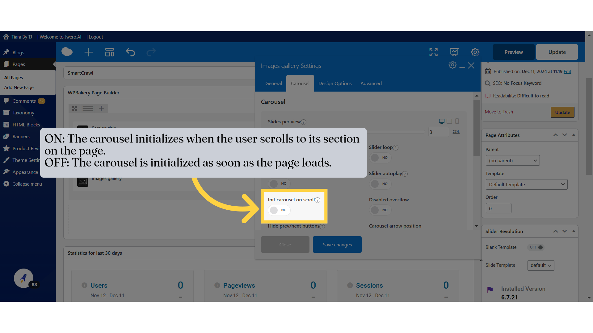
32. ON: The carousel initializes when the user scrolls to its section on the page.
OFF: The carousel is initialized as soon as the page loads.
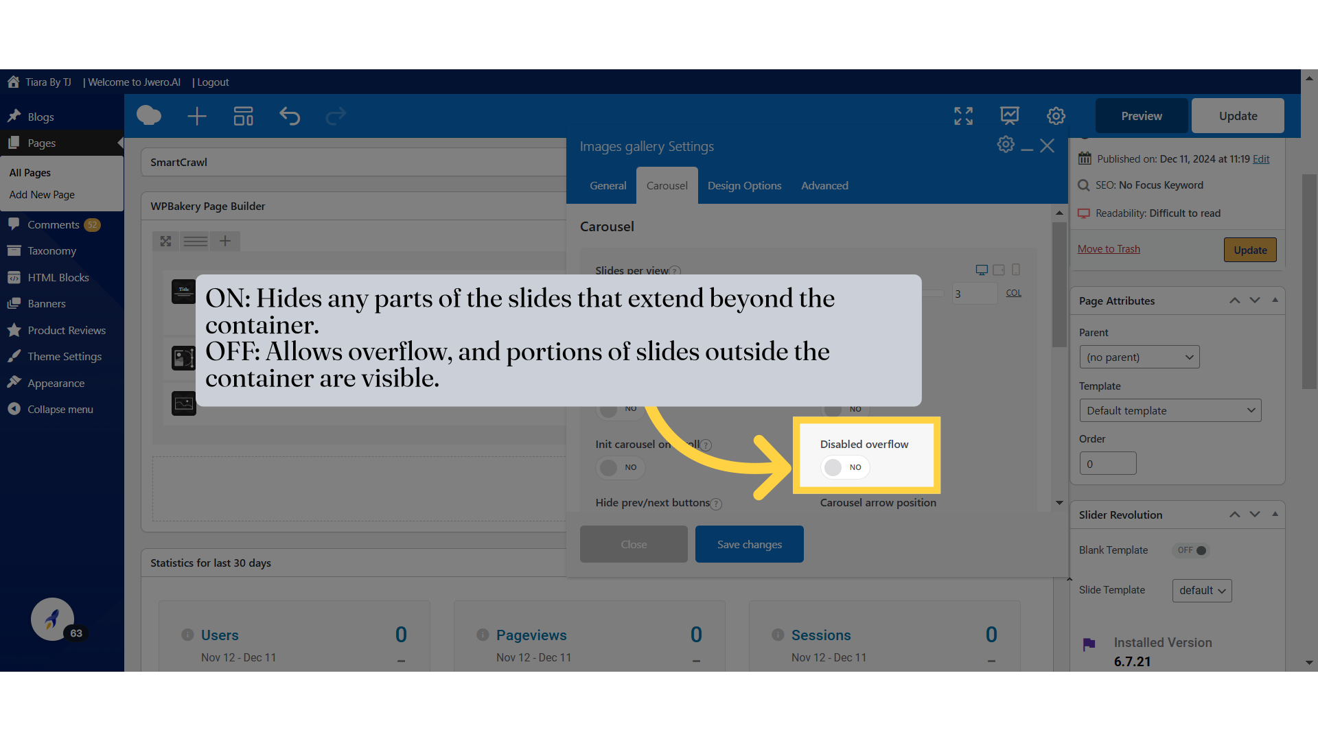
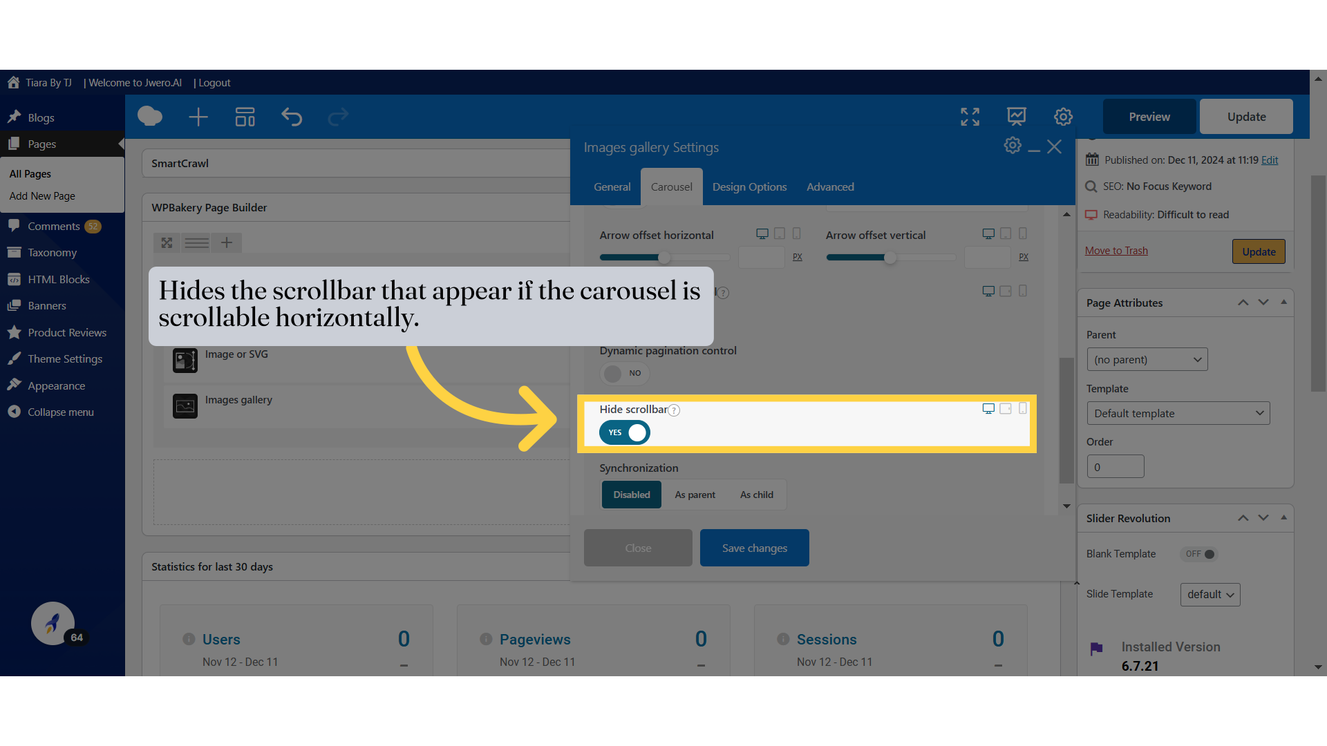
33. ON: Hides any parts of the slides that extend beyond the container.
OFF: Allows overflow, and portions of slides outside the container are visible.
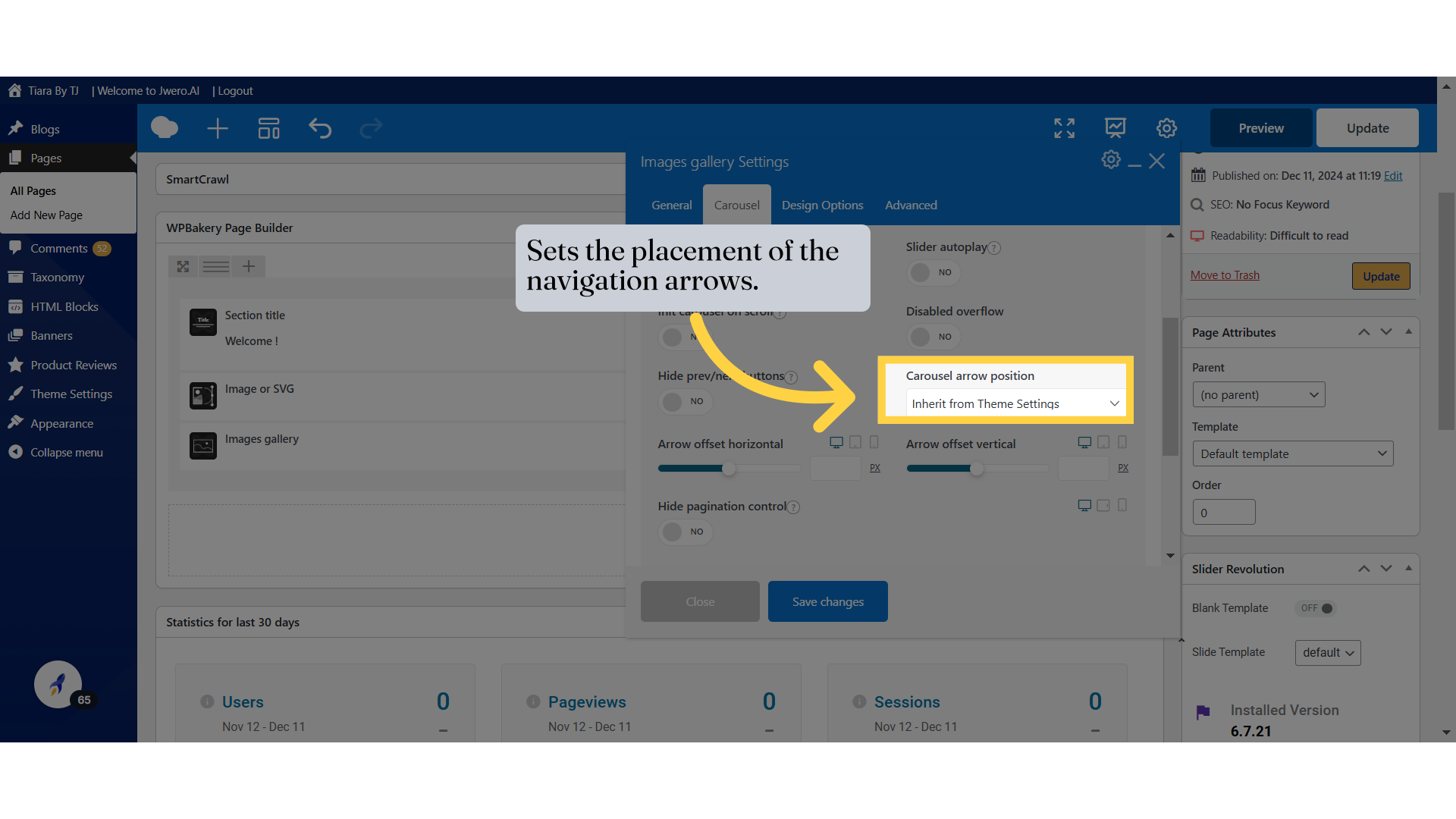
35. Sets the placement of the navigation arrows.
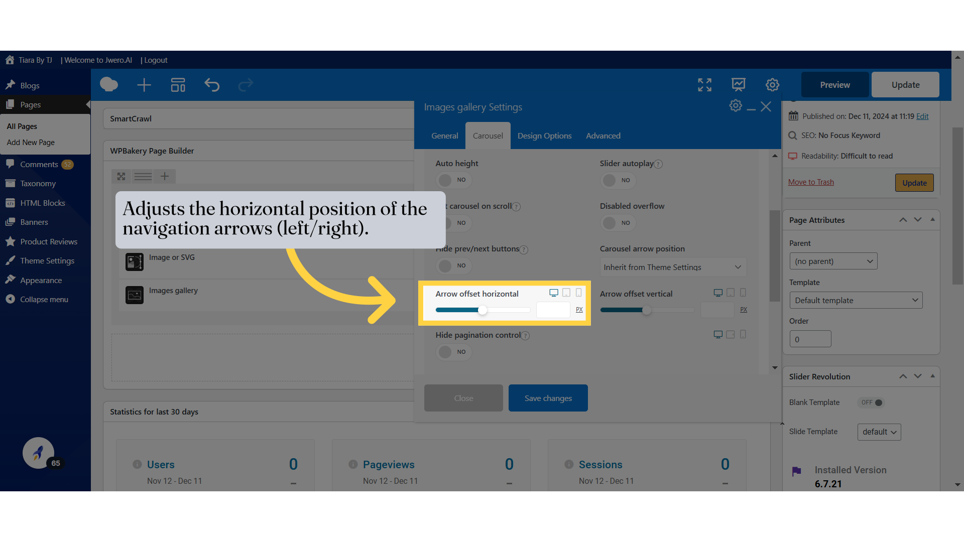
36. Adjusts the horizontal position of the navigation arrows (left/right).
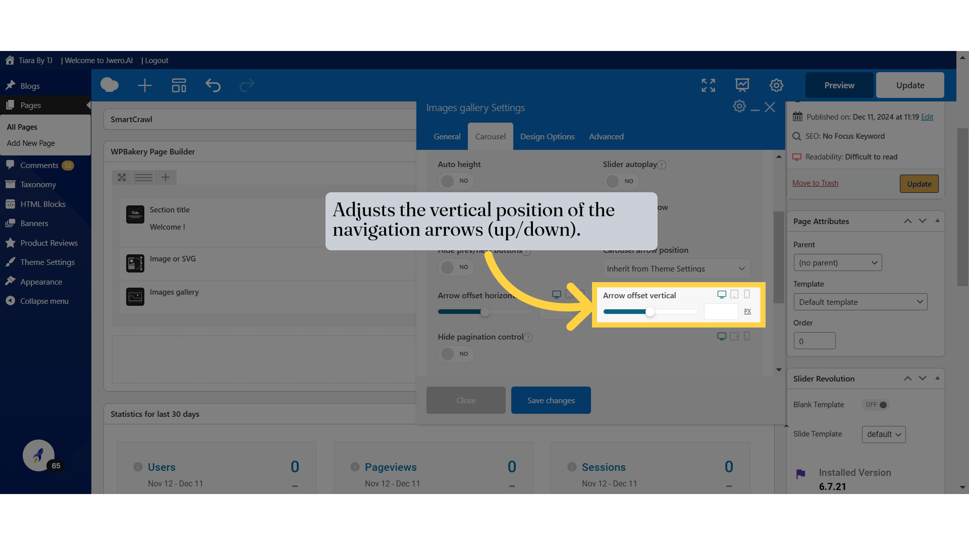
37. Adjusts the vertical position of the navigation arrows (up/down).
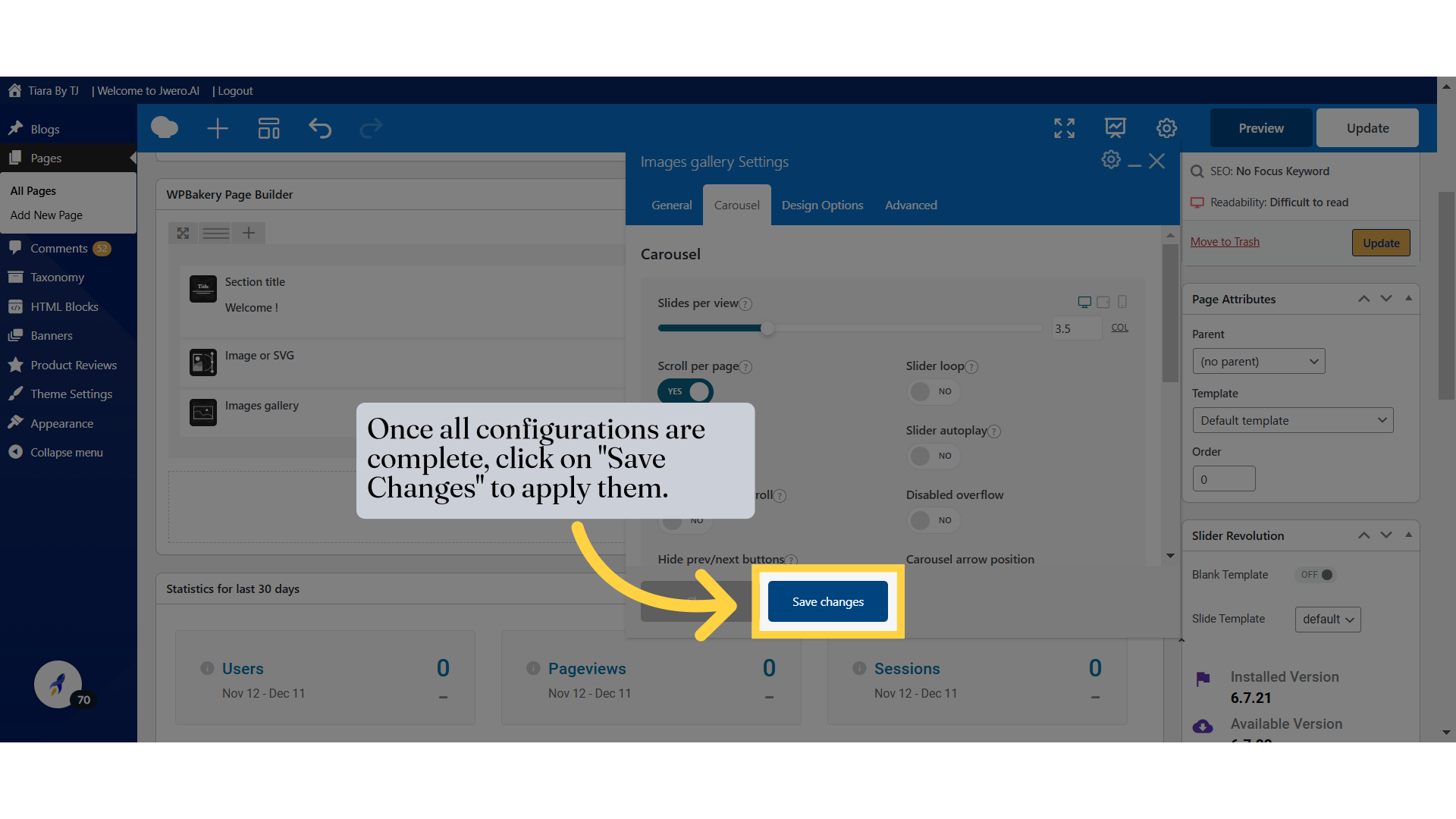
40. Once all configurations are complete, click on "Save Changes" to apply them.
41. This is how the Carousel looks like with 3.5 per slide.