How To Create A Banner
Go to app.jwero.ai
1. Click "Frontend"
Access the Frontend section to make the desired changes to the website.
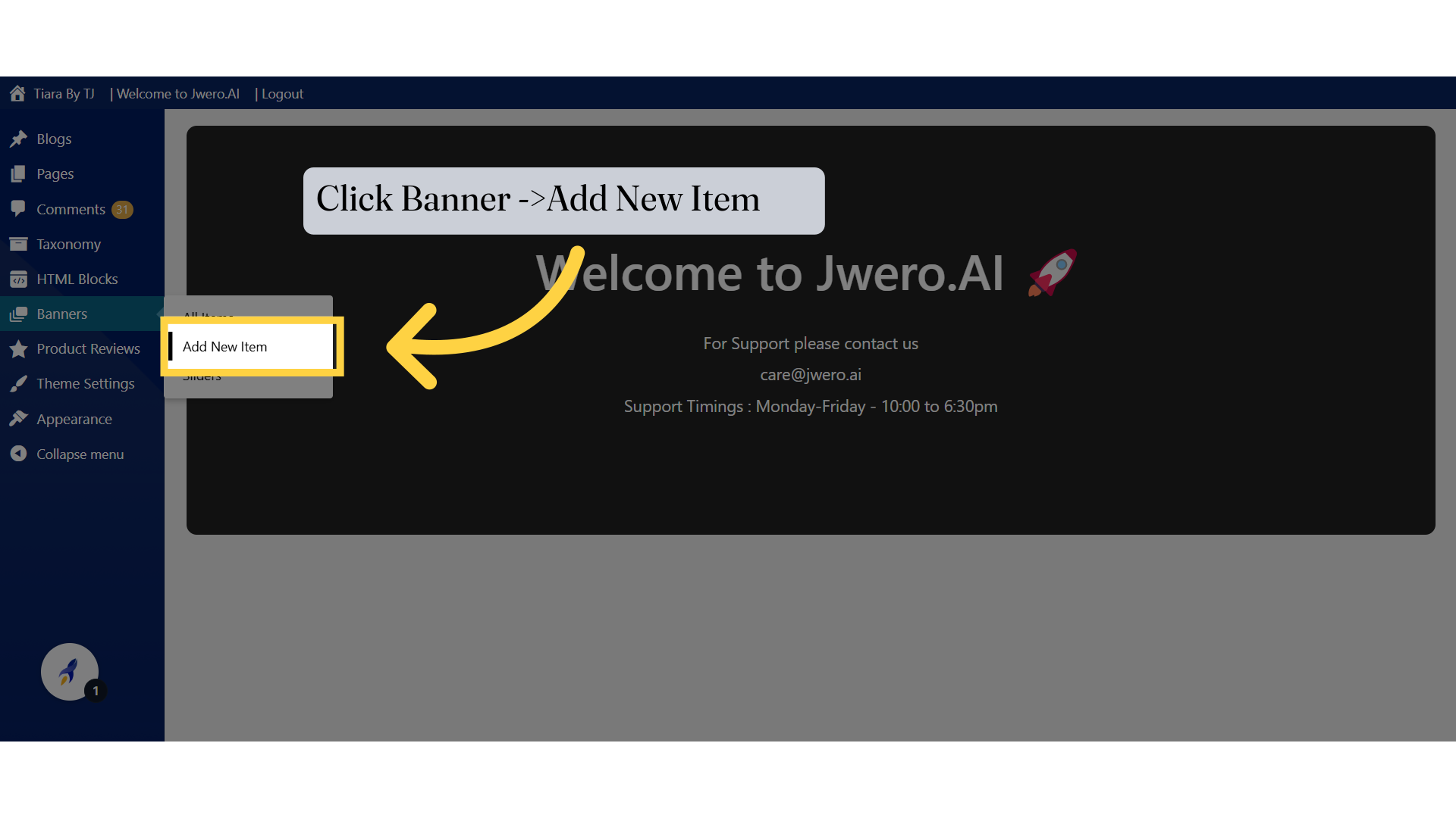
2. Click Banner ->Add New Item
Select the option to add a new banner.
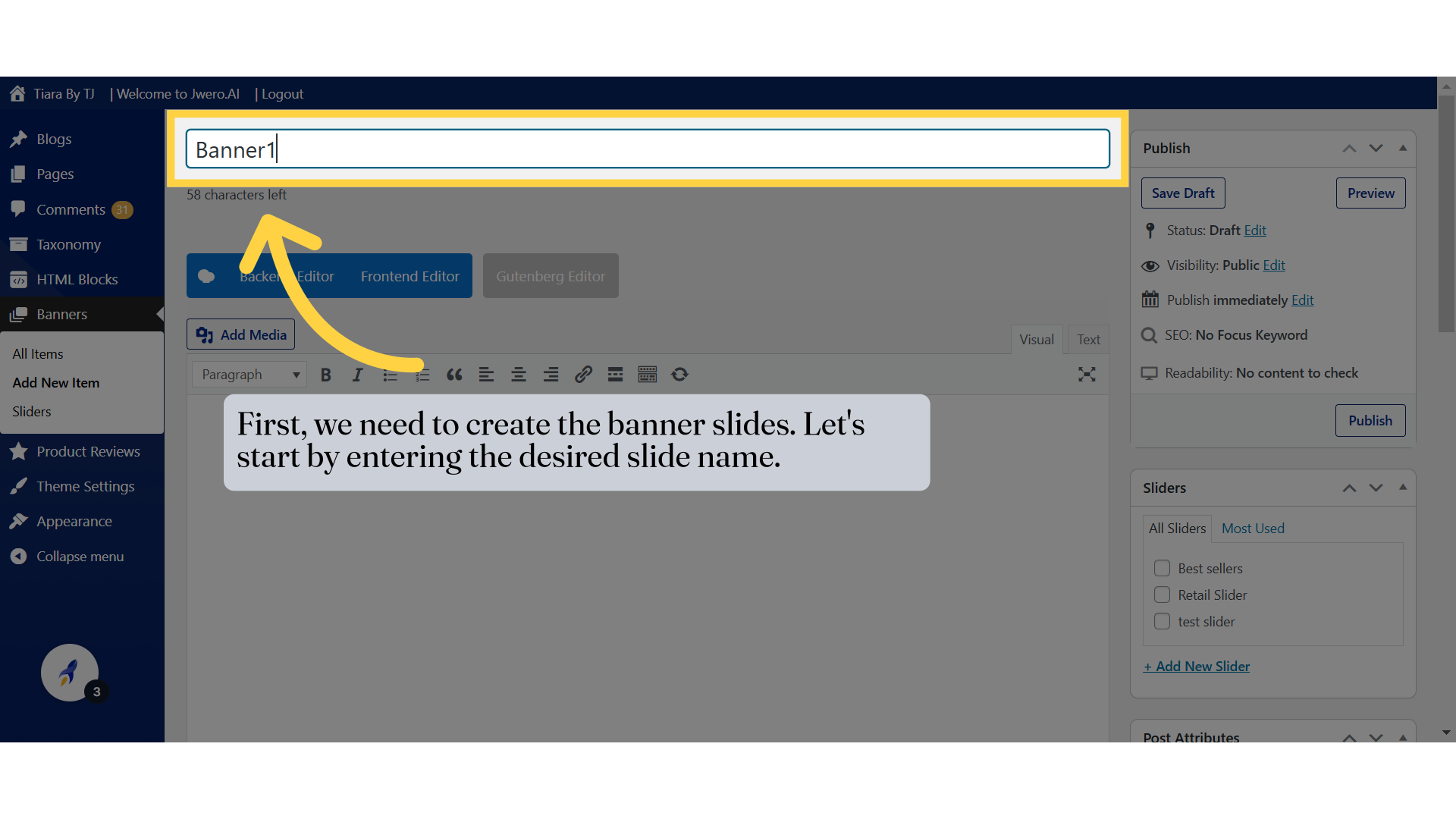
3. First, we need to create the banner slides. Let's start by entering the desired slide name.
4. To set the image for the slider, click on Featured Image
The recommended dimensions of the banner image is as follows:
Desktop : 1440px x 600px JPEG, PNG, WEBP Under 5 MB
Tablet : 1440px x 600px JPEG, PNG, WEBP Under 5 MB
Mobile : 865px x 1280px JPEG, PNG, WEBP Under 5 MB
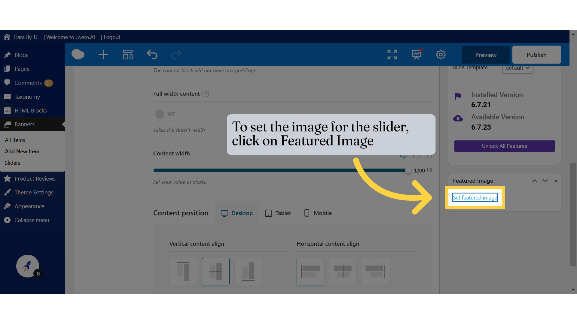
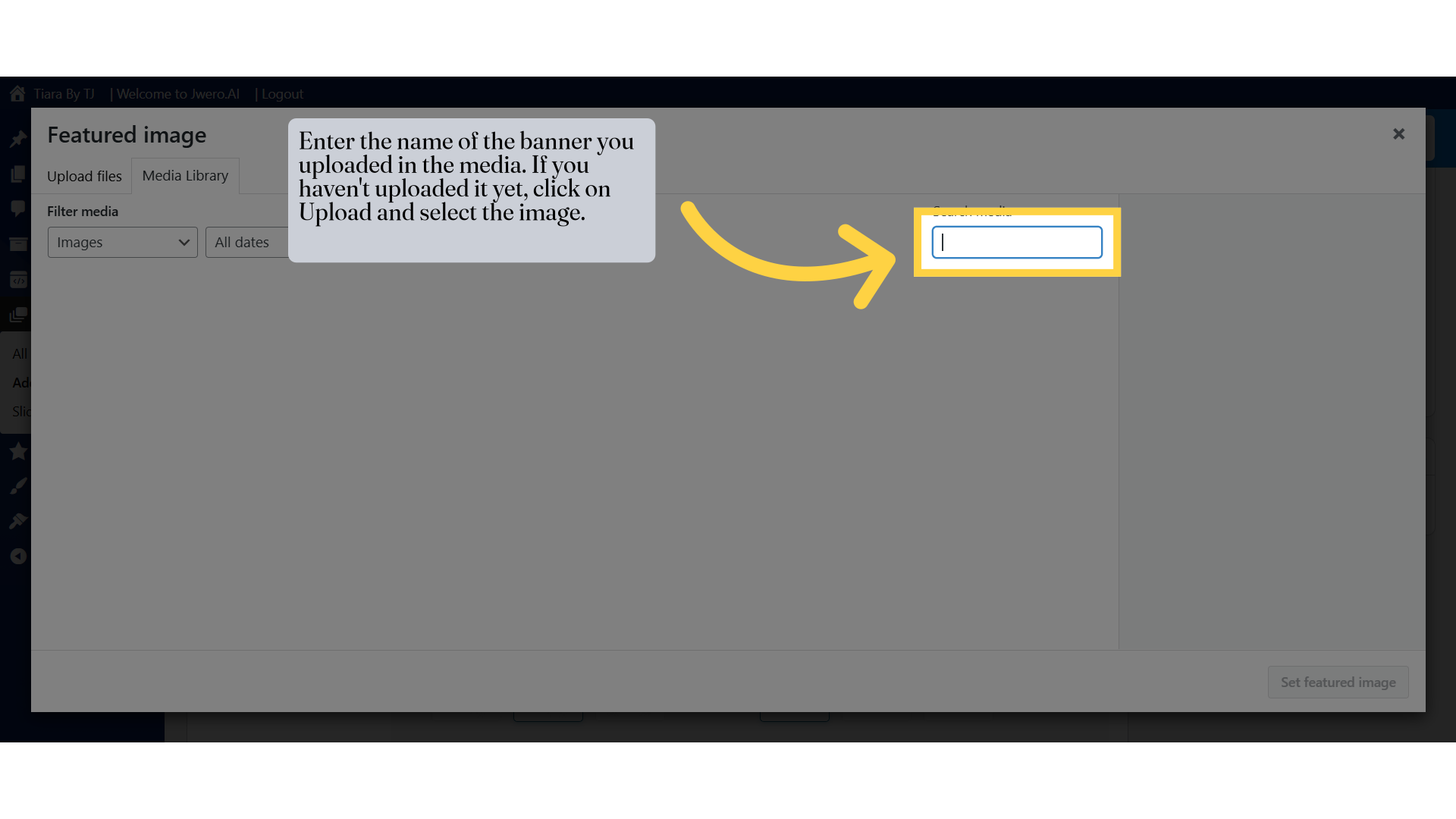
5. Enter the name of the banner you uploaded in the media. If you haven't uploaded it yet, click on Upload and select the image.
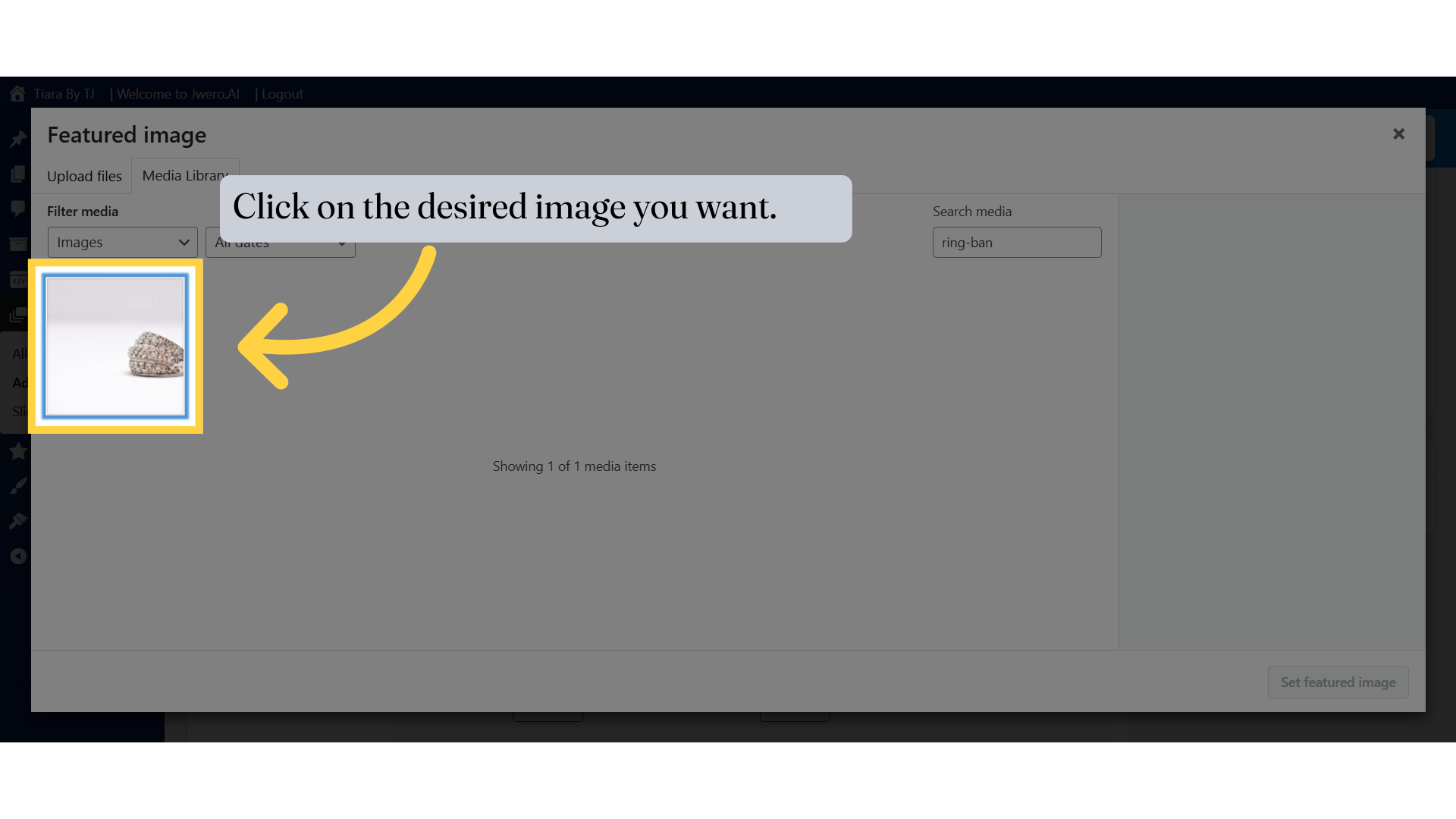
6. Click on the desired image you want.
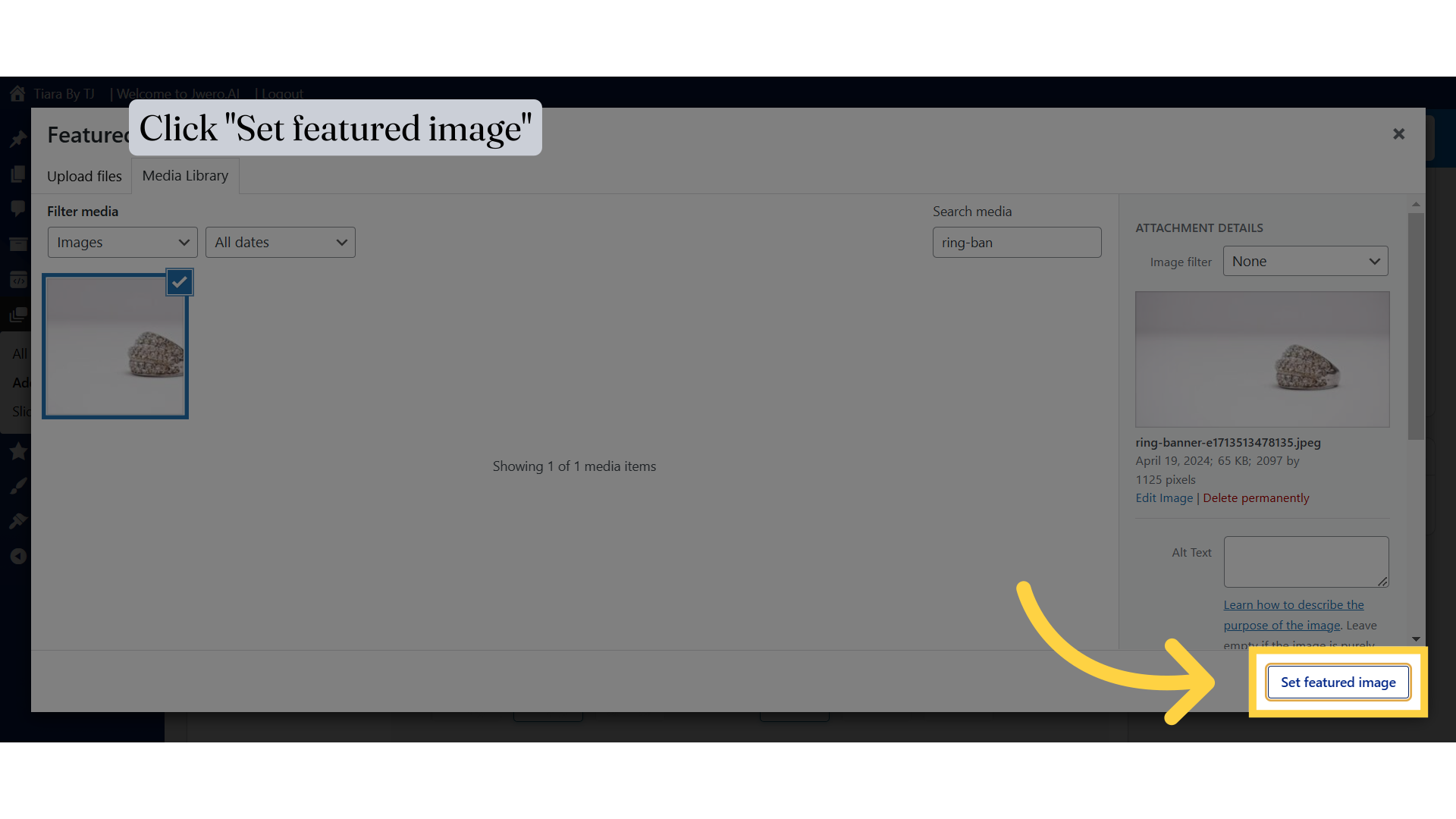
7. Click "Set featured image"
8. You can also set the image by clicking on Background.
It is recommended to set the image from the background, as it allows you to specify different images for various dimensions. The featured image typically has a fixed size, which may not display properly on all responsive devices.
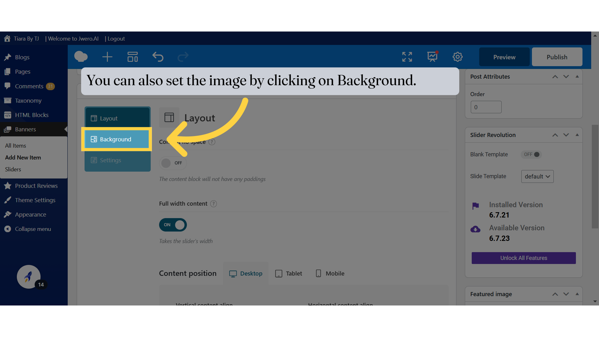
9. To set the banner for mobile with the appropriate mobile dimensions, click here. You can also adjust the size and position.
The Background Options in the slide settings allow you to customize the background image or color for the slide for different devices (Desktop, Tablet, Mobile). Here's a detailed explanation of the highlighted sections:
Background Size:
Cover: Fills the entire slide area (may crop).
Contain: Fits the whole image without cropping (may leave space).
Auto: Keeps the image's original size.
Custom: Allows specific dimensions.
Background Position:
Aligns the image (e.g., Center Center, Top Left, Bottom Right).
Keeps the focal point of the image visible.
Custom: Allows manual positioning.
Device-Specific Customization:
Set different sizes/positions for Desktop, Tablet, and Mobile.
Ensures the background adapts to screen sizes.
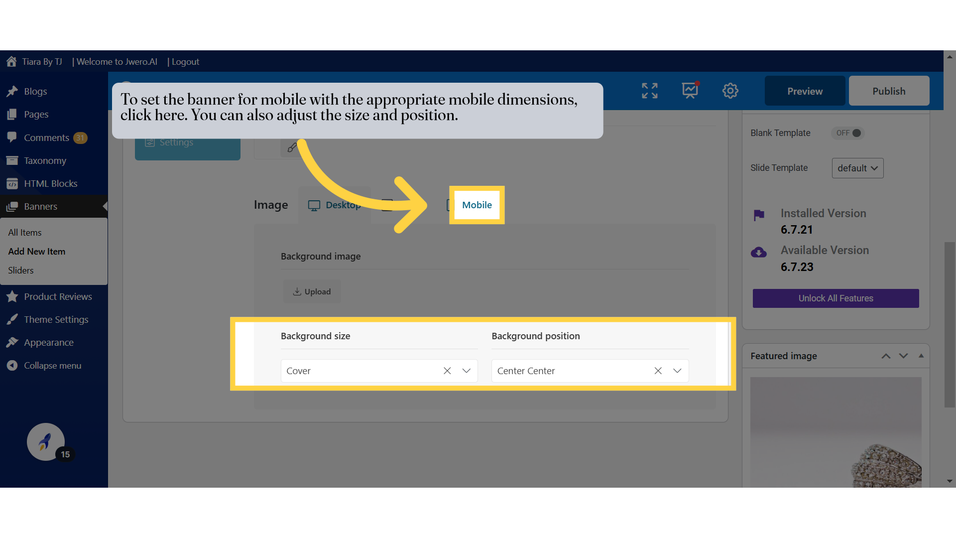
10. To set the banner for desktop with appropriate dimensions, Click Here.
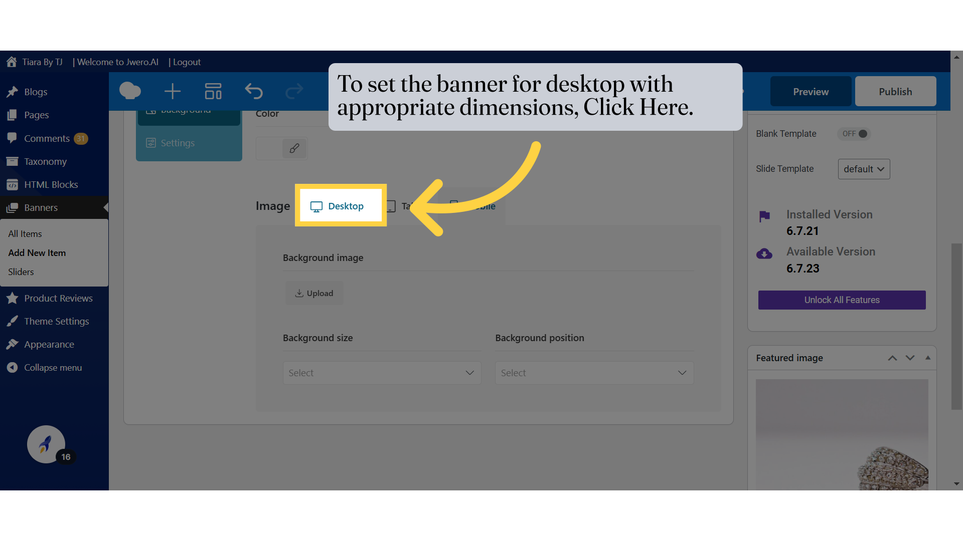
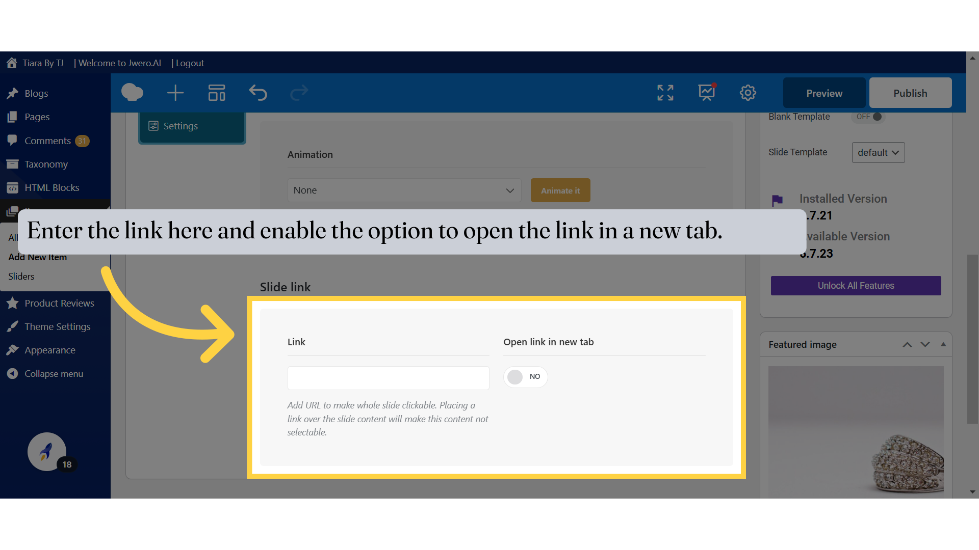
11. To add a link to the banner, click on Settings.
This allows you to configure what happens when users click on the slide. It helps create interactive slides that direct users to specific pages, products, or external websites.
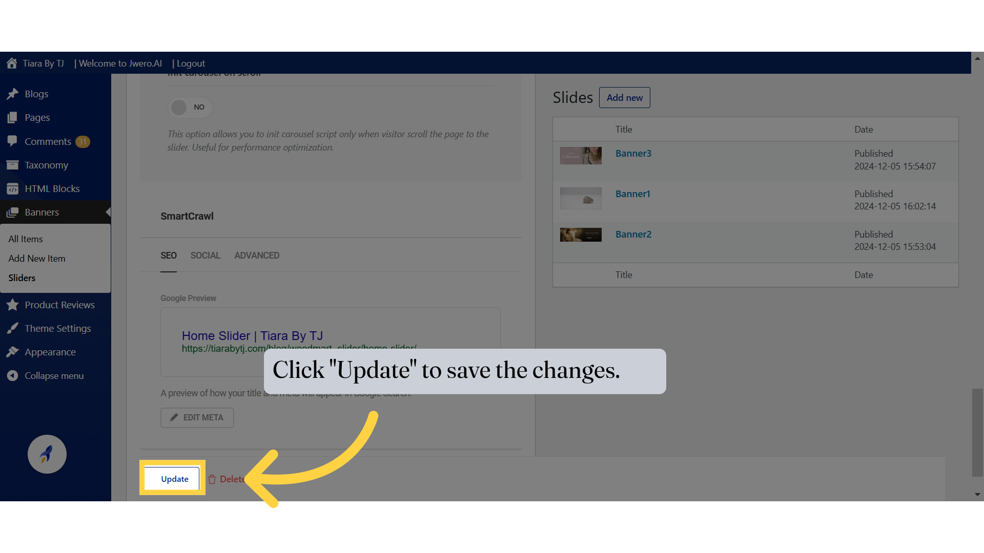
12. Enter the link here and enable the option to open the link in a new tab.
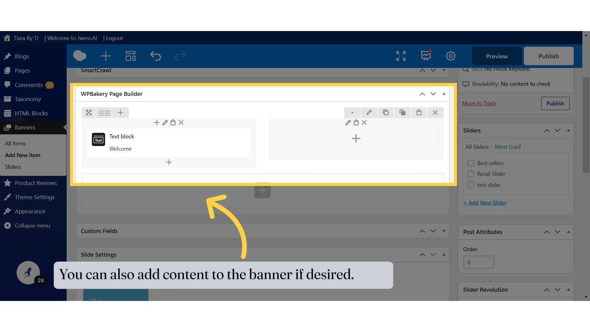
13. You can also add content to the banner if desired.
You can enhance your banner by adding additional content, such as text, images, buttons, or other elements. This allows you to create a more engaging and visually appealing banner that effectively communicates your message or promotes your offerings. Adding content can help draw attention to specific details, provide context, or encourage user interaction.
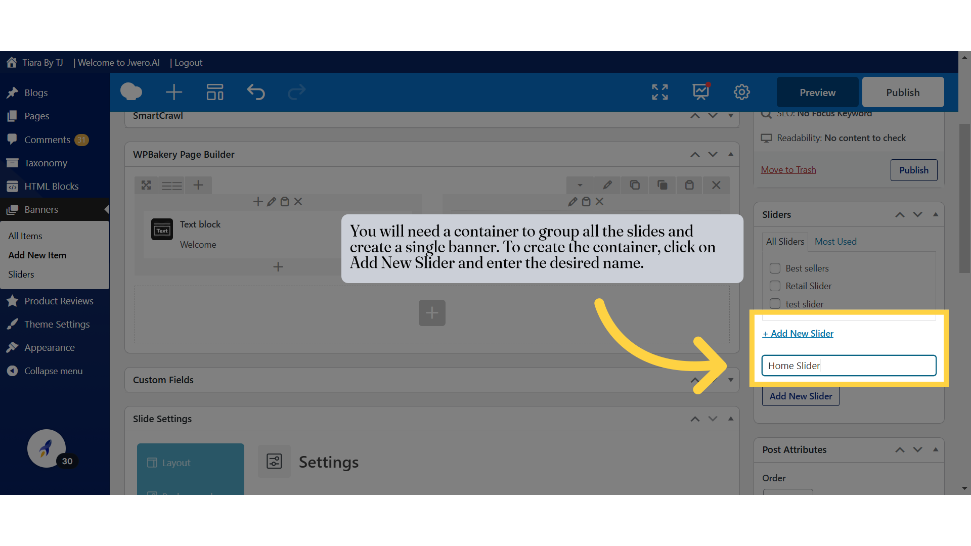
14. You will need a container to group all the slides and create a single banner. To create the container, click on Add New Slider and enter the desired name.
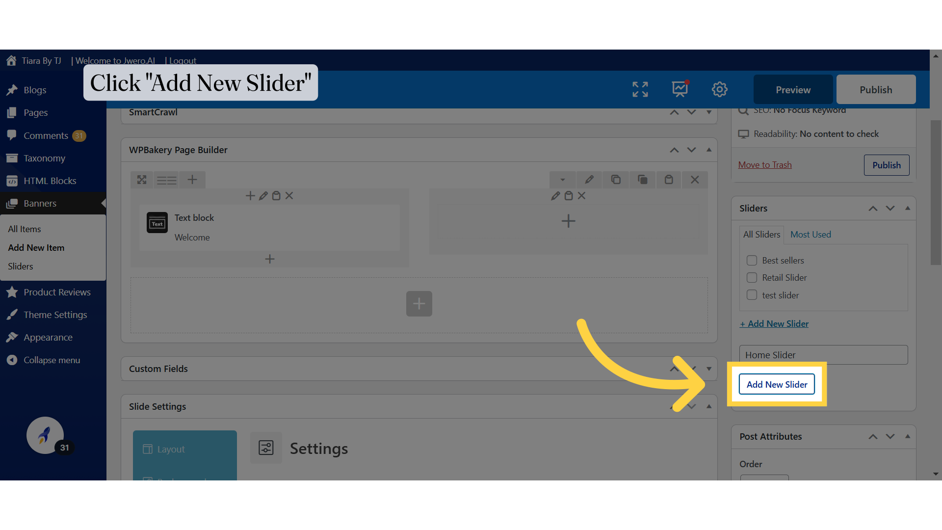
15. Click "Add New Slider"
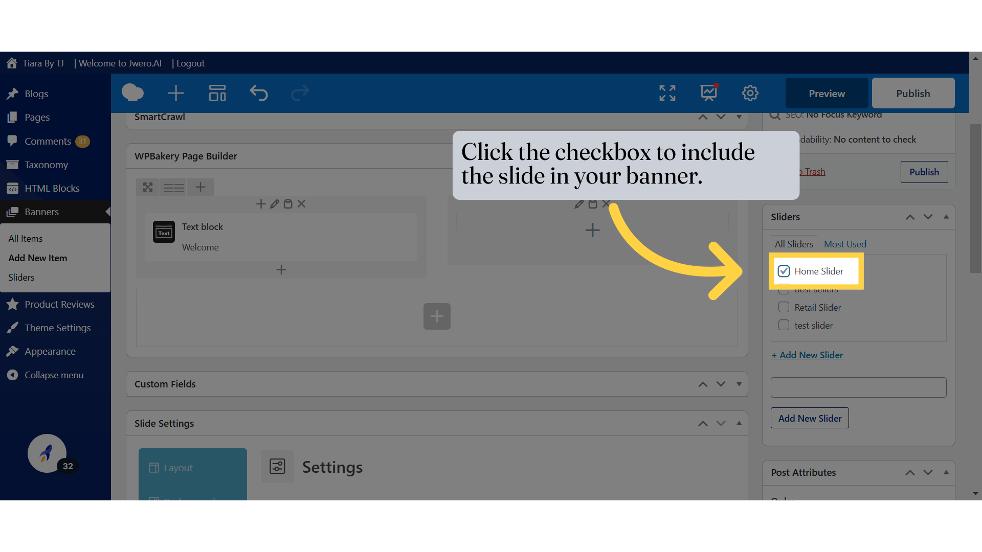
16. Click the checkbox to include the slide in your banner.
Make sure to check this checkbox, or the slide will not be included in the banner.
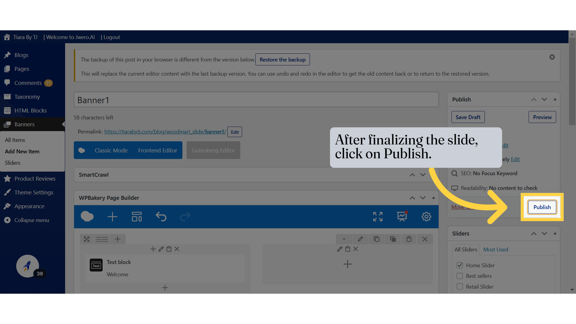
17. After finalizing the slide, click on Publish.
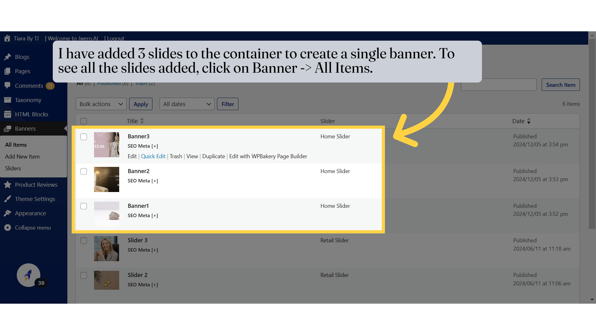
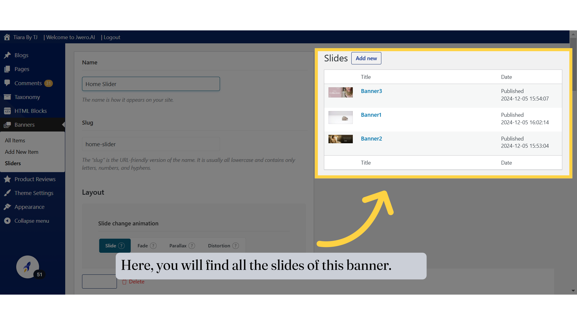
18. I have added 3 slides to the container to create a single banner. To see all the slides added, click on Banner -> All Items.
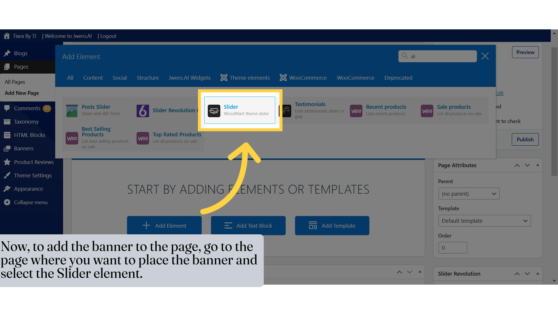
19. Now, to add the banner to the page, go to the page where you want to place the banner and select the Slider element.
20. Select the container name (banner) you created from the dropdown.
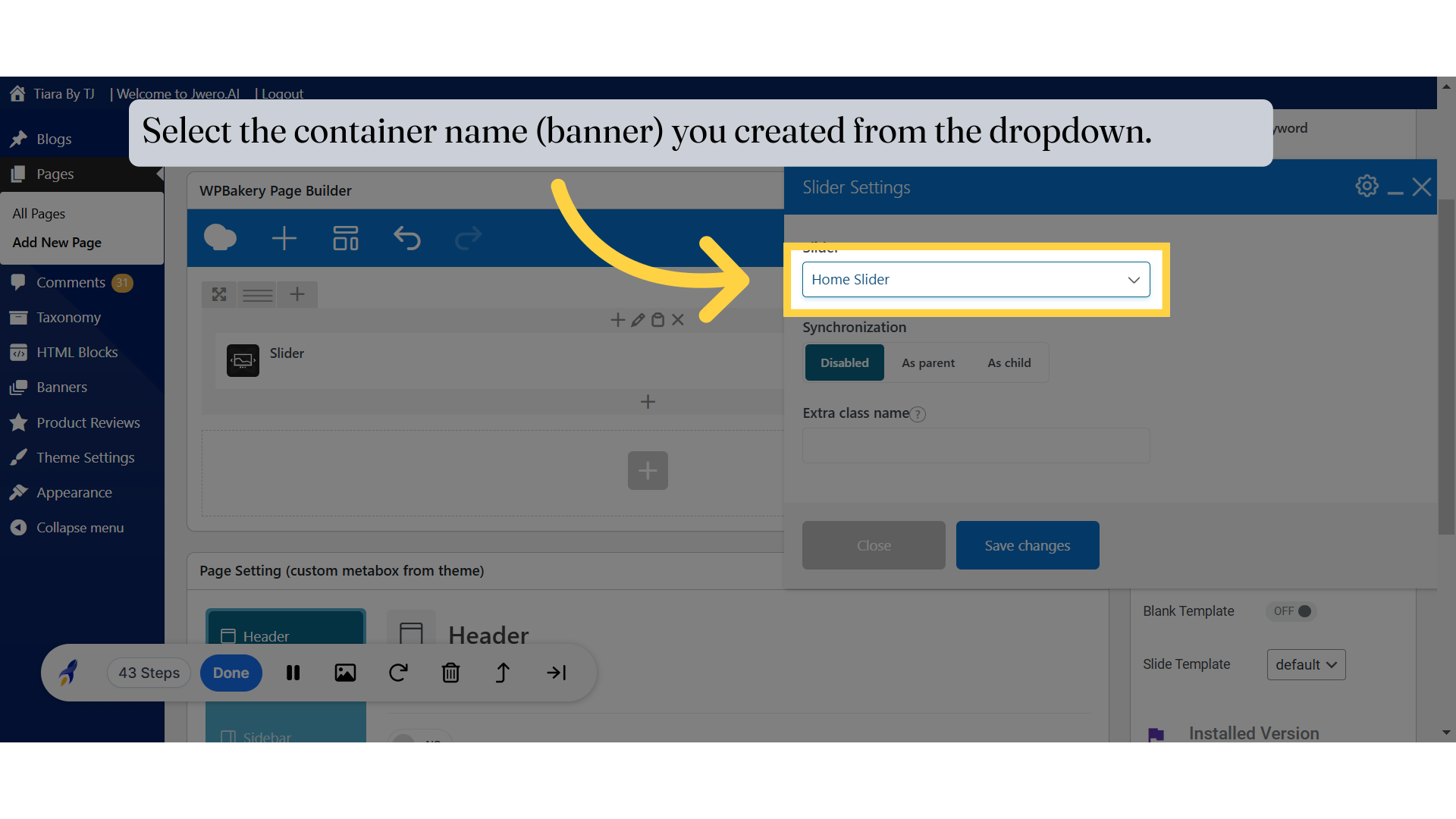
21. Click "Save changes"
Save the changes made.
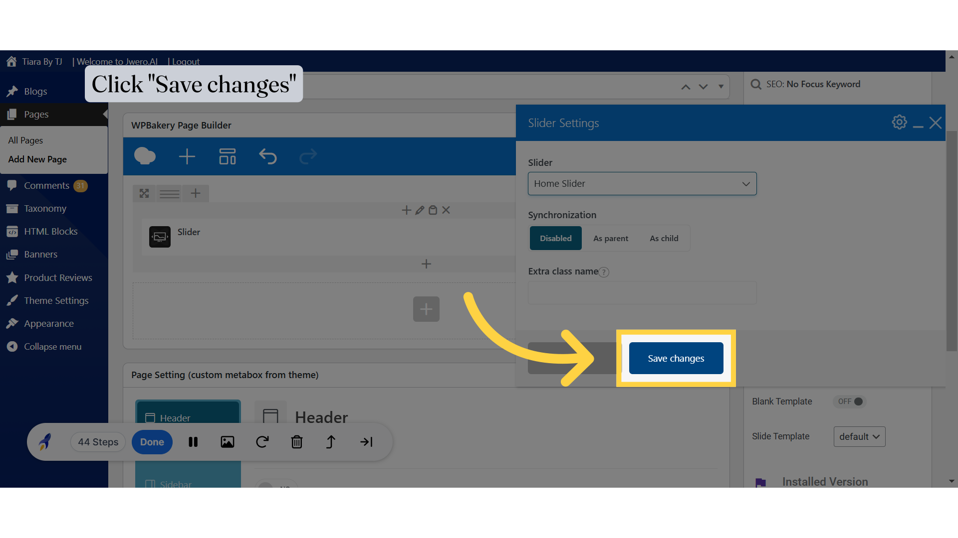
22. Click Publish. The banner will now be added to the page.
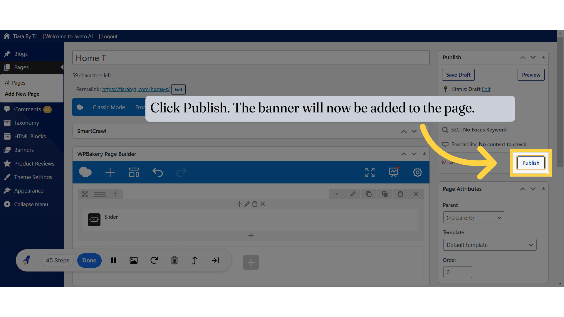
23. Click "View page"
Preview the banner to see how it looks. You can make further modifications from the Sliders options to adjust it according to your requirements.
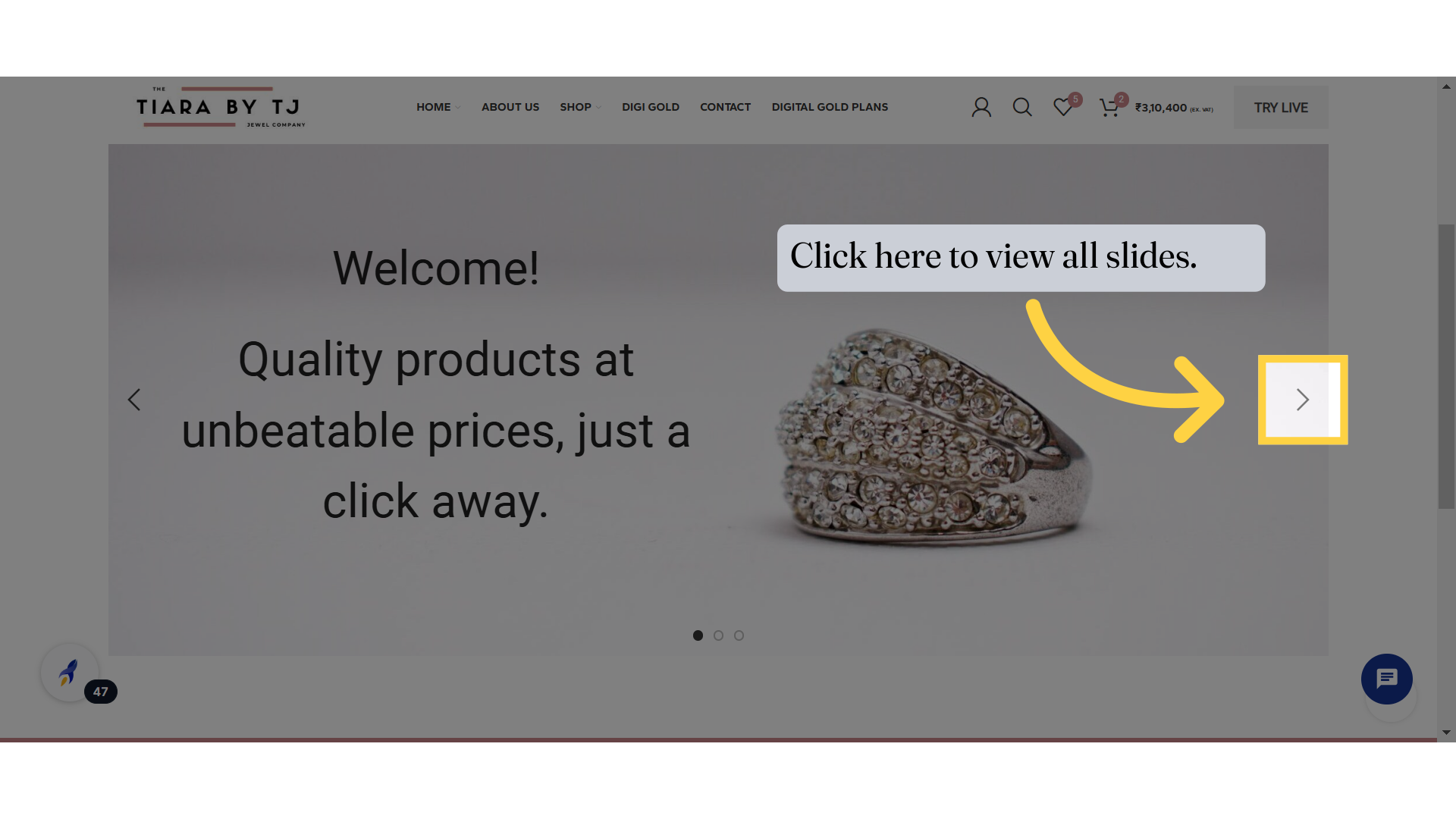
24. Click here to view all slides.
The banner has now been added as a carousel. Slide through the banner to view all the slides.
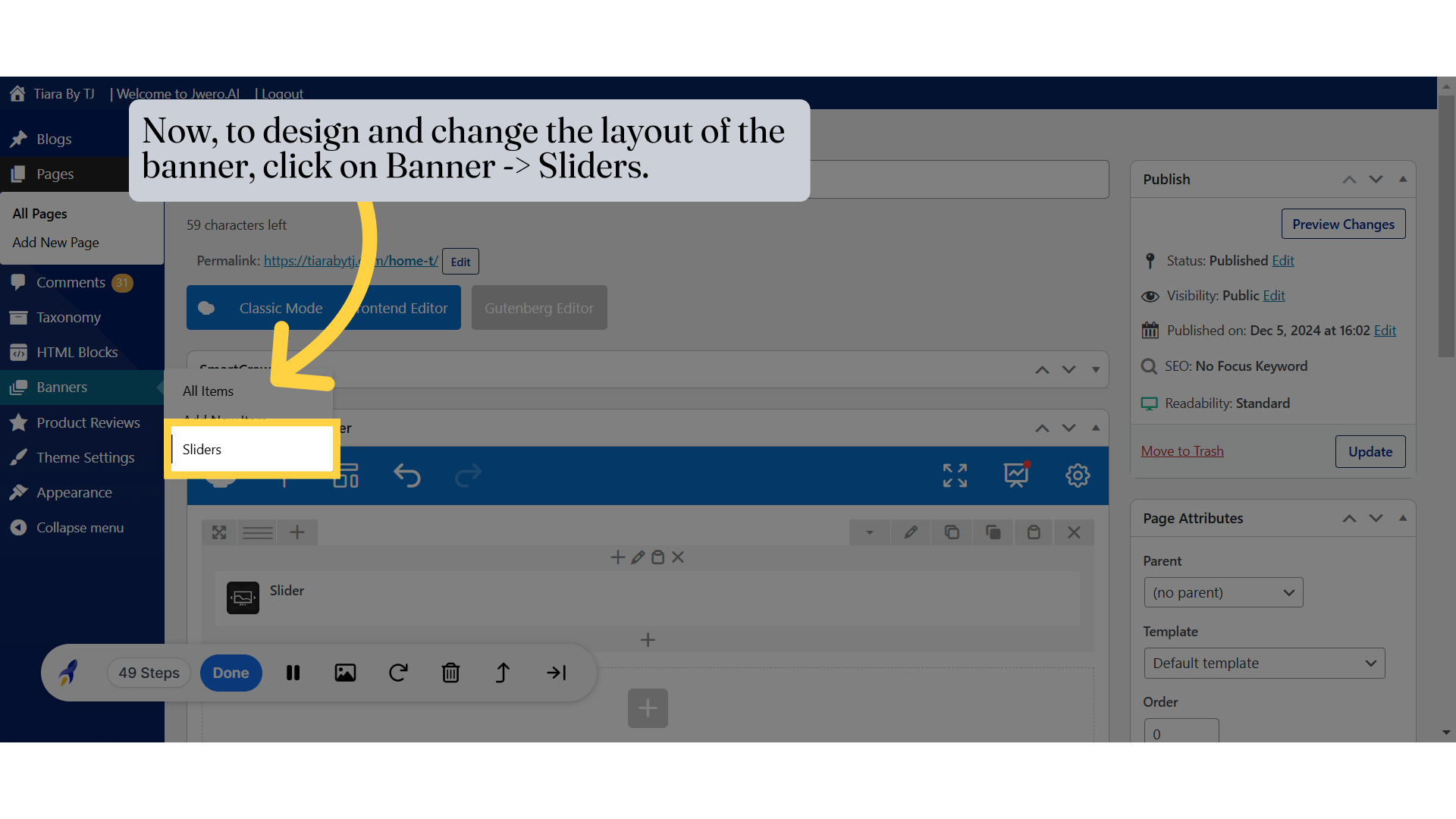
25. Now, to design and change the layout of the banner, click on Banner -> Sliders.
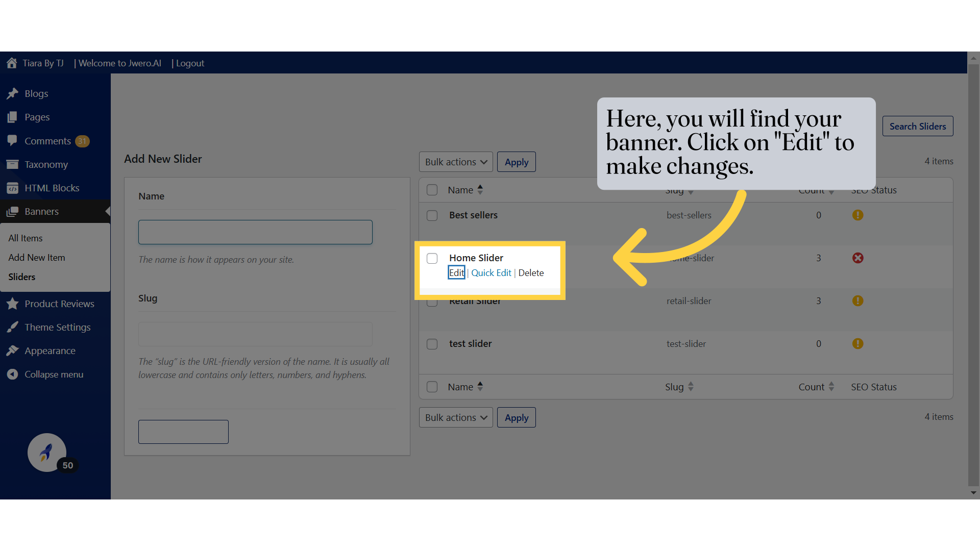
26. Here, you will find your banner. Click on "Edit" to make changes.
27. Here, you will find all the slides of this banner.
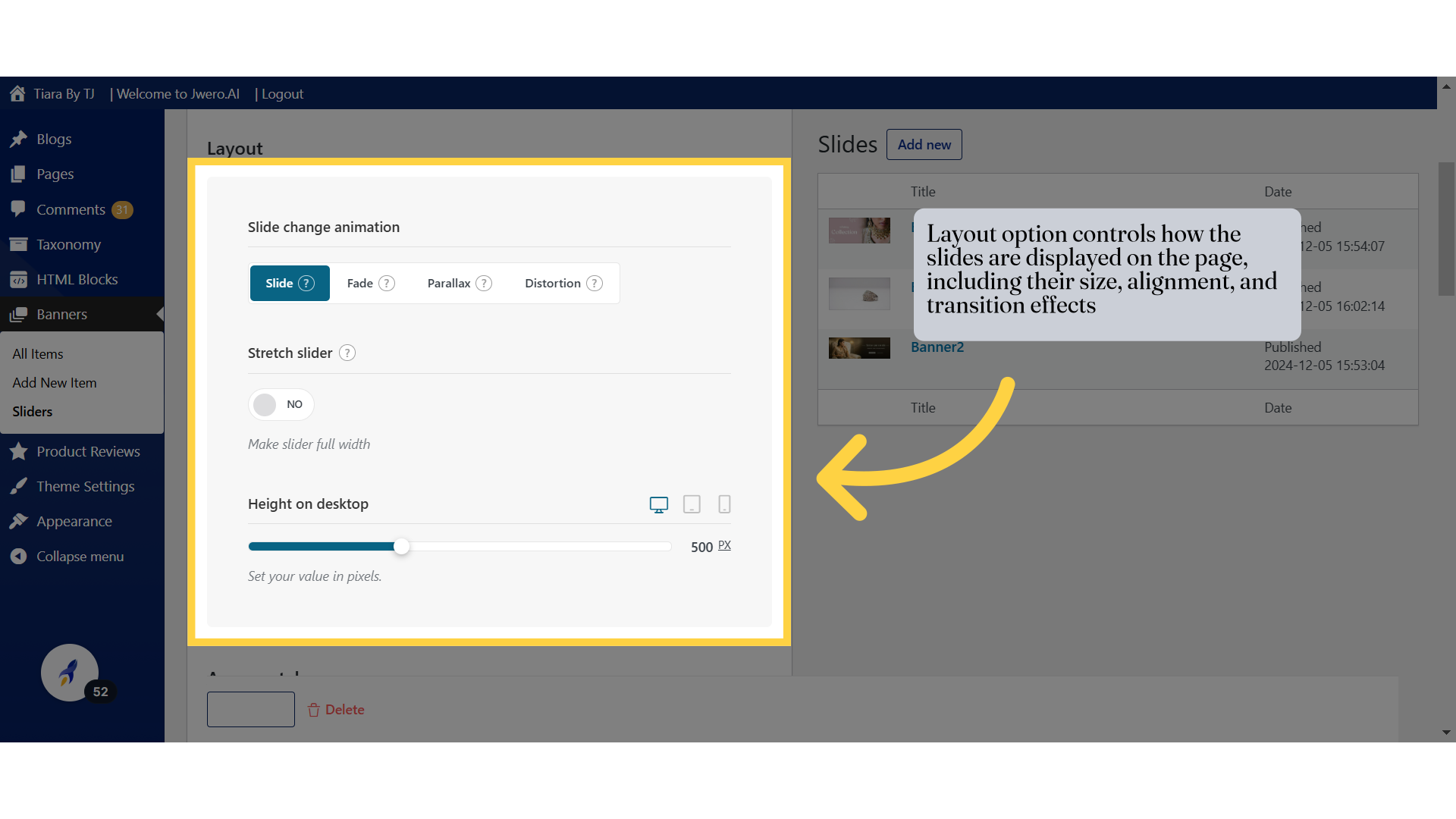
28. Layout option controls how the slides are displayed on the page, including their size, alignment, and transition effects
This Layout section for the slider includes several customization options:
Slide Change Animation:
Slide: Animates the transition by sliding the content horizontally or vertically.
Fade: Creates a smooth fade effect between slides.
Parallax: Adds a parallax effect during the slide transition, where the background moves at a slower pace than the foreground for a 3D effect.
Distortion: Applies a distortion animation during transitions for a more creative and unique effect.
Stretch Slider:
Enable Full Width: When enabled, the slider stretches to the full width of the screen or container, regardless of its size.
Purpose: Helps create an immersive, full-width experience for banners or promotional content.
Height on Desktop:
Allows you to set the height of the slider for desktop displays in pixels.
Adjustable Slider: Use the slider to modify the height dynamically and ensure the content fits properly within the chosen dimensions.
Ensures your slider looks proportional and visually appealing on larger screens.
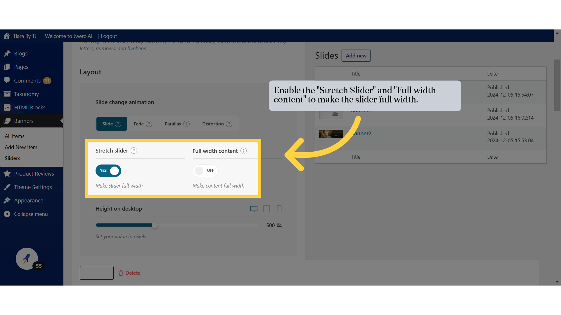
29. Enable the "Stretch Slider" and "Full width content" to make the slider full width.
The Stretch Slider option allows you to extend the width of the slider to fill the entire browser window or container
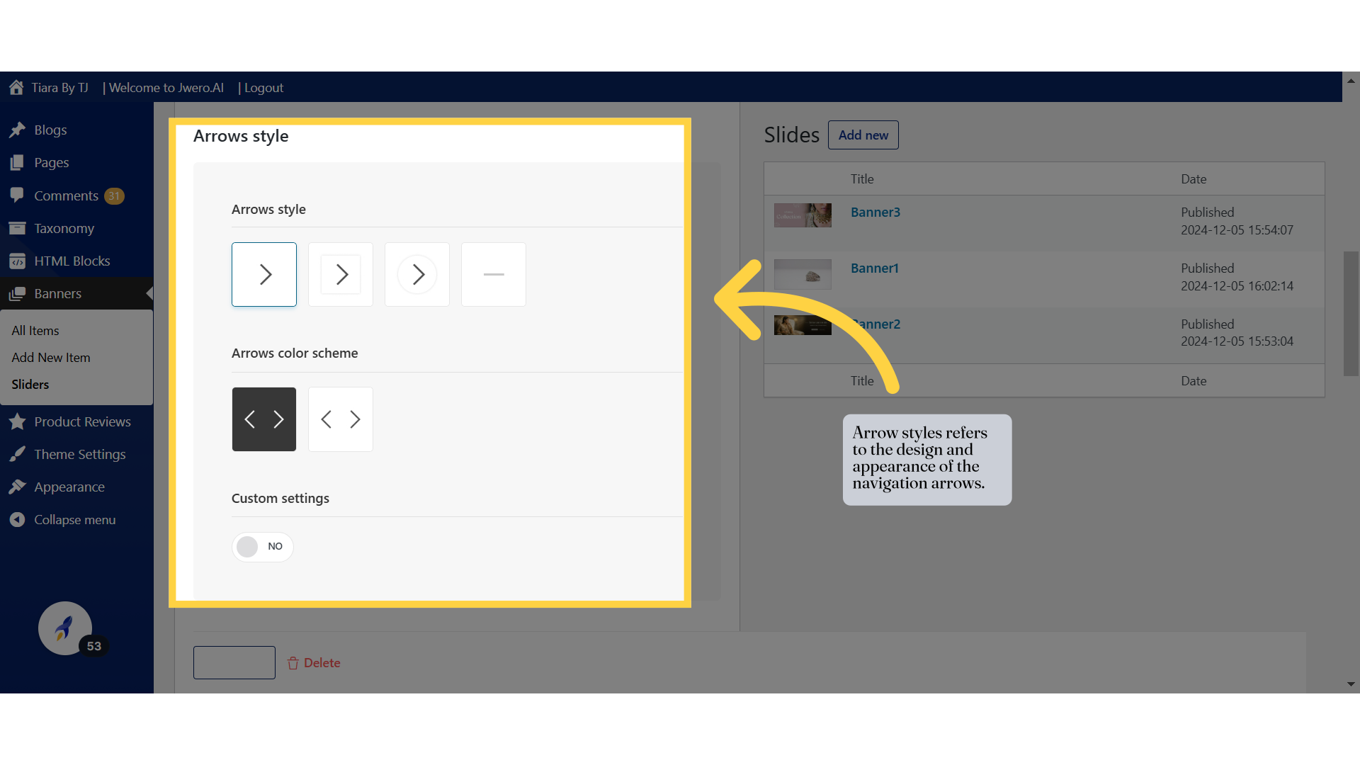
30. Arrow styles refers to the design and appearance of the navigation arrows.
The Arrows Style section allows you to customize the appearance of navigation arrows on your slider. Here’s a breakdown of the options:
Arrows Style:
Select the design of the arrows that will appear on the slider. Options include different arrow shapes and icons, such as plain arrows, outlined arrows, circular arrows, or minimal designs.
This lets you align the slider’s navigation style with your website's overall design.
Arrows Color Scheme:
Choose the color scheme for the arrows. Typically, you can select between a light or dark color scheme to ensure good visibility against the slider's background.
Custom Settings:
If enabled, this allows for additional customization options beyond the predefined styles and colors, giving you more control over the arrow appearance.
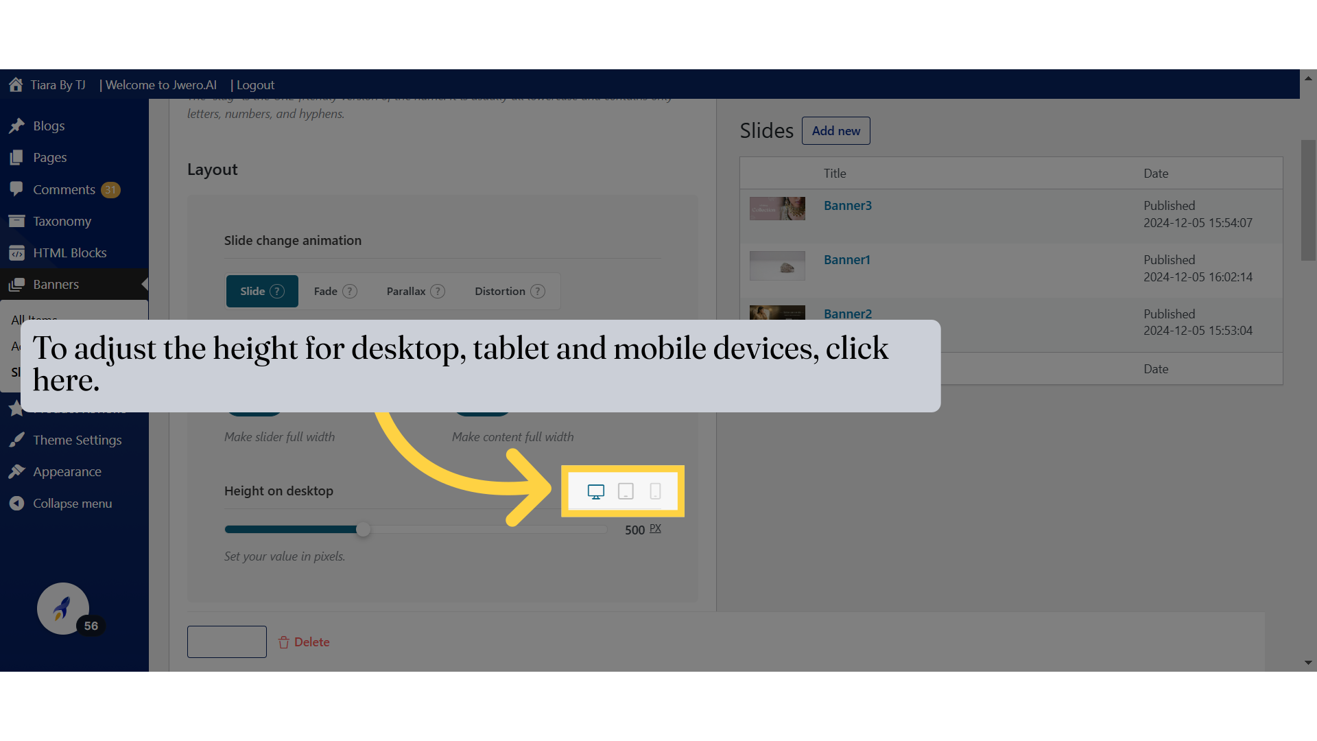
31. To adjust the height for desktop, tablet and mobile devices, click here.
To customize the height of your slider for different devices such as desktops, tablets, and mobile phones, simply click on the respective device tab. Each tab allows you to set specific height values tailored to that device type, ensuring the slider appears proportionate and visually appealing across all screen sizes.
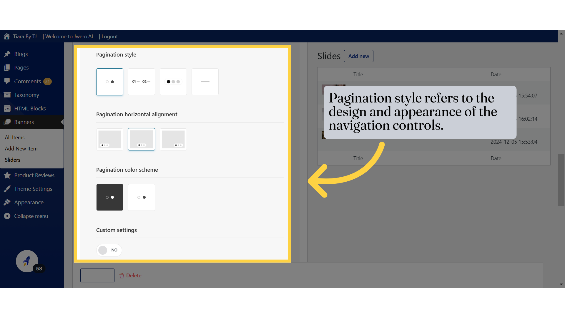
32. Pagination style refers to the design and appearance of the navigation controls.
Pagination Options in Sliders:
Pagination Style:
Choose how the pagination (navigation dots or numbers) will appear on the slider. Options include:Dots
Numbers (e.g., "01 — 02")
Lines or custom styles.
Pagination Horizontal Alignment:
Allows you to position the pagination:Left
Center
Right.
Pagination Color Scheme:
Customize the appearance of the pagination with a:Dark background with light dots.
Light background with dark dots.
Custom Settings:
Toggle this to "Yes" to enable advanced customization options for the slider's pagination beyond the default settings.
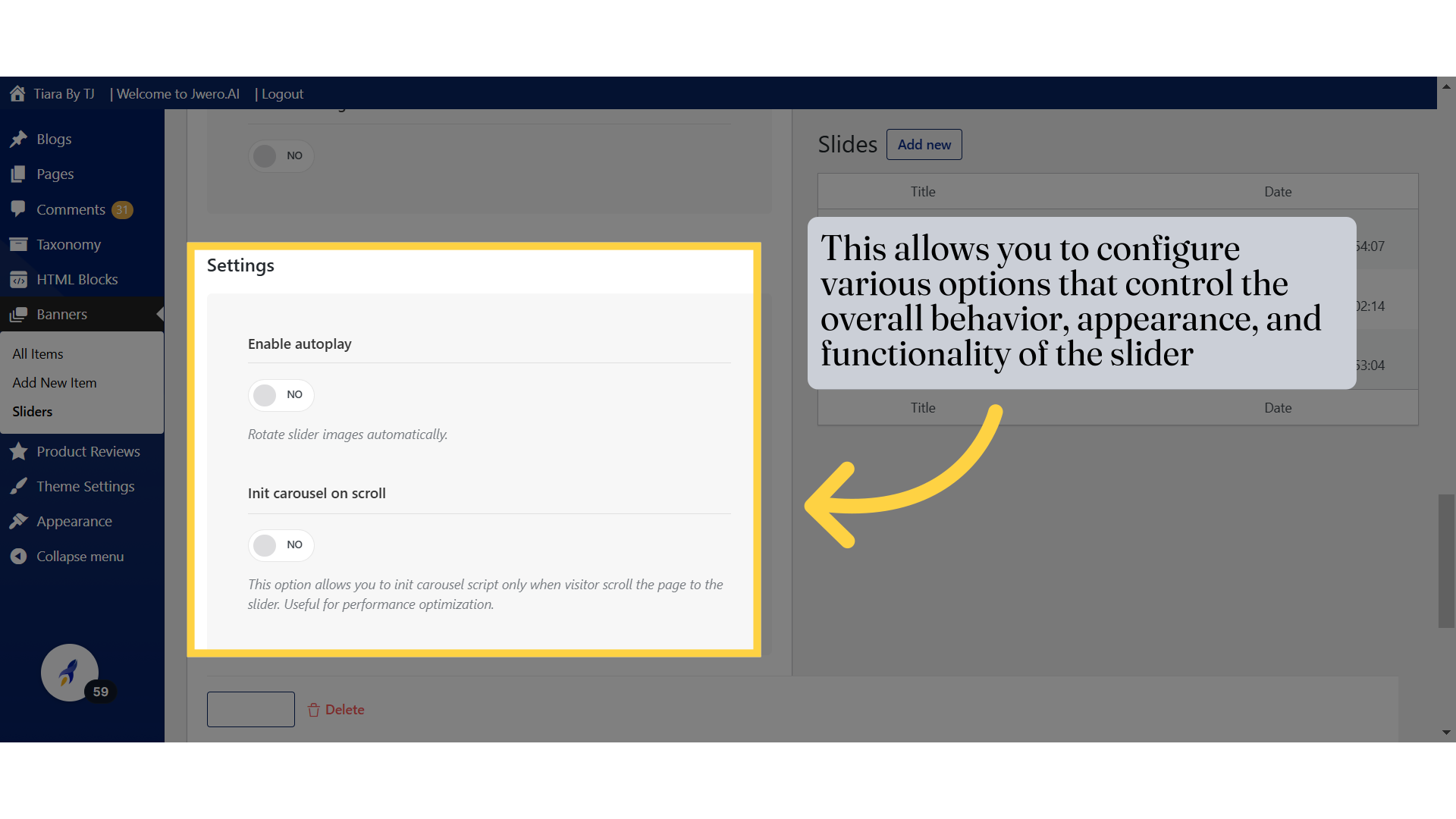
33. This allows you to configure various options that control the overall behavior, appearance, and functionality of the slider
Slider Settings Options:
Enable Autoplay:
When turned on, the slider will automatically rotate through the images without user interaction.Init Carousel on Scroll:
Activates the slider script only when the user scrolls to the slider section, improving performance by delaying initialization until needed.
34. Click "Update"
